- Home
- /
- Programming
- /
- Graphics
- /
- Create a challenging multiple bar graph
- RSS Feed
- Mark Topic as New
- Mark Topic as Read
- Float this Topic for Current User
- Bookmark
- Subscribe
- Mute
- Printer Friendly Page
- Mark as New
- Bookmark
- Subscribe
- Mute
- RSS Feed
- Permalink
- Report Inappropriate Content
Dear all,
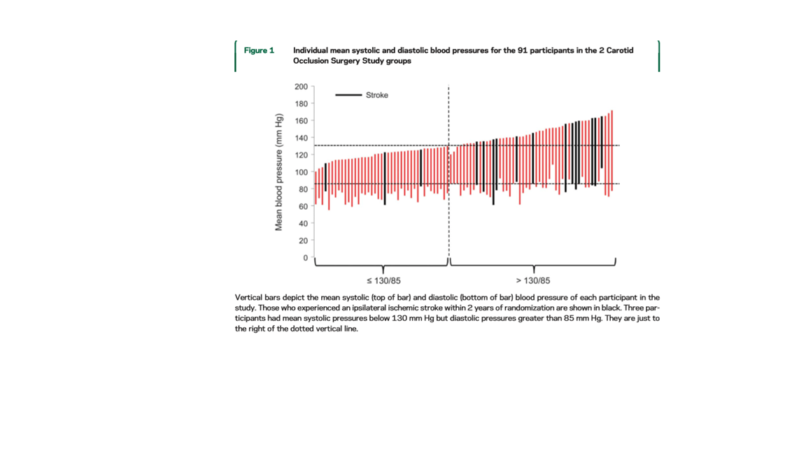
I want to create a graph like attached from reference.
below is my data:
Status ID sbp dbp
normal 46 125 72
normal 53 134 63
low 54 114 71
normal 59 126 72
normal 66 167 85
normal 78 185 80
normal 79 147 94
normal 80 169 91
normal 83 129 73
low 90 122 69
normal 93 153 89
normal 100 147 77
normal 109 126 71
low 110 152 70
normal 111 133 77
normal 113 130 77
normal 115 152 86
low 117 135 79
normal 120 144 73
normal 128 113 77
my syntax is:
data want;
set A;
if 0<sbp<140 or 0<dbp<90 then combp=0;/*normal group*/
if sbp>=140 or dbp>=90 then combp=1;/*hypertension group*/
proc gplot data=want;
plot ( sbp dbp)*ID/overlay;
run;
I have not figured out using variable 'combp' to split two groups and highlight status 'low' in graph. Is it possible to use my data to created same kind of reference graph?
Thanks in advance.
- Mark as New
- Bookmark
- Subscribe
- Mute
- RSS Feed
- Permalink
- Report Inappropriate Content
Your image is too small for me to see the details, but it looks somewhat like a waterfall plot that is used in clinical studies. Look at the article "How to create a waterfall plot in SAS" and see if you can adapt that technique to your data.
- Mark as New
- Bookmark
- Subscribe
- Mute
- RSS Feed
- Permalink
- Report Inappropriate Content
- Mark as New
- Bookmark
- Subscribe
- Mute
- RSS Feed
- Permalink
- Report Inappropriate Content
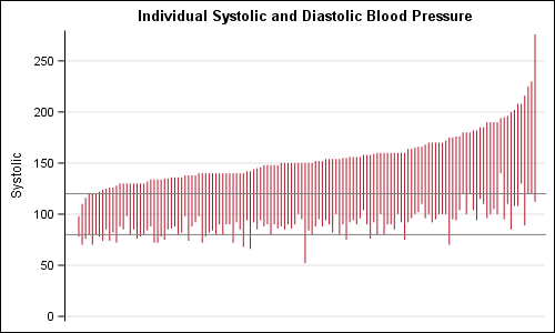
Here is how you can use the HIGHLOW plot to create such a graph. Data uses sashelp.heart (age> 59) sorted by ascending Systolic, with Reference Lines at 80 and 120.
title 'Individual Systolic and Diastolic Blood Pressure';
proc sgplot data=heart2 noborder nowall;
highlow x=id high=systolic low=diastolic / type=line;
refline 80 120;
xaxis display=none;
yaxis min=0 grid;
run;
Catch up on SAS Innovate 2026
Dive into keynotes, announcements and breakthroughs on demand.
Explore Now →Learn how use the CAT functions in SAS to join values from multiple variables into a single value.
Find more tutorials on the SAS Users YouTube channel.
SAS Training: Just a Click Away
Ready to level-up your skills? Choose your own adventure.


