- Home
- /
- Programming
- /
- Graphics
- /
- Re: How to remove spacing in the graph?
- RSS Feed
- Mark Topic as New
- Mark Topic as Read
- Float this Topic for Current User
- Bookmark
- Subscribe
- Mute
- Printer Friendly Page
- Mark as New
- Bookmark
- Subscribe
- Mute
- RSS Feed
- Permalink
- Report Inappropriate Content
Hi All,
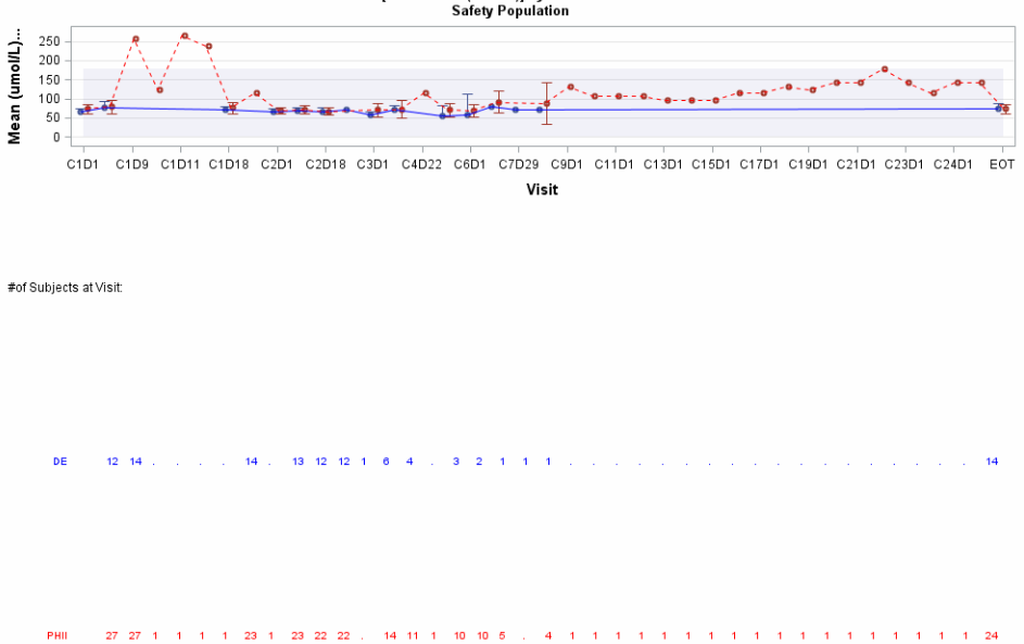
My graph is not showing the complete y axis...need to increase the height of y axis . Too much space between # of subject visits label and the rows showing subject number for each treatment groups.
Since I increased the pixel with to 950 to include all visits , not creating any GIF image only html is created.
Please see the complete code.
I need to use this for different lab tests.
Please help me to fix this issue... its very urgent.
Any help is greatly appreciated.
Thanks in advance!
/* Create the template that will be used to graph the merged dataset */
%macro gtemplate(lbtestcd,ll=,lu=,fnote=);
proc template;
define statgraph &lbtestcd._profile4;
dynamic title;
begingraph / designwidth=15in designheight=15in;
entrytitle halign=left textattrs=(size=8 weight=normal) "xxxxxxxxxxxxxxxxxxx" halign=right "PAGE 1 OF 1";
entrytitle halign=center textattrs=(size=10 weight=bold) " ";
entrytitle halign=center textattrs=(size=10 weight=bold) "Mean of &lbtestcd. [&&lbt&lbtestcd.(&&lbu&lbtestcd.)] by Treatment: Profile Over Time";
entrytitle halign=center textattrs=(size=10 weight=bold) "Safety Population";
/* layout lattice / columndatarange=union rowweights=(0.84 0.05 0.05 0.05 0.05 0.05 0.05);*/
/* layout lattice / columndatarange=union rowweights=(0.90 0.08 0.05 0.05 0.05 0.05 0.05 0.05 0.05 0.05);*/
layout lattice / columndatarange=union rowweights=(0.84 0.04 0.04 0.04 0.04 );
layout overlay / cycleattrs=true yaxisopts=(label="Mean (&&lbu&lbtestcd) with 95% CI" labelattrs=(size=11.5 weight=bold) griddisplay=on)
xaxisopts=(label='Visit' labelattrs=(size=11.5 weight=bold) /*offsetmin=0.05 offsetmax=0.05 display=(line ticks
tickvalues)*/
linearopts=(tickvaluelist=(1 2 3 4 5 6 7 8 9 10 11 12 13 14 15 16 17 18 19 20 21 22 23 24 25 26 27 28 29 30 31 32 33 34 35 36 37 38 39)
tickdisplaylist=('C1D1' 'C1D8' 'C1D9' 'C1D10' 'C1D11' 'C1D14' 'C1D18' '122' 'C2D1' 'C2D8' 'C2D18' 'C2D22' 'C3D1' 'C4D1' 'C4D22' 'C5D1' 'C6D1'
'C7D1' 'C7D29' 'C8D1' 'C9D1' 'C10D1' 'C11D1' 'C12D1' 'C13D1' 'C14D1' 'C15D1' 'C16D1' 'C17D1' 'C18D1' 'C19D1' 'C20D1' 'C21D1' 'C22D1'
'C23D1' 'C23D8' 'C24D1' 'C24D18' 'EOT')));
bandplot x=visitnum limitlower=&ll limitupper=&lu /display=standard datatransparency=.9 name='Overall Normal Range';
scatterplot x=eval(visitnum-0.15) y=DE / yerrorlower=LCLlow yerrorupper=UCLde name='DE'
markerattrs=graphdata1(size=9px weight=bold)
errorbarattrs=graphdata1(pattern=solid thickness=1.5);
scatterplot x=eval(visitnum+0.15) y=PHII / yerrorlower=LCLphii yerrorupper=UCLphii name='PHII'
markerattrs=graphdata2(size=9px weight=bold)
errorbarattrs=graphdata2(pattern=solid thickness=1.5);
seriesplot x=eval(visitnum-0.15) y=de / lineattrs=graphdata1(pattern=solid color=blue thickness=1.5px) name='DE';
seriesplot x=eval(visitnum+0.05) y=phii / lineattrs=graphdata2(pattern=shortdash color=red thickness=1.5px) name='PHII';
endlayout;
layout overlay;
entry halign=left '#of Subjects at Visit:';
endlayout;
blockplot x=visitx block=TDE / display=(values label) valuehalign=/*center*/left label='DE' repeatedvalues=true
valueattrs=graphdata1(size=7.5 color=blue) labelattrs=graphdata1(size=7.5 weight=normal color=blue);
blockplot x=visitx block=tphii / display=(values label) valuehalign=/*center*/left label='PHII' repeatedvalues=true
valueattrs=graphdata2(size=7.5 color=red) labelattrs=graphdata2(size=7.5 weight=normal color=red);
sidebar / spacefill=false;
discretelegend 'DE' 'PHII' 'Overall Normal Range' / title='Treatment Group Means:' titleattrs=(size=8 weight=normal) across=4
valueattrs=(size=8 weight=normal);
endsidebar;
endlayout;
entryfootnote halign=left textattrs=(size=8 weight=normal) "Note: Overall Normal Range represents the lowest lower limit and the highest upper limit from the set of ranges provided by different local laboratories";
entryfootnote halign=left textattrs=(size=8 weight=normal) "&fnote";
entryfootnote halign=left textattrs=(size=8 weight=normal) "Data Extract: &rawvers. Produced: %sysfunc(date(),date9.) %sysfunc(time(),time5.) Source: &pgm. Output:&lbtestcd.Profile.html";
endgraph;
end;
run;
%mend gtemplate;
%gtemplate(CREAT,ll=0,lu=176.8,fnote=%str(CTCAE Range (umol/L): Grade1:>177 - 265; Grade2:>265 - 530; Grade3:>530 - 1061; Grade4:>1061));
%macro greport(lbtestcd);
/* Create graph using the template and data. */
ods listing close;
ods html image_dpi=100 file="&lbtestcd.Profile.html" path="&path";
ods graphics / reset noborder width=950px height=800px
imagename="&lbtestcd.Profile" imagefmt=gif noscale;
proc sgrender data=&lbtestcd template=&lbtestcd._profile4;
run;
ods html close;
ods listing;
%mend greport;
see Screen shot

Accepted Solutions
- Mark as New
- Bookmark
- Subscribe
- Mute
- RSS Feed
- Permalink
- Report Inappropriate Content
As I suggested earlier, removing the extra 0.04 in the ROWWEIGHTS option will produce better spacing.
layout lattice / columndatarange=union rowweights=(0.84 0.040.04 0.04);

- Mark as New
- Bookmark
- Subscribe
- Mute
- RSS Feed
- Permalink
- Report Inappropriate Content
What version of SAS are you using?
- Mark as New
- Bookmark
- Subscribe
- Mute
- RSS Feed
- Permalink
- Report Inappropriate Content
I am using SAS 9.3.
The previous program was showing 3 treatment groups . I just removed the last one.
The other program was working fine
- Mark as New
- Bookmark
- Subscribe
- Mute
- RSS Feed
- Permalink
- Report Inappropriate Content
Hi Dan,
How can send you the data set that I am using. Attachment is not working.
- Mark as New
- Bookmark
- Subscribe
- Mute
- RSS Feed
- Permalink
- Report Inappropriate Content
Not sure this is the problem, but you have a mismatch between the number of entries in the ROWHEIGHT options and the number of cells in the graph. Also, if you put the block plots in an INNERMARGIN, they will size correctly by themselves. If you can attach the full program, it may be better as you have macros and macro variables. I believe you can create a zip file of program and data and attach it.
- Mark as New
- Bookmark
- Subscribe
- Mute
- RSS Feed
- Permalink
- Report Inappropriate Content
Hi Sanjay,
Is it possible to send you in your email.
- Mark as New
- Bookmark
- Subscribe
- Mute
- RSS Feed
- Permalink
- Report Inappropriate Content
Sure. I assume you have my email address or can easily find it. ![]()
- Mark as New
- Bookmark
- Subscribe
- Mute
- RSS Feed
- Permalink
- Report Inappropriate Content
Hi Sanjay,
I sent it. did you get it?
- Mark as New
- Bookmark
- Subscribe
- Mute
- RSS Feed
- Permalink
- Report Inappropriate Content
Hi Sanjay,
I tried sending you email but not going
- Mark as New
- Bookmark
- Subscribe
- Mute
- RSS Feed
- Permalink
- Report Inappropriate Content
You can send me the program and data at ods@sas.com
.
- Mark as New
- Bookmark
- Subscribe
- Mute
- RSS Feed
- Permalink
- Report Inappropriate Content
Thanks Sanjay! Already sent
- Mark as New
- Bookmark
- Subscribe
- Mute
- RSS Feed
- Permalink
- Report Inappropriate Content
As I suggested earlier, removing the extra 0.04 in the ROWWEIGHTS option will produce better spacing.
layout lattice / columndatarange=union rowweights=(0.84 0.040.04 0.04);

- Mark as New
- Bookmark
- Subscribe
- Mute
- RSS Feed
- Permalink
- Report Inappropriate Content
Hi Sanjay,
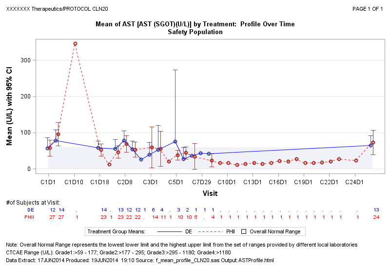
Thank you very much the rawweight change worked perfect!
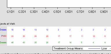
Now another issue is . The same code created the graph with gray back ground and the # of subject at visit is showing in uniform distance and is aligned with the plot.
If you look at my graph after first 2 visits few gap then after 3rd one few gap then showing in uniform distance till before last visits. See the part of sample graph with gray back ground and uniform distance (Same template code is for is used with one more REWWEIGHT value)

Thanks in advance!
- Mark as New
- Bookmark
- Subscribe
- Mute
- RSS Feed
- Permalink
- Report Inappropriate Content
To align the values with the tick values, use VALUEHALIGN=START on the BLOCKPLOTs.
- Mark as New
- Bookmark
- Subscribe
- Mute
- RSS Feed
- Permalink
- Report Inappropriate Content
Thanks Sanjay! I will try that! But how to get that greyish background?? Is it because my SAS version is 3.0?
Catch up on SAS Innovate 2026
Nearly 200 sessions are now available on demand with the SAS Innovate Digital Pass.
Explore Now →Learn how use the CAT functions in SAS to join values from multiple variables into a single value.
Find more tutorials on the SAS Users YouTube channel.
SAS Training: Just a Click Away
Ready to level-up your skills? Choose your own adventure.


