- Home
- /
- Programming
- /
- Graphics
- /
- How to plot top ten causes of death
- RSS Feed
- Mark Topic as New
- Mark Topic as Read
- Float this Topic for Current User
- Bookmark
- Subscribe
- Mute
- Printer Friendly Page
- Mark as New
- Bookmark
- Subscribe
- Mute
- RSS Feed
- Permalink
- Report Inappropriate Content
Hi Everyone,
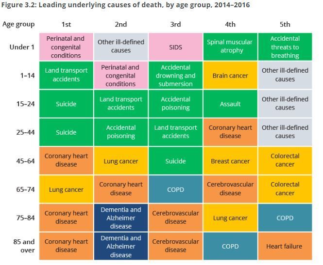
I need to plot the top ten causes of death for 3 groups of my study population. Below is an example of what I want to get at the
end but for 3 groups (instead of eight) and ten diseases (instead of five). Attached is the dataset containing study participant ID, causes and patient groups.
I was wondering if someone could help me how I should go about it?
Accepted Solutions
- Mark as New
- Bookmark
- Subscribe
- Mute
- RSS Feed
- Permalink
- Report Inappropriate Content
Hello,
Here's how I would make it. This would require SAS 9.4 but there are ways to do it earlier as well. I set it up to make the blocks with the HIGHLOW plot and showed the order with an XAXISTABLE. I made up an age format for your group variable, so you can make your own for that. The text is plotted with a TEXTPLOT and I use the ` symbol to force a split in the text for the longer ones. Note the file paths would need to be changed. You can set up a STYLEATTRS statement to modify your colors for the text or blocks.
proc import file='~/ibm/Death_group.csv' dbms=csv out=dat replace;
run;

proc sort data=dat;
    by group;
run;


proc freq data=dat noprint;
    by group;
    table cause / out=frq;
run;
proc sort data=frq;
    by group descending count;
run;
proc format;
    value groupf
        0 ='20-30'
        1 ='30-40'
        2 ='40-50'
        other=' ';
run;
data plot;
    set frq;
    by group;

    if first.group then do;
        order=0.5;
        low=0.05;
    end;
    else do;
        low+1;
        order+1;
    end;
    if group=0 then do;
        if ceil(order)=1 then orderf='1st';
        else if ceil(order)=2 then orderf='2nd';
        else if ceil(order)=3 then orderf='3rd';
        else if ceil(order)=4 then orderf='4th';
        else if ceil(order)=5 then orderf='5th';
        else if ceil(order)=6 then orderf='6th';
        else if ceil(order)=7 then orderf='7th';
        else if ceil(order)=8 then orderf='8th';
        else if ceil(order)=9 then orderf='9th';
    end;
    high=low+0.9;

    if cause='Cerebrovascular diseases' then cause='Cerebrovascular`diseases';
    else if cause='Heart diseases: IHDs + others' then cause='Heart diseases:`IHDs + others';
    else if cause='influenza/ pneumonia' then cause='influenza/`pneumonia';
run;
ods listing gpath='~/ibm/';
ods graphics / reset width=15in height=4in;
proc sgplot data=plot nowall noborder noautolegend;
    scatter x=order y=group / markerattrs=(size=0pt);
    highlow low=low high=high y=group / group=cause x2axis type=bar barwidth=0.9;
    text y=group x=order text=cause / position=center strip textattrs=(size=12pt) splitchar='`' splitpolicy=splitalways;
    xaxistable orderf / position=top x=order location=inside label='Age Group' labelattrs=(size=12pt) valueattrs=(size=12pt);
    yaxis type=linear label='Group' min=-0.5 max=2.5  tickvalueformat=groupf.  reverse display=(nolabel noticks noline) offsetmin=0 offsetmax=0;
    xaxis type=linear min=0 max=9 display=none offsetmin=0 offsetmax=0;
    x2axis type=linear min=0 max=9 display=none offsetmin=0 offsetmax=0;
run;- Mark as New
- Bookmark
- Subscribe
- Mute
- RSS Feed
- Permalink
- Report Inappropriate Content
@SAS--_lover wrote:
Hi Everyone,
I need to plot the top ten causes of death for 3 groups of my study population. Below is an example of what I want to get at the
end but for 3 groups (instead of eight) and ten diseases (instead of five). Attached is the dataset containing study participant ID, causes and patient groups.
I was wondering if someone could help me how I should go about it?
Do you want a table or a plot? Plot usually refers to a graphic and that does not appear to be a graph.
If the desire is a colored table similar to what you show you might indicate any rules involved.
Also do you want done if there are ties for top 3? Such as 2nd, 3rd and 4th all have the same frequency for a group?
- Mark as New
- Bookmark
- Subscribe
- Mute
- RSS Feed
- Permalink
- Report Inappropriate Content
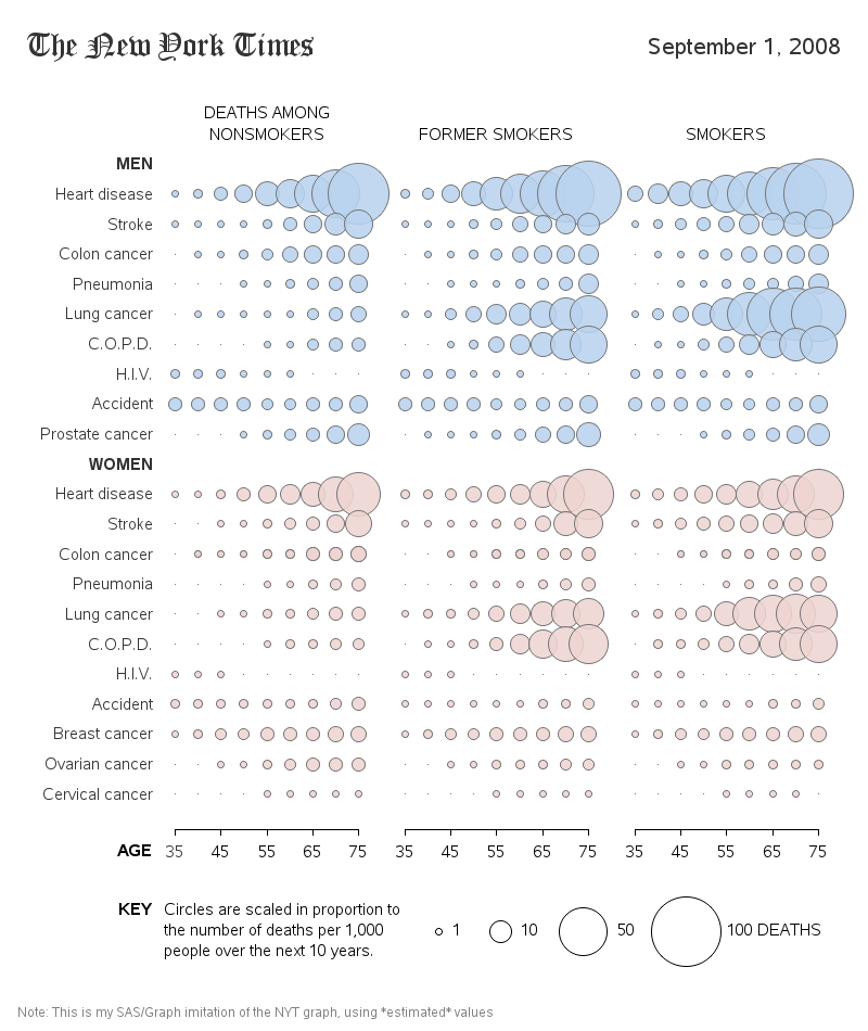
It took a bit of custom coding, but here's a SAS graph on the topic:
http://robslink.com/SAS/democd33/death_odds.htm
http://robslink.com/SAS/democd33/death_odds_info.htm
Learn how use the CAT functions in SAS to join values from multiple variables into a single value.
Find more tutorials on the SAS Users YouTube channel.
SAS Training: Just a Click Away
Ready to level-up your skills? Choose your own adventure.


