- Home
- /
- Programming
- /
- Graphics
- /
- Re: How to plot by ID by VISIT across age
- RSS Feed
- Mark Topic as New
- Mark Topic as Read
- Float this Topic for Current User
- Bookmark
- Subscribe
- Mute
- Printer Friendly Page
- Mark as New
- Bookmark
- Subscribe
- Mute
- RSS Feed
- Permalink
- Report Inappropriate Content
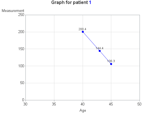
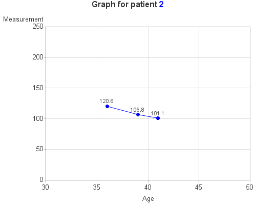
I would like to create a graph with age as my x axis and subject ID as my Y axis, grouped by treatment group. I want the markers to represent the subject visit at each age and a line to connect across to all visits, only by ID. How can I do this?
Sample data set:
ID VISIT AGE Y TX
1 1 40 200.4 A
1 2 43 144.4 A
1 3 45 106.3 A
2 1 36 120.6 B
2 2 39 106.8 B
2 3 41 101.1 B
- Mark as New
- Bookmark
- Subscribe
- Mute
- RSS Feed
- Permalink
- Report Inappropriate Content
Are you sure about this portion?
subject ID as my Y axis
And which variable corresponds to 'treatment group'?
@Melk wrote:
grouped by treatment group.
A sketch of what you're looking for would be helpful. This should be relatively easy within a SGPLOT, with a SERIES statement and the MARKERS option to have points that are connected via a line.
And what is the Y supposed to represent, or is it extraneous information?
@Melk wrote:
I would like to create a graph with age as my x axis and subject ID as my Y axis, grouped by treatment group. I want the markers to represent the subject visit at each age and a line to connect across to all visits, only by ID. How can I do this?
Sample data set:
ID VISIT AGE Y
1 1 40 200.4
1 2 43 144.4
1 3 45 106.3
2 1 36 120.6
2 2 39 106.8
2 3 41 101.1
- Mark as New
- Bookmark
- Subscribe
- Mute
- RSS Feed
- Permalink
- Report Inappropriate Content
- Mark as New
- Bookmark
- Subscribe
- Mute
- RSS Feed
- Permalink
- Report Inappropriate Content
Have you tried SGPLOT yet? If so, please post what you've attempted thus far.
- Mark as New
- Bookmark
- Subscribe
- Mute
- RSS Feed
- Permalink
- Report Inappropriate Content
Here's some code to do what I *think* you're looking for (or at least, maybe it will get you started)...
data foo;
length tx $1;
input ID VISIT AGE Y TX;
datalines;
1 1 40 200.4 A
1 2 43 144.4 A
1 3 45 106.3 A
2 1 36 120.6 B
2 2 39 106.8 B
2 3 41 101.1 B
;
run;
proc sort data=foo out=foo;
by id age;
run;
goptions xpixels=500 ypixels=400 htitle=12pt htext=10pt ctext=gray33;
symbol1 value=dot height=8pt interpol=join color=blue pointlabel=(height=8pt color=gray55 "#y");
axis1 label=('Measurement') order=(0 to 250 by 50) minor=none offset=(0,0);
axis2 label=('Age') order=(30 to 50 by 5) minor=none offset=(0,0);
options nobyline;
title1 "Graph for patient " c=blue "#byval(id)";
footnote;
proc gplot data=foo;
by id;
plot y*age=1 /
vaxis=axis1 haxis=axis2
autovref cvref=graydd autohref chref=graydd;
run;
Learn how use the CAT functions in SAS to join values from multiple variables into a single value.
Find more tutorials on the SAS Users YouTube channel.
SAS Training: Just a Click Away
Ready to level-up your skills? Choose your own adventure.


