BookmarkSubscribeRSS Feed
🔒 This topic is solved and locked. Need further help from the community? Please sign in and ask a new question.
aminkarimid
Lapis Lazuli | Level 10

Hello everybody,

I want to plot a 3D box blot which illustrates means with standard error bars from calculated data as I show bellow:
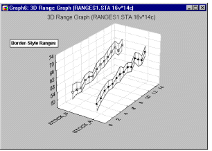
3D Box Plot3D Box Plot


All of data, which I have, are numeric type.


How can I do that?

1 ACCEPTED SOLUTION

Accepted Solutions
aminkarimid
Lapis Lazuli | Level 10

I have a suggestion, However it is not the best one and needs to be corrected.


/* Set the graphics environment */                                                                                                      
goptions reset=all cback=white border htext=10pt htitle=12pt;                                                                           
 proc sort data=have;                                                                                                                    
   by x y;                                                                                                                             
run;

/* Calculate the mean and standard error for each X */                                                                                  
proc means data=have noprint;                                                                                                           
   by x y;                                                                                                                             
   var z;                                                                                                                            
   output out=meansout mean=mean stderr=stderr;                                                                                         
run;                                                                                                                                    
                                                                                                                                        
/* Reshape the data to contain three Y values for */                                                                                    
/* each X for use with the HILOC interpolation.   */                                                                                    
data reshape(keep=x y z mean);                                                                                                      
   set meansout;                                                                                                                        
   z=mean;  
   output;                                                                                                                              
                                                                                                                                        
   z=mean - stderr;                                                                                                                  
   output;                                                                                                                              
                                                                                                                                        
   z=mean + stderr;                                                                                                                  
   output;                                                                                                                              
run;                                                                                                                                    
 
/* Define the title */
   title1 '3D Plot Intraday Volume vs year and Time from Calculated Data'; 

/* Define the axis characteristics */
   axis1 offset=(10,10) minor=none;                                                                                                                  
   axis2 label=(angle=90);                                                                                                              

/* Define the symbol characteristics */
   symbol1 interpol=hiloctj color=blue line=2;                                                                                          
   symbol2 interpol=none color=blue value=dot height=1.5;
                                                                                                                                       
/* Plot the error bars using the HILOCTJ interpolation */                                                                               
/* and overlay symbols at the means. */                                                                                                 
proc g3d data=reshape;                                                                                                                
   scatter x*y=z / size=2 shape='prism';     
run;                                                                                                      
quit;

This program make a bar chart which illustrates means of z vs x and y variables.


View solution in original post

7 REPLIES 7
WarrenKuhfeld
Ammonite | Level 13

How about something more like this instead? You can make two panels of two-dimensional box plots. Here is one way.

data x;
   do z = 1 to 2;
      do x = 1 to 5;
         do i = 1 to 100;
            y = log(x) + 2 * z + normal(7);
            output;
         end;
      end;
   end;
run;

proc sgpanel;
   panelby z / columns=1;
   vbox y / category=x;
   run;


aminkarimid
Lapis Lazuli | Level 10

Thanks @WarrenKuhfeld, However simultaneous effects of variables is important.

Reeza
Super User

Since you're not displaying 3 variables, a single line series plot with the high/low bars will communicate the information in a more efficient manner.

Reeza
Super User

Thats one of those things you can technically do, but really really shouldn't. 

3D graphs rarely do a good job of conveying information. 


So if you're looking for data to include in a presentation I would suggest an alternative visualization. 

aminkarimid
Lapis Lazuli | Level 10
Hello @Reeza,
Please let me know your suggestions.
Thanks.
ballardw
Super User

Not a Box plot in normal terms. A box plot, or box and whisker shows mean, median, interquartile range [box part] and whiskers out from the box to +/- 1.5 interquartile range for outliers.


If you have SAS Graph then the  procedure us Proc G3D. The data set to plot would require the x, y and z value for each point. Getting the series connected as shown would take more than a bit of work to get the correct symbol statements displaying the intended series (upper, lower bound or the value though).


aminkarimid
Lapis Lazuli | Level 10

I have a suggestion, However it is not the best one and needs to be corrected.


/* Set the graphics environment */                                                                                                      
goptions reset=all cback=white border htext=10pt htitle=12pt;                                                                           
 proc sort data=have;                                                                                                                    
   by x y;                                                                                                                             
run;

/* Calculate the mean and standard error for each X */                                                                                  
proc means data=have noprint;                                                                                                           
   by x y;                                                                                                                             
   var z;                                                                                                                            
   output out=meansout mean=mean stderr=stderr;                                                                                         
run;                                                                                                                                    
                                                                                                                                        
/* Reshape the data to contain three Y values for */                                                                                    
/* each X for use with the HILOC interpolation.   */                                                                                    
data reshape(keep=x y z mean);                                                                                                      
   set meansout;                                                                                                                        
   z=mean;  
   output;                                                                                                                              
                                                                                                                                        
   z=mean - stderr;                                                                                                                  
   output;                                                                                                                              
                                                                                                                                        
   z=mean + stderr;                                                                                                                  
   output;                                                                                                                              
run;                                                                                                                                    
 
/* Define the title */
   title1 '3D Plot Intraday Volume vs year and Time from Calculated Data'; 

/* Define the axis characteristics */
   axis1 offset=(10,10) minor=none;                                                                                                                  
   axis2 label=(angle=90);                                                                                                              

/* Define the symbol characteristics */
   symbol1 interpol=hiloctj color=blue line=2;                                                                                          
   symbol2 interpol=none color=blue value=dot height=1.5;
                                                                                                                                       
/* Plot the error bars using the HILOCTJ interpolation */                                                                               
/* and overlay symbols at the means. */                                                                                                 
proc g3d data=reshape;                                                                                                                
   scatter x*y=z / size=2 shape='prism';     
run;                                                                                                      
quit;

This program make a bar chart which illustrates means of z vs x and y variables.


SAS Innovate 2025: Register Today!


Join us for SAS Innovate 2025, our biggest and most exciting global event of the year, in Orlando, FL, from May 6-9. Sign up by March 14 for just $795.


Register now!

How to Concatenate Values

Learn how use the CAT functions in SAS to join values from multiple variables into a single value.

Find more tutorials on the SAS Users YouTube channel.

SAS Training: Just a Click Away

 Ready to level-up your skills? Choose your own adventure.

Browse our catalog!

Discussion stats
  • 7 replies
  • 2057 views
  • 1 like
  • 4 in conversation