- Home
- /
- Programming
- /
- Graphics
- /
- Re: How to draw Clark Error Grid with SAS/Graph tools?
- RSS Feed
- Mark Topic as New
- Mark Topic as Read
- Float this Topic for Current User
- Bookmark
- Subscribe
- Mute
- Printer Friendly Page
- Mark as New
- Bookmark
- Subscribe
- Mute
- RSS Feed
- Permalink
- Report Inappropriate Content
SASDR
- Mark as New
- Bookmark
- Subscribe
- Mute
- RSS Feed
- Permalink
- Report Inappropriate Content
- Mark as New
- Bookmark
- Subscribe
- Mute
- RSS Feed
- Permalink
- Report Inappropriate Content
One more question, how to remove the most outside frame? Thanks.
- Mark as New
- Bookmark
- Subscribe
- Mute
- RSS Feed
- Permalink
- Report Inappropriate Content
- Mark as New
- Bookmark
- Subscribe
- Mute
- RSS Feed
- Permalink
- Report Inappropriate Content
I tried noframe option in plot statement in Proc gplot. The frame connected to x-axis and y-axis disappeared but the outmost frame is still there.
- Mark as New
- Bookmark
- Subscribe
- Mute
- RSS Feed
- Permalink
- Report Inappropriate Content
Scott Barry
SBBWorks, Inc.
http://support.sas.com/documentation/cdl/en/graphref/61884/HTML/default/gopdict-border.htm
- Mark as New
- Bookmark
- Subscribe
- Mute
- RSS Feed
- Permalink
- Report Inappropriate Content
It works great.
Jack
- Mark as New
- Bookmark
- Subscribe
- Mute
- RSS Feed
- Permalink
- Report Inappropriate Content
Hi everybody,
Would it be possible to have an example of code to draw these Clark Error Grid plots?
Thanking you in advance.
- Mark as New
- Bookmark
- Subscribe
- Mute
- RSS Feed
- Permalink
- Report Inappropriate Content
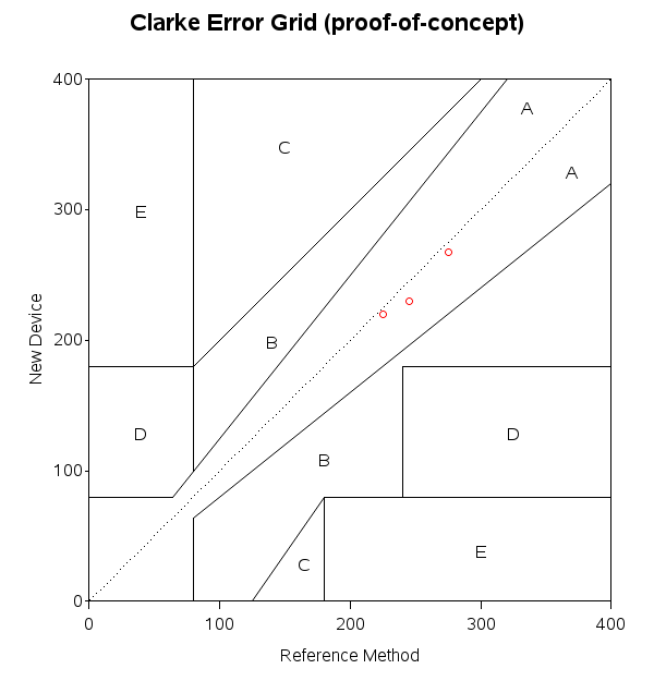
I've taken a stab at this, basing my grid visually on the example in Wikipedia.
Mine looks very similar to theirs, but I wasn't sure what the *exact* cut-off values should be.
If someone knows the exact values, I'd be happy to have them update my sample ![]()

- Mark as New
- Bookmark
- Subscribe
- Mute
- RSS Feed
- Permalink
- Report Inappropriate Content
And, after seeing how they specified the coordinates for the areas of the 2nd example, I think it probably makes more sense to specify the coordinates of the areas in direct values (rather than %), so I've re-written the first example to use direct values (like the 2nd example). Attaching the new code:
- Mark as New
- Bookmark
- Subscribe
- Mute
- RSS Feed
- Permalink
- Report Inappropriate Content
Hi Robert,
Thanks a lor for your quick answer. It souds great!!!
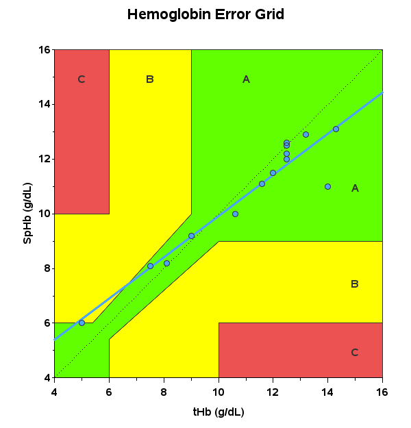
Just a last question: would it be possible to fill with figures and borders with colors (see example in this article - Figure 1)? If yes, It would be perfect!
Thanking you in advance
- Mark as New
- Bookmark
- Subscribe
- Mute
- RSS Feed
- Permalink
- Report Inappropriate Content
This could be done with annotated polygons (rather than annotated lines). Also the areas and axis values are different (actually simpler) in this chart, than in the one I used (from Wikipedia). And this brings to mind a suggestion for everyone ... if you have a certain chart in mind, please post that in your first comment - this can save a lot of confusion & re-work!
- Mark as New
- Bookmark
- Subscribe
- Mute
- RSS Feed
- Permalink
- Report Inappropriate Content
Dear Robert,
Thanks for your answer. I will try to do this with annotated polygons. I will let you informed if I succeed to perfom this.
I agree, we have to be very clear about the result we want to obtain.
In my case, please be sure that your code is highly appreciated and helpful as I will have to generate both plots (with 3 and 5 different areas) and also with colors at the request of my colleagues.
Thanking you again for your help.
Best regards
- Mark as New
- Bookmark
- Subscribe
- Mute
- RSS Feed
- Permalink
- Report Inappropriate Content
Ok - here's what I've come up with for the other plot (using annotated poly/polycont areas for the colored background)...

- Mark as New
- Bookmark
- Subscribe
- Mute
- RSS Feed
- Permalink
- Report Inappropriate Content
Thanks a lot Robert! That is perfect! This is exactly what we wanted to generate.
Thanks again a lot for your help.
Best regards,
Catch up on SAS Innovate 2026
Dive into keynotes, announcements and breakthroughs on demand.
Explore Now →Learn how use the CAT functions in SAS to join values from multiple variables into a single value.
Find more tutorials on the SAS Users YouTube channel.
SAS Training: Just a Click Away
Ready to level-up your skills? Choose your own adventure.


