- Home
- /
- Programming
- /
- Graphics
- /
- Re: How to create 3d clustered column chart in sas
- RSS Feed
- Mark Topic as New
- Mark Topic as Read
- Float this Topic for Current User
- Bookmark
- Subscribe
- Mute
- Printer Friendly Page
- Mark as New
- Bookmark
- Subscribe
- Mute
- RSS Feed
- Permalink
- Report Inappropriate Content
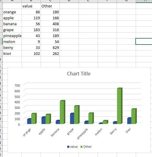
i can create a chart with clustered but how to create a 3D clustered chart as below
Accepted Solutions
- Mark as New
- Bookmark
- Subscribe
- Mute
- RSS Feed
- Permalink
- Report Inappropriate Content
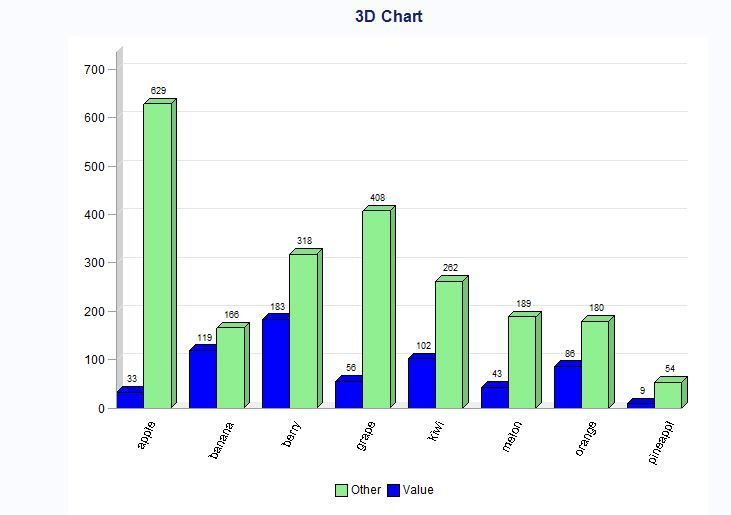
Try this:
axis1 minor=none label=('') value=none ;
axis2 minor=none label=('');
axis3 label=('') minor=none value=(angle=65) ;
legend1 label=none
shape=bar(3,3)
cborder=white
cblock=white
origin=(24,);
pattern1 color='#90EE90' ;
pattern2 color=blue;
title "3D Chart";
proc gchart data=have;
vbar3d app / discrete sumvar=count
group=fruit
subgroup=App
space=0
maxis=axis1
raxis=axis2
gaxis=axis3
outside=sum
legend=legend1
shape=block
autoref cframe=white
ascending
;
run;
quit;
- Mark as New
- Bookmark
- Subscribe
- Mute
- RSS Feed
- Permalink
- Report Inappropriate Content
Hi,
Can you post the code which you are using .
Thanks,
Vishnu
- Mark as New
- Bookmark
- Subscribe
- Mute
- RSS Feed
- Permalink
- Report Inappropriate Content
I did transpose the data as below :
| fruit | count | App |
| orange | 86 | Value |
| orange | 180 | Other |
| apple | 33 | Value |
| apple | 629 | Other |
| banana | 119 | Value |
| banana | 166 | Other |
| grape | 56 | Value |
| grape | 408 | Other |
| melon | 43 | Value |
| melon | 189 | Other |
| pineapple | 9 | Value |
| pineapple | 54 | Other |
| berry | 183 | Value |
| berry | 318 | Other |
| kiwi | 102 | Value |
| kiwi | 262 | Other |
PROC SGPLOT DATA =dash.month_data noborder;
styleattrs datacolors=('#90EE90' blue);
VBAR fruit /response=count GROUP = App GroupDisplay=Cluster datalabel
dataskin=pressed
baselineattrs=(thickness=0) nooutline;
xaxis display=(nolabel) FITPOLICY=SPLIT discreteorder=data;
yaxis display=(noline);
run;
- Mark as New
- Bookmark
- Subscribe
- Mute
- RSS Feed
- Permalink
- Report Inappropriate Content
Try this:
axis1 minor=none label=('') value=none ;
axis2 minor=none label=('');
axis3 label=('') minor=none value=(angle=65) ;
legend1 label=none
shape=bar(3,3)
cborder=white
cblock=white
origin=(24,);
pattern1 color='#90EE90' ;
pattern2 color=blue;
title "3D Chart";
proc gchart data=have;
vbar3d app / discrete sumvar=count
group=fruit
subgroup=App
space=0
maxis=axis1
raxis=axis2
gaxis=axis3
outside=sum
legend=legend1
shape=block
autoref cframe=white
ascending
;
run;
quit;
- Mark as New
- Bookmark
- Subscribe
- Mute
- RSS Feed
- Permalink
- Report Inappropriate Content
- Mark as New
- Bookmark
- Subscribe
- Mute
- RSS Feed
- Permalink
- Report Inappropriate Content
Thank you Reeza for the link.
- Mark as New
- Bookmark
- Subscribe
- Mute
- RSS Feed
- Permalink
- Report Inappropriate Content
You probably know this, but 3D charts are considered junk charts.
Catch up on SAS Innovate 2026
Dive into keynotes, announcements and breakthroughs on demand.
Explore Now →Learn how use the CAT functions in SAS to join values from multiple variables into a single value.
Find more tutorials on the SAS Users YouTube channel.
SAS Training: Just a Click Away
Ready to level-up your skills? Choose your own adventure.


