- Home
- /
- Programming
- /
- Graphics
- /
- SGPLOT Series - not seeing a trend/connected lines
- RSS Feed
- Mark Topic as New
- Mark Topic as Read
- Float this Topic for Current User
- Bookmark
- Subscribe
- Mute
- Printer Friendly Page
- Mark as New
- Bookmark
- Subscribe
- Mute
- RSS Feed
- Permalink
- Report Inappropriate Content
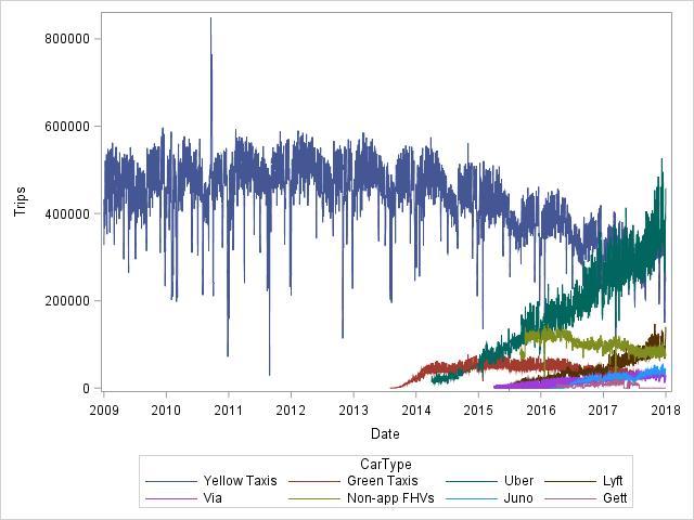
I am quite new to Sgplot... and wondering why I get "vertical lines" instead of 8 series lines.
/* Import NYC Taxi and Limosine Trip Data */
PROC IMPORT OUT= SASUSER.NYCTaxis
     DATAFILE= "C:\Users\Michael King\Desktop\GMU Presentation\Taxi Data from NYC Taxi Commission.xlsx"
     DBMS=EXCEL REPLACE;
     RANGE="Data1$";
     GETNAMES=YES;
     MIXED=NO;
     SCANTEXT=YES;
     USEDATE=YES;
     SCANTIME=YES;
RUN;

/* View the data */
Proc Print Data=SASUser.NYCTaxis;
Run;

/* Display scatter plots */
ODS Graphics / ANTIALIASMAX=60000;
Title 'Plot of  Trips by Car Type';
PROC Sgplot Data=SASUser.Nyctaxis;
  Series x=Date y=Trips / Group = CarType grouplc=CarType name='grouping';
  Xaxis Label = 'Date';
  yaxis label = 'Trips';
Run;- Mark as New
- Bookmark
- Subscribe
- Mute
- RSS Feed
- Permalink
- Report Inappropriate Content
I am afraid I am not downloading xl files. Post example test data in the form of a datastep, you can follow this post if needed:
As for why you get vertical lines rather than what you were expecting, this is down to your data - which I can't see. You may need more ticks, or you might need to process the data some more.
- Mark as New
- Bookmark
- Subscribe
- Mute
- RSS Feed
- Permalink
- Report Inappropriate Content
Did you check your imported data to verify it was read in correctly and has the correct values?
@MichaelAKIng wrote:
I am quite new to Sgplot... and wondering why I get "vertical lines" instead of 8 series lines.
/* Import NYC Taxi and Limosine Trip Data */
PROC IMPORT OUT= SASUSER.NYCTaxis
     DATAFILE= "C:\Users\Michael King\Desktop\GMU Presentation\Taxi Data from NYC Taxi Commission.xlsx"
     DBMS=EXCEL REPLACE;
     RANGE="Data1$";
     GETNAMES=YES;
     MIXED=NO;
     SCANTEXT=YES;
     USEDATE=YES;
     SCANTIME=YES;
RUN;

/* View the data */
Proc Print Data=SASUser.NYCTaxis;
Run;

/* Display scatter plots */
ODS Graphics / ANTIALIASMAX=60000;
Title 'Plot of  Trips by Car Type';
PROC Sgplot Data=SASUser.Nyctaxis;
  Series x=Date y=Trips / Group = CarType grouplc=CarType name='grouping';
  Xaxis Label = 'Date';
  yaxis label = 'Trips';
Run;
- Mark as New
- Bookmark
- Subscribe
- Mute
- RSS Feed
- Permalink
- Report Inappropriate Content
If your Excel data is not in the form one row per record, such as date with with values of counts or similar then you will have a big fail.
Note that it is very possible to turn your data set into code so that we can see what your data actually looks like.
Instructions here: https://communities.sas.com/t5/SAS-Communities-Library/How-to-create-a-data-step-version-of-your-dat... will show how to turn an existing SAS data set into data step code that can be pasted into a forum code box using the {i} icon or attached as text to show exactly what you have and that we can test code against.
Many users here don't want to download Excel files because of virus potential, others have such things blocked by security software. Also if you give us Excel we have to create a SAS data set and due to the non-existent constraints on Excel data cells the result we end up with may not have variables of the same type (numeric or character) and even values.
- Mark as New
- Bookmark
- Subscribe
- Mute
- RSS Feed
- Permalink
- Report Inappropriate Content
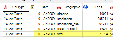
Your Excel data is a Pivot table and contains presummarized data, with multiple records per date. Each record represents a category, and then a "Total" row is included. When you try to visualize/analyze the data as-is, you're double counting (at least) many of the values.
Try this as a start -- but more work may be needed:
ODS Graphics / ANTIALIASMAX=60000;
Title 'Plot of  Trips by Car Type';
PROC Sgplot Data=SASUser.Nyctaxis (where=(geographic="total"));
  Series x=Date y=Trips / Group = CarType grouplc=CarType name='grouping';
  Xaxis Label = 'Date';
  yaxis label = 'Trips';
Run;- Mark as New
- Bookmark
- Subscribe
- Mute
- RSS Feed
- Permalink
- Report Inappropriate Content
Catch up on SAS Innovate 2026
Dive into keynotes, announcements and breakthroughs on demand.
Explore Now →Learn how use the CAT functions in SAS to join values from multiple variables into a single value.
Find more tutorials on the SAS Users YouTube channel.
SAS Training: Just a Click Away
Ready to level-up your skills? Choose your own adventure.


