- Home
- /
- Programming
- /
- Graphics
- /
- How to control Y2axis tick value labels using PROC TEMPLATE
- RSS Feed
- Mark Topic as New
- Mark Topic as Read
- Float this Topic for Current User
- Bookmark
- Subscribe
- Mute
- Printer Friendly Page
- Mark as New
- Bookmark
- Subscribe
- Mute
- RSS Feed
- Permalink
- Report Inappropriate Content
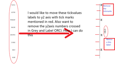
I am trying to create a graph expecting with y2axis tick labels and removing y2axis label. How I can achieve it. any suggestions? thank you.
data orci;
 input effect$ OR LCL UCL;
 cards;
 AGE 1.05 1.01 1.09
 BEC 1.00 0.98 1.02
 IVHX 0.70 0.54 0.89
 DRUTX 0.94 0.90 0.99
 RACE 1.26 0.81 1.95
 TREAT 1.54 1.04 2.27
 SITE 1.13 0.74 1.72
 ;
 RUN;
 data orci1;

 effect='Cats';
 run;

 data orci2;
 set orci orci1;
 orci=_n_;
 xval=0;
 run;


proc template;
	define statgraph xx;
		begingraph/BORDER=off;


layout overlay /  border=false walldisplay= none
                             yaxisopts=(reverse=false type=discrete display=none)
                             xaxisopts = (display=none offsetmin=0 offsetmax=.7);
                    entry  halign=center " " / pad=(right=40%) location=outside
					valign=top textattrs=(family="Courier New" size=10pt);

              scatterplot  x=xval y=orci / markercharacter=effect  yaxis=y2
							markercharacterposition= left markercharacterattrs=(family="Courier New" size=10pt);

              endlayout;
endgraph;
end;
run;

proc sgrender data=orci2 template="xx";
run;
Accepted Solutions
- Mark as New
- Bookmark
- Subscribe
- Mute
- RSS Feed
- Permalink
- Report Inappropriate Content
Your "text" are not axis labels at all from your shown example. They are marker labels.
One way to get the shown text as an axis label is a format for the actual variable making the axis with the desired values and associate the format with the variable in either the data or the Sgrender code.
Other is in the Yaxisopts or Y2axisopts for DISCRETE axis you can use a number of options such as TICKVALUELIST , TICKVALUEDISPLAYLIST and TICKVALUEFORMAT The lists are rather fixed or require dynamic values.
You control options on the Y2 axis with Y2axisopts .
This gets most of what I think you are asking for with the given demo data.
proc format ;
 value orci
 1='AGE'
 2='BEC'
 3='IVHX'
 4='DRUTX'
 5='RACE'
 6='TREAT'
 7='SITE'
;
run;
proc template;
	define statgraph xx;
		begingraph/BORDER=off;


layout overlay /  border=false walldisplay= none
                             yaxisopts=(reverse=false type=discrete display=none )
                             y2axisopts=(type=discrete tickstyle=inside
                                        label=" "
                                )
                             xaxisopts = (display=none offsetmin=0 offsetmax=.7);
                    entry  halign=center " " / pad=(right=40%) location=outside
					valign=top textattrs=(family="Courier New" size=10pt);
              scatterplot  x=xval y=orci /
                      yaxis=y2
          ;
              endlayout;
endgraph;
end;
run;

proc sgrender data=orci2 template="xx";
format orci orci.;
run;
Since your y values, orci are pretty much dummy values I didn't spend any time trying to fix an axis value with no corresponding text. That could be done here by not creating a Y value to plot against for the non-plot points:
data orci2;
 set orci (in=in1) orci1;
 if in1 then orci=_n_;
 xval=0;
 run;
- Mark as New
- Bookmark
- Subscribe
- Mute
- RSS Feed
- Permalink
- Report Inappropriate Content
Have you tried using Proc SGplot, rather than Proc SGrender & custom template?
(just curious if there's a specific functionality you're wanting, that's not available in sgplot)
- Mark as New
- Bookmark
- Subscribe
- Mute
- RSS Feed
- Permalink
- Report Inappropriate Content
I am very new to SGplot, and presently learning. We use GTL because of the flexibility it gives for our study-related Graphs. I am not looking for functionality.
1. I am looking to display the character values on Y2axis,
2. Either I want to display tickmark inside instead of outside. Is there any function or able to draw them using dummy data!
Thank you for your response.
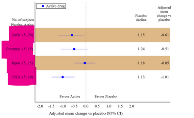
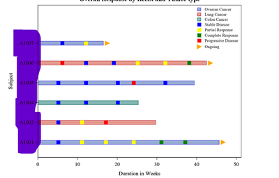
I am kind of looking similar to the following image, instead, of Yaxis it should display on y2axis.
Ref: Image Article "Graphs made easy using SAS Graph Template Language "
- Mark as New
- Bookmark
- Subscribe
- Mute
- RSS Feed
- Permalink
- Report Inappropriate Content
Your "text" are not axis labels at all from your shown example. They are marker labels.
One way to get the shown text as an axis label is a format for the actual variable making the axis with the desired values and associate the format with the variable in either the data or the Sgrender code.
Other is in the Yaxisopts or Y2axisopts for DISCRETE axis you can use a number of options such as TICKVALUELIST , TICKVALUEDISPLAYLIST and TICKVALUEFORMAT The lists are rather fixed or require dynamic values.
You control options on the Y2 axis with Y2axisopts .
This gets most of what I think you are asking for with the given demo data.
proc format ;
 value orci
 1='AGE'
 2='BEC'
 3='IVHX'
 4='DRUTX'
 5='RACE'
 6='TREAT'
 7='SITE'
;
run;
proc template;
	define statgraph xx;
		begingraph/BORDER=off;


layout overlay /  border=false walldisplay= none
                             yaxisopts=(reverse=false type=discrete display=none )
                             y2axisopts=(type=discrete tickstyle=inside
                                        label=" "
                                )
                             xaxisopts = (display=none offsetmin=0 offsetmax=.7);
                    entry  halign=center " " / pad=(right=40%) location=outside
					valign=top textattrs=(family="Courier New" size=10pt);
              scatterplot  x=xval y=orci /
                      yaxis=y2
          ;
              endlayout;
endgraph;
end;
run;

proc sgrender data=orci2 template="xx";
format orci orci.;
run;
Since your y values, orci are pretty much dummy values I didn't spend any time trying to fix an axis value with no corresponding text. That could be done here by not creating a Y value to plot against for the non-plot points:
data orci2;
 set orci (in=in1) orci1;
 if in1 then orci=_n_;
 xval=0;
 run;
Catch up on SAS Innovate 2026
Dive into keynotes, announcements and breakthroughs on demand.
Explore Now →Learn how use the CAT functions in SAS to join values from multiple variables into a single value.
Find more tutorials on the SAS Users YouTube channel.
SAS Training: Just a Click Away
Ready to level-up your skills? Choose your own adventure.


