- Home
- /
- Programming
- /
- Graphics
- /
- Re: How to change the appearance of values in the chart using proc sgp...
- RSS Feed
- Mark Topic as New
- Mark Topic as Read
- Float this Topic for Current User
- Bookmark
- Subscribe
- Mute
- Printer Friendly Page
- Mark as New
- Bookmark
- Subscribe
- Mute
- RSS Feed
- Permalink
- Report Inappropriate Content
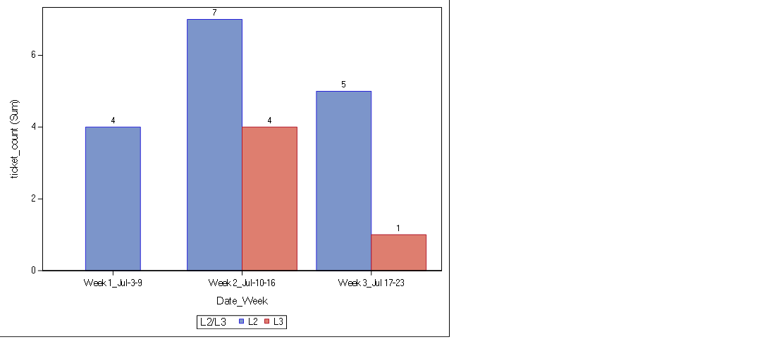
I'm able to generate the below chart using the following code. However, I want to bold all the values (e.g. all the numbers in the chart, Date_Week,ticket_count) in the chart. Appreciate if someone of you help me.
ods rtf body='/sasuser/Date_Weekly_Reporting.rtf' rs=none style=RTFBLUE;

proc sgplot data=chart;
	title 'count of Tickets by Date_Week';
	vbar Date_Week / response=Ticket_Count datalabel=Ticket_Count group=Resolved_by groupdisplay=cluster;
	label Resolved_by='L2/L3';
	run;

ods rtf close;Accepted Solutions
- Mark as New
- Bookmark
- Subscribe
- Mute
- RSS Feed
- Permalink
- Report Inappropriate Content
Add
datalabelattrs=(Weight=Bold)to your vbar options (after the / ).
You can see what else you can control with this option in the documentation below
- Mark as New
- Bookmark
- Subscribe
- Mute
- RSS Feed
- Permalink
- Report Inappropriate Content
Add
datalabelattrs=(Weight=Bold)to your vbar options (after the / ).
You can see what else you can control with this option in the documentation below
April 27 – 30 | Gaylord Texan | Grapevine, Texas
Registration is open
Walk in ready to learn. Walk out ready to deliver. This is the data and AI conference you can't afford to miss.
Register now and lock in 2025 pricing—just $495!
Learn how use the CAT functions in SAS to join values from multiple variables into a single value.
Find more tutorials on the SAS Users YouTube channel.
SAS Training: Just a Click Away
Ready to level-up your skills? Choose your own adventure.


