- Home
- /
- Programming
- /
- Graphics
- /
- Chart creation
- RSS Feed
- Mark Topic as New
- Mark Topic as Read
- Float this Topic for Current User
- Bookmark
- Subscribe
- Mute
- Printer Friendly Page
- Mark as New
- Bookmark
- Subscribe
- Mute
- RSS Feed
- Permalink
- Report Inappropriate Content
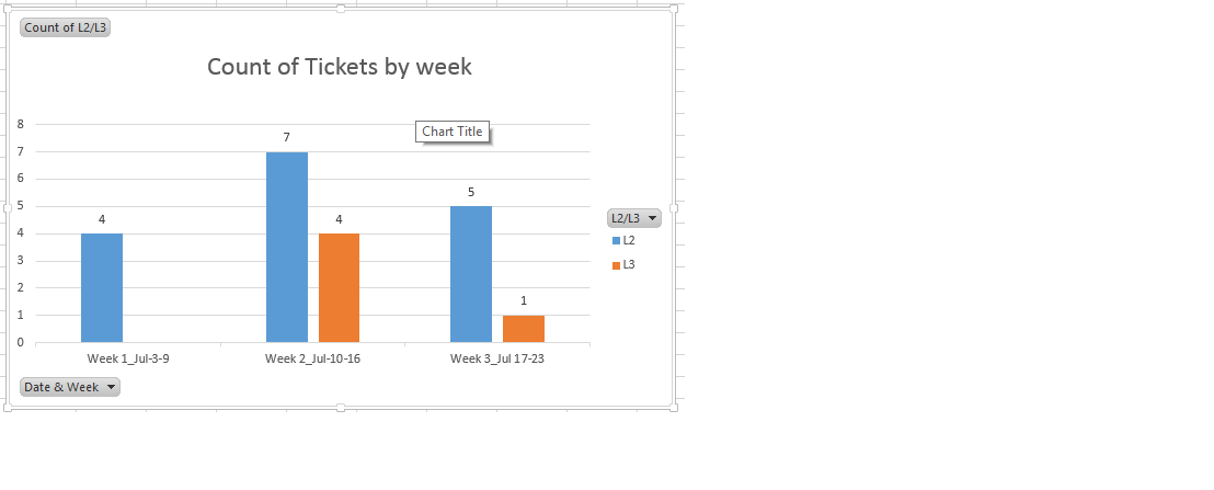
I've a data as follows. Now I've to create a pivot table via SAS program to know graphically how many tickets were worked by L2 and L3 as per chart below. I did tried this using proc summary and proc transpose, but I'm unable to get this work done using those procs. Appreciate if someone of you help me to achive this.
| Count of L2/L3 | Column Labels | ||
| Row Labels | L2 | L3 | Grand Total |
| Week 1_Jul-3-9 | 4 | 4 | |
| Week 2_Jul-10-16 | 7 | 4 | 11 |
| Week 3_Jul 17-23 | 5 | 1 | 6 |
| Grand Total | 16 | 5 | 21 |
Accepted Solutions
- Mark as New
- Bookmark
- Subscribe
- Mute
- RSS Feed
- Permalink
- Report Inappropriate Content
Hi, as I explained, using STYLE= in your ODS statement will change the style:
For example:
ods rtf file='c:\temp\myfile.rtf' style=journal;
**... your code ...;
ods rtf close;
Where I have style=journal, you can change to any of the SAS-supplied styles you want:
style=journal
style=pearl
style=rtf
style=htmlblue
style=sasweb
... to name just a few --you'll have to experiment to see which style you want/like. But the bottom line is that the STYLE= option will go on the ODS statement -- that comes with colors predefined for grouping when you are doing graphs.
If you want to change the colors used, you can either:
1) change the style you use with the STYLE= option
2) use internal SGPLOT syntax for changing bar colors (you will find this in the documentation)
3) use an attribute map (part of ODS GRAPHICS) to change the colors (there are examples of this in the doc and in previous forum postings)
cynthia
- Mark as New
- Bookmark
- Subscribe
- Mute
- RSS Feed
- Permalink
- Report Inappropriate Content
Proc Summary should work, what do you have so far in terms of code.
Also, we see something, but it's not what you want and we don't know what you have so we don't have a lot of information here. You need to detail your question a lot more.
- Mark as New
- Bookmark
- Subscribe
- Mute
- RSS Feed
- Permalink
- Report Inappropriate Content
To make it simple, assume you've the data as follows in the SAS program and I just wanted to create a bar chart as shown below. Appreciate if could help me with the coding part.
data have;
input week $ L2 L3 Grant_total;
datalines;
week1 4 . 4
week2 7 4 11
week3 5 1 1
;
run;- Mark as New
- Bookmark
- Subscribe
- Mute
- RSS Feed
- Permalink
- Report Inappropriate Content
Hi:
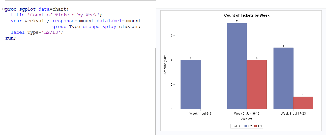
If you structure your data a bit differently -- so you have a "TYPE" variable that can be used for grouping and you only have one row for every type/week combo, like this:
data chart;
  length Weekval $30;
  infile datalines dlm=',' dsd;
  input Weekval $ Amount Type $;
return;
datalines;
"Week 1_Jul-3-9", 	4, L2
"Week 2_Jul-10-16",	7, L2
"Week 3_Jul 17-23",	5,  L2
"Week 1_Jul-3-9", 	 ,  L3
"Week 2_Jul-10-16",	4,  L3
"Week 3_Jul 17-23",	1,  L3
;
run;
Then it would be a very simple SGPLOT to do a VBAR chart.
cynthia
- Mark as New
- Bookmark
- Subscribe
- Mute
- RSS Feed
- Permalink
- Report Inappropriate Content
Great! It worked like a charm. Now I want to write a code to send an email to our group which has this chart and also the dataset 'Chart'. So that end user can understand the data and the chart. I know we can achive this using filename email statement. but I'm not certain how to do that. Appreciate if someone of you help me here.
- Mark as New
- Bookmark
- Subscribe
- Mute
- RSS Feed
- Permalink
- Report Inappropriate Content
I recommend you search the Tech Support notes for how to use the FILENAME email engine. The easiest thing would be for you to make an RTF or PDF file that contains your table and graph and then email them as an attachment.
The basic syntax is shown on page 7 here: http://support.sas.com/resources/papers/proceedings11/300-2011.pdf
However, your system administrator has to turn on some SAS configuration options before emailing will work for you. So looking for Tech Support notes will help you figure out which options you need to talk to your SAS Administrator about.
cynthia
- Mark as New
- Bookmark
- Subscribe
- Mute
- RSS Feed
- Permalink
- Report Inappropriate Content
Emailing is working for me. Is there any way to send an email which has chart (bar chart) and dataset in body of the email instead of attachment using Filename statement?
- Mark as New
- Bookmark
- Subscribe
- Mute
- RSS Feed
- Permalink
- Report Inappropriate Content
So you first have to check whether you can even send HTML messages and then you have to use the right HTML destination so that the image gets embedded in the HTML.
ODS HTML produces HTML 4.0 and your images in that case are contained in external files and pointed to with an <IMG> tag, so they are not really "embedded". If you use ODS HTML5, then you can create an HTML5 file with embedded images, but again, you need to check whether you can even send HTML5.
Here are some previous postings relevant to your question:
https://communities.sas.com/t5/SAS-GRAPH-and-ODS-Graphics/sending-html-output-via-email-with-picture... and here's a blog post with an example of HTML5 usage: http://blogs.sas.com/content/sastraining/2013/11/06/sas-9-4-has-a-new-way-to-send-interactive-graphs...
Hope this helps,
cynthia
- Mark as New
- Bookmark
- Subscribe
- Mute
- RSS Feed
- Permalink
- Report Inappropriate Content
email with attachment. E.g. bar chart is in blue and red colour in output
from SAS E.G and I except the same colour in the chart when it has been
send as an attachment via Filename Email statement. But the colour I see in
attachment is Yellow and Orange.
Appreciate if someone guide me to control the colour in the attachment.
##- Please type your reply above this line. Simple formatting, no
attachments. -##
- Mark as New
- Bookmark
- Subscribe
- Mute
- RSS Feed
- Permalink
- Report Inappropriate Content
Sounds like EG is using a different style template than the style you used to create your HTML file for sending. Without seeing your code and your STYLE= option, it is hard to comment constructively.
It may be as simple as adding STYLE=HTMLBLUE or STYLE=EGDEFAULT to your ODS HTML or ODS HTML5 statements (depending on which destination you used to create your HTML file).
cynthia
- Mark as New
- Bookmark
- Subscribe
- Mute
- RSS Feed
- Permalink
- Report Inappropriate Content
you could help me with the syntax for the same to control the colour in the
chart.
##- Please type your reply above this line. Simple formatting, no
attachments. -##
- Mark as New
- Bookmark
- Subscribe
- Mute
- RSS Feed
- Permalink
- Report Inappropriate Content
Hi, as I explained, using STYLE= in your ODS statement will change the style:
For example:
ods rtf file='c:\temp\myfile.rtf' style=journal;
**... your code ...;
ods rtf close;
Where I have style=journal, you can change to any of the SAS-supplied styles you want:
style=journal
style=pearl
style=rtf
style=htmlblue
style=sasweb
... to name just a few --you'll have to experiment to see which style you want/like. But the bottom line is that the STYLE= option will go on the ODS statement -- that comes with colors predefined for grouping when you are doing graphs.
If you want to change the colors used, you can either:
1) change the style you use with the STYLE= option
2) use internal SGPLOT syntax for changing bar colors (you will find this in the documentation)
3) use an attribute map (part of ODS GRAPHICS) to change the colors (there are examples of this in the doc and in previous forum postings)
cynthia
Catch up on SAS Innovate 2026
Nearly 200 sessions are now available on demand with the SAS Innovate Digital Pass.
Explore Now →Learn how use the CAT functions in SAS to join values from multiple variables into a single value.
Find more tutorials on the SAS Users YouTube channel.
SAS Training: Just a Click Away
Ready to level-up your skills? Choose your own adventure.


