- Home
- /
- Programming
- /
- Graphics
- /
- Re: How to change colors on bars?
- RSS Feed
- Mark Topic as New
- Mark Topic as Read
- Float this Topic for Current User
- Bookmark
- Subscribe
- Mute
- Printer Friendly Page
- Mark as New
- Bookmark
- Subscribe
- Mute
- RSS Feed
- Permalink
- Report Inappropriate Content
Hi again. More questions regarding proc template.
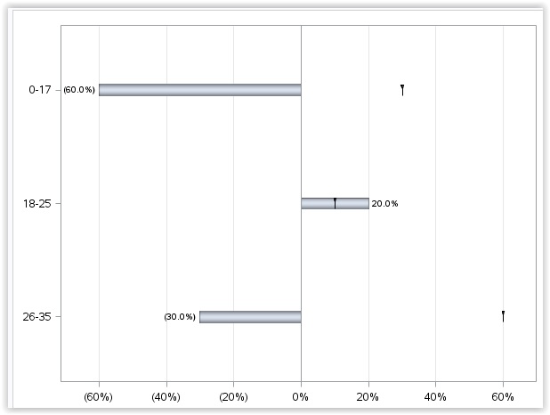
I want to have diffrent colors on the bars depending on the values. For instance, I want color red on "negative" bars and color blue on "positive" bars. Right now I have the same colors for both bars:

0-17 bar should be red same with 26-35.
18-25 bar should be blue.
Any help is appriciated.
Thanks.
best regards
Johan
Here is my code:
data test;
input CU_AGE $ MALGRUPPE REFERANSE DIFF;
datalines;
0-17 0.1 0.3 -0.6
18-25 0.2 0.1 0.2
26-35 0.4 0.6 -0.3
;
proc template;
define statgraph profile_age;
dynamic _NEGATIVE_;
dynamic _ticklist_;
begingraph /;
entrytitle "";
layout overlay / xaxisopts=( griddisplay=on Label="% av målgruppe" /*offsetmin=0*/ type=linear ) yaxisopts=( reverse=true display=( ticks tickvalues line ) type=discrete ) y2axisopts=(reverse=true);
if (_NEGATIVE_) ReferenceLine x=0 / lineattrs=GraphAxisLines;
endif;
barchart X='CU_AGE'n Y=DIFF / primary=true orient=horizontal LegendLabel="Aldersgruppe" NAME="a" dataskin=PRESSED target=REFERANSE barlabel=true barwidth=0.1 BASELINEINTERCEPT=0;
/*ScatterPlot X='TARGET'n Y='CU_GENDER'n / discreteOffset=-0.35 Markerattrs=( Symbol=TRIANGLEDOWNFILLED Size=10) DataTransparency=0.4 LegendLabel="normale population" NAME="t";*/
DiscreteLegend "a" "t" / Location=outside Title="";
endlayout;
endgraph;
end;
run;
ods graphics on / height=500px width=600px;
proc sgrender data=work.test template=profile_age;
format DIFF percent12.1;
run;
ods graphics off;
- Mark as New
- Bookmark
- Subscribe
- Mute
- RSS Feed
- Permalink
- Report Inappropriate Content
Easiest way would be to compute a classifier column that has two values based on DIFF. Then you can assign that as the GROUP role for the bar chart. Alternatively, you could use the IFC or IFN function to assign such a value directly to the group role. GROUP=ifc(diff >=0, 'Positive', 'Negative');
Then, use the appropriate colors you need in the style colors. With SAS 9.4, you can use the DATACOLOR option on the BEGINGRAPH statement. To ensure Positive bars are always blue, use the DiscreteAttrMap.
- Mark as New
- Bookmark
- Subscribe
- Mute
- RSS Feed
- Permalink
- Report Inappropriate Content
Hi
We have only SAS 9.3. Is it still possible?
I have now this dataset:

what is my next step?
- Mark as New
- Bookmark
- Subscribe
- Mute
- RSS Feed
- Permalink
- Report Inappropriate Content
Assign the GROUP column to the GROUP role in the bar chart. You will get the first two colors from the current style, based on which valued is first in the data. To ensure Positive is always Blue, use the DiscreteAttrMap. This is the right way to ensure correct color assignment.
Alternatively, add two dummy observations to the top of your data, with missing CU_AGE, first one having "Positive" and second one having "Negative" values for the GROUP variable. This will ensure the first group color (generally blue) will be assigned to "Positive", and second group color (generally light red) will be assigned to "Negative".
- Mark as New
- Bookmark
- Subscribe
- Mute
- RSS Feed
- Permalink
- Report Inappropriate Content
Thank you very much ![]() sir
sir
- Mark as New
- Bookmark
- Subscribe
- Mute
- RSS Feed
- Permalink
- Report Inappropriate Content
Thank you it works ![]()
Here is the code for those who wants them ![]()
data test;
input CU_AGE $ MALGRUPPE REFERANSE DIFF;
datalines;
0-17 0.1 0.3 -0.6
18-25 0.2 0.1 0.2
26-35 0.4 0.6 -0.3
;
data test;
set test;
GROUP=ifc(DIFF>=0, 'Positive', 'Negative');
run;
proc template;
define statgraph profile_age;
dynamic _NEGATIVE_;
dynamic _ticklist_;
begingraph /;
entrytitle "";
discreteattrmap name='colors' / ignorecase=true;
value "Positive" / fillattrs=(color=blue);
value "Negative" / fillattrs=(color=red);
enddiscreteattrmap;
discreteattrvar attrvar=barcolors var=group attrmap='colors';
layout overlay / xaxisopts=( griddisplay=on Label="% av målgruppe" /*offsetmin=0*/ type=linear ) yaxisopts=( reverse=true display=( ticks tickvalues line ) type=discrete ) y2axisopts=(reverse=true);
if (_NEGATIVE_) ReferenceLine x=0 / lineattrs=GraphAxisLines;
endif;
barchart X='CU_AGE'n Y=DIFF / primary=true orient=horizontal LegendLabel="Aldersgruppe" NAME="a" dataskin=PRESSED target=REFERANSE barlabel=true barwidth=0.1 BASELINEINTERCEPT=0 group=barcolors;
/*ScatterPlot X='TARGET'n Y='CU_GENDER'n / discreteOffset=-0.35 Markerattrs=( Symbol=TRIANGLEDOWNFILLED Size=10) DataTransparency=0.4 LegendLabel="normale population" NAME="t";*/
DiscreteLegend "a" "t" / Location=outside Title="";
endlayout;
endgraph;
end;
run;
ods graphics on / height=500px width=600px;
proc sgrender data=work.test template=profile_age;
format DIFF percent12.1;
run;
ods graphics off;
Learn how use the CAT functions in SAS to join values from multiple variables into a single value.
Find more tutorials on the SAS Users YouTube channel.
SAS Training: Just a Click Away
Ready to level-up your skills? Choose your own adventure.


