- Home
- /
- Programming
- /
- Graphics
- /
- How do I make the yaxis on gplot as wide as possible
- RSS Feed
- Mark Topic as New
- Mark Topic as Read
- Float this Topic for Current User
- Bookmark
- Subscribe
- Mute
- Printer Friendly Page
- Mark as New
- Bookmark
- Subscribe
- Mute
- RSS Feed
- Permalink
- Report Inappropriate Content
Hello,
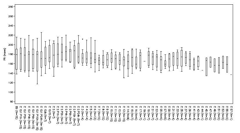
I am trying to produce a set of boxplots with y-axis like this one:
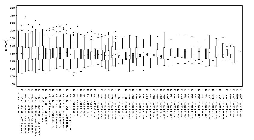
However for some plot that have more points on y-axis they come out like this one:
The code used to produce the plot is:
GOPTIONS  FTEXT=SWISS htitle=7pt htext=7pt hpos=140 vpos=40 ;
axis1 label=none  value=(h=1 f='simplex')  minor=none split='/' order=(&ordx.) offset=(0.15cm,0.15cm) value=(a=270 f='simplex') major=none ;
axis2  order= (&min_v to %eval(&max_v+&bymax) by &bymax) label=(a=90 f='simplex' height=1.5  &vslbly. r=0) minor=none
value = (height = 1.5 f='simplex');
symbol1 interpol =boxt  color=black value = circle cv=black  width=0.5 height=0.5 bwidth=0.7 ;
title4 &pop.;

proc gplot data=final1 ;
  plot aval*visitgrph   /   haxis=axis1 vaxis=axis2  /*noframe vref=(35 38.5 ) */ lvref=2  hminor=0 vminor=0;
  format visitgrph grphn.;
run;
quit;
it uses a lot of macro variables as the program produces 40 plots. the warning message i get in the log for the plots that don't work properly is:
WARNING: The intervals on the axis labeled visitgrph are not evenly spaced.
I am just trying to find a way of making the yaxis wider and therefore fit all points on and have them all looking the same, i have tried using hsize and horigin option to try move the origin but neither have worked, the only way so far that works is making the text size 5pt but then it is far too small to read, if anybody has any suggestions then that would be very helpful!
Jessica

- Mark as New
- Bookmark
- Subscribe
- Mute
- RSS Feed
- Permalink
- Report Inappropriate Content
1: Warning is not an Error
2: This message will appear with any graphy where you set the X axis tickmarks at uneven intervals. The most common case I encounter is using date values but any list of values . I cannot confirm this with your examples because the image is too small to read anything.
Why are you asking about Y axis and "wide", Y axis is vertical and would impact height. Did you mean X? Since you are setting HPOS and VPOS that is setting the sizes of your graphs. Increase the values to have more space. OR did you rotate the image posting it here?
I am not sure what you mean with " fit all points on and have them all looking the same". Are you referring to the labels on the horizontal axis?
I am guessing that you may have some of the horizontal (X axis) labels with rotated text. That is because the available width of the horizontal axis does not allow the height of the individual characters of the label to appear as in your capture. From the documentation:
The values specified in the HPOS= and VPOS= graphics options determine the size of a character cell for the graphics output area and consequently the size of many graphics elements, such as device-resident text. The larger the size of the HPOS= and VPOS= values, the smaller the size of each character cell.
HPOS/VPOS interact with HSIZE/VSIZE.
If I need to make a large number of box and whisker plots I would look at Proc BOXPLOT, with horizontal boxes and make the display area tall. Then your labels would read right to left like typical text and not have some of the appearance issues.
- Mark as New
- Bookmark
- Subscribe
- Mute
- RSS Feed
- Permalink
- Report Inappropriate Content
Have you tried setting the XPIXELS option on the GOPTIONS statement to a large value?
- Mark as New
- Bookmark
- Subscribe
- Mute
- RSS Feed
- Permalink
- Report Inappropriate Content
In your 2nd graph image (with the bad x-axis tickmark values), Gplot thinks it can't fit the values gracefully, so it is reverting to a technique that takes the least horizontal space (stacking the letters up/down over each other).
Here are some recommendations that might help:
Rather than letting the axis values be in their default rotation/angle, specify value=(angle=90). I notice you have an (angle=270), but I would recommend only using angle=90.
Rather than using the swiss and simplex fonts, I would recommend using the new 'albany amt' truetype font that we now ship with SAS. It will look much better, and will probably handle the rotate/angle better, and it's easier to handle the spacing.
And if you're still having problems, you can make the graph wider using goptions xpixels, like Dan mentioned.
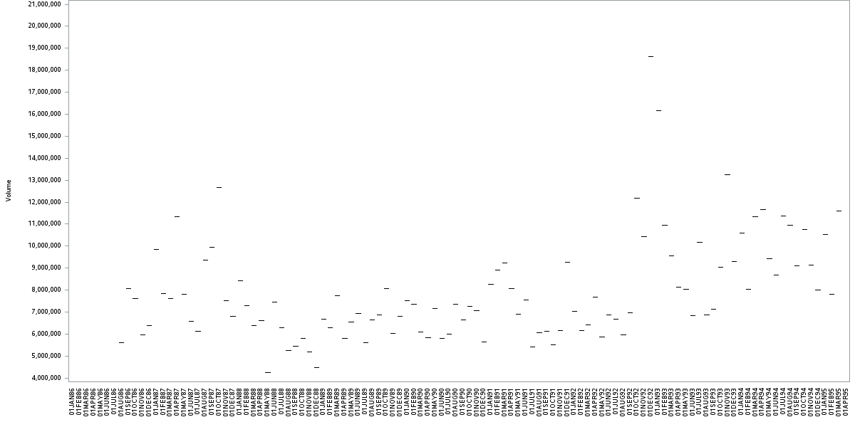
Here's a little example (using a stripped-down version of your code, and some of the SAS sample data) that demonstrates these things:
goptions ftext='albany amt' htitle=7pt htext=7pt;
axis1 label=none value=(angle=90) order=('01jan1986'd to '01apr1995'd by month) major=none;
axis2 label=(a=90) minor=none;
symbol1 interpol =boxt color=black value = circle cv=black width=0.5 height=0.5 bwidth=0.7 ;
title;
goptions xpixels=1200;
proc gplot data=sashelp.stocks (where=(stock='IBM'));
plot volume*date / haxis=axis1 vaxis=axis2;
run;
quit;
Catch up on SAS Innovate 2026
Nearly 200 sessions are now available on demand with the SAS Innovate Digital Pass.
Explore Now →Learn how use the CAT functions in SAS to join values from multiple variables into a single value.
Find more tutorials on the SAS Users YouTube channel.
SAS Training: Just a Click Away
Ready to level-up your skills? Choose your own adventure.


