- Home
- /
- Programming
- /
- Graphics
- /
- Proc GCchart
- RSS Feed
- Mark Topic as New
- Mark Topic as Read
- Float this Topic for Current User
- Bookmark
- Subscribe
- Mute
- Printer Friendly Page
- Mark as New
- Bookmark
- Subscribe
- Mute
- RSS Feed
- Permalink
- Report Inappropriate Content
I have a 12 month data starting from Nov12 to Nov13 with which I intend to build 3d bar diagrams. However proc gcchart is not printing all the 12 months.Is there a syntax to specify to print all?
proc gchart data=work.new3;
vbar3D use_date /sumvar=Count sum
subgroup=status_pr_end width=5 INSIDE=SUM ;
/* by year descending;*/
run;
quit;
Thanks in advance!!
- Mark as New
- Bookmark
- Subscribe
- Mute
- RSS Feed
- Permalink
- Report Inappropriate Content
Well, I would suggest move to sgplot/gtl which is the modern incarnation of the graphing system in SAS. You can find examples of all types here:
http://blogs.sas.com/content/graphicallyspeaking/
With this you just use the: values=
To specify what you want on the axis.
- Mark as New
- Bookmark
- Subscribe
- Mute
- RSS Feed
- Permalink
- Report Inappropriate Content
Thanks for your suggestion I have figured out the following solution:
axis1 order=('NOV15' 'DEC15' 'JAN16' 'FEB16' 'MAR16' 'APR16' 'MAY16' 'JUN16' 'JUL16' 'AUG16' 'SEP16'
'OCT16''NOV16' 'DEC16');
proc gchart data=work.new3;
vbar chardate /sumvar=Count sum
subgroup=status_pr_end width=5 maxis=axis1 ;
run;
quit;
- Mark as New
- Bookmark
- Subscribe
- Mute
- RSS Feed
- Permalink
- Report Inappropriate Content
I strongly urge you to consider using actual DATE values and not character for use with graphing procedures. The sort order for months will always require an explict list either an AXIS order option or XAXIS values list. SAS date values will 1) sort in expected order 2) allow changing axis displayed values with built-in SAS procedures 3) allows specifying tick marcs with order/ value options like '01NOV2015'd to '01DEC2016'd by month
- Mark as New
- Bookmark
- Subscribe
- Mute
- RSS Feed
- Permalink
- Report Inappropriate Content
But how to use a stagger option with the SAS dates in place ? For eg I have used the SAS dates the month labels on the x axis are appearing inverted . On contrary I would like the labels to shrink in terms of the font size. Do you have some reading material that I can quite browse through?
Thanks in advance !!
- Mark as New
- Bookmark
- Subscribe
- Mute
- RSS Feed
- Permalink
- Report Inappropriate Content
The online documentation or search for "gchart axis" at http://support.sas.com/en/technical-support.html
AXIS statement will allow you to set the font size, formats to display values. With actual dates you might use MONYY5. or mmyy4. or mmyys5. to get different appearance for the date.
- Mark as New
- Bookmark
- Subscribe
- Mute
- RSS Feed
- Permalink
- Report Inappropriate Content
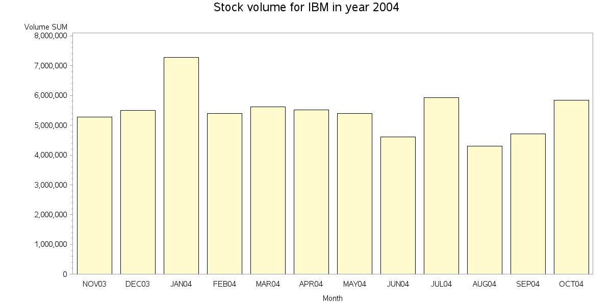
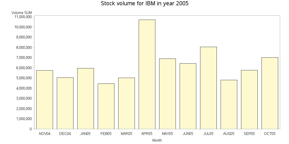
Here's an example showing how to do this using Proc Gchart, and real date values:
data mydata; set sashelp.stocks (where=(stock='IBM' and date>='01nov1999'd));
my_year=.; my_year=year(date+70);
run;
proc sort data=mydata out=mydata;
by my_year date;
run;
goptions gunit=pct htitle=4 htext=2.5;
options nobyline;
title1 "Stock volume for IBM in year #byval(my_year)";
proc gchart data=mydata;
format date monyy5.;
label date='Month';
by my_year;
vbar date / discrete type=sum sumvar=volume;
run;
Catch up on SAS Innovate 2026
Dive into keynotes, announcements and breakthroughs on demand.
Explore Now →Learn how use the CAT functions in SAS to join values from multiple variables into a single value.
Find more tutorials on the SAS Users YouTube channel.
SAS Training: Just a Click Away
Ready to level-up your skills? Choose your own adventure.


