- Home
- /
- Programming
- /
- Graphics
- /
- plot by treatment and color different types
- RSS Feed
- Mark Topic as New
- Mark Topic as Read
- Float this Topic for Current User
- Bookmark
- Subscribe
- Mute
- Printer Friendly Page
- Mark as New
- Bookmark
- Subscribe
- Mute
- RSS Feed
- Permalink
- Report Inappropriate Content
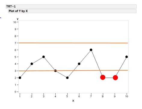
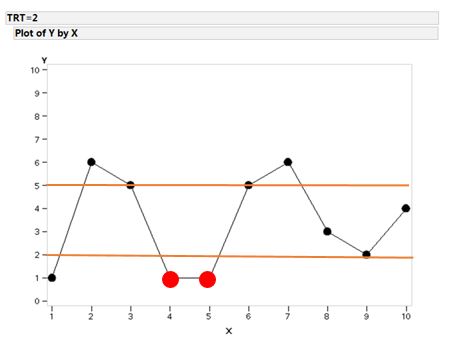
Hello All, Could you do me a great favor to plot the graph as follows?(plot each TRT separately and set different color for each type) Thanks in advance.
data one;
input TRT X Y Ref type $;
datalines;
1 1 2 . A
1 2 4 . A
1 3 5 . A
1 4 3 3 A
1 5 2 . A
1 6 4 . A
1 7 6 . A
1 8 2 . B
1 9 2 . B
1 10 5 7 A
2 1 1 . A
2 2 6 2 A
2 3 5 . A
2 4 1 . B
2 5 1 . B
2 6 5 . A
2 7 6 . A
2 8 3 5 A
2 9 2 . A
2 10 4 . A
;
run;
output should be:
Accepted Solutions
- Mark as New
- Bookmark
- Subscribe
- Mute
- RSS Feed
- Permalink
- Report Inappropriate Content
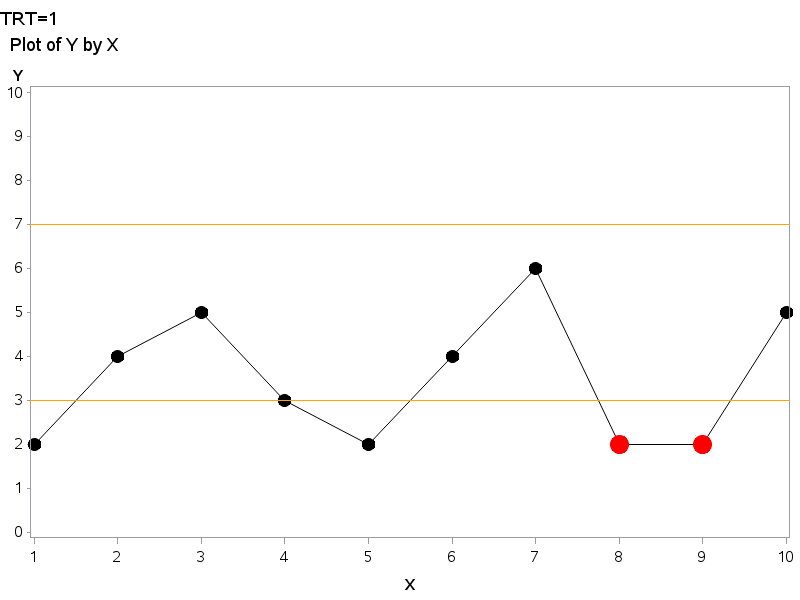
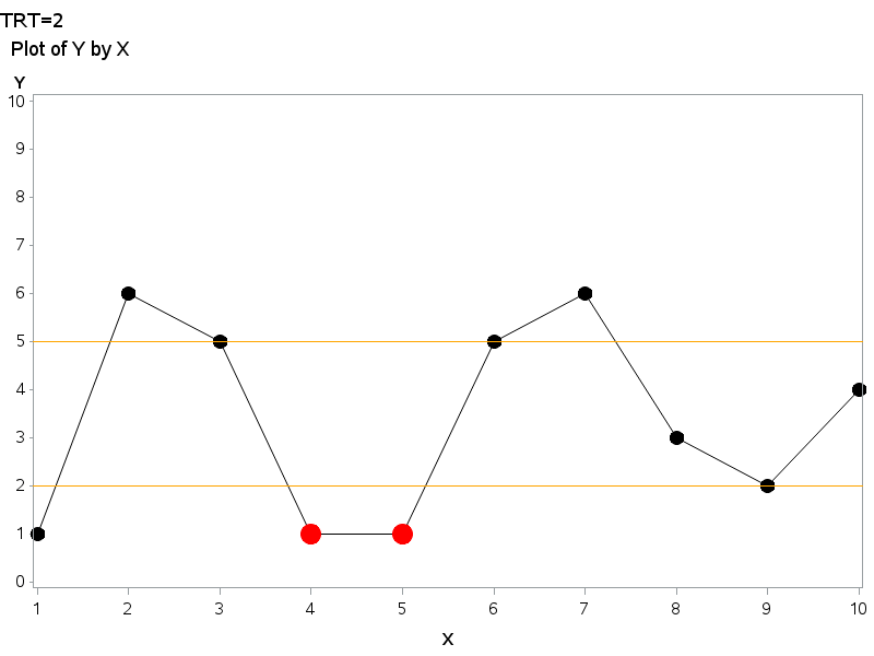
Or, if you are more familiar with Proc Gplot, rather than Proc SGplot, here's another way ...
data anno_reflines; set one (where=(ref^=.));
xsys='1'; ysys='2'; hsys='3'; when='a';
x=0; y=ref; function='move'; output;
x=100; y=ref; function='draw'; color='orange'; size=.1; output;
run;
data one; set one;
if type='B' then y_red=y;
run;
goptions gunit=pct htitle=2.5 htext=2.5 ftitle='albany amt' ftext='albany amt';
symbol1 value=dot color=black height=4pct interpol=join ci=black;
symbol2 value=dot color=red height=6pct interpol=none;
axis1 order=(0 to 10 by 1) minor=none label=(font='albany amt/bold');
axis2 minor=none label=(font='albany amt/bold');
options nobyline;
title1 h=3 justify=left ls=1.5 "TRT=#byval(trt)";
title2 h=3 justify=left ls=0.8 " Plot of Y by X";
proc gplot data=one;
by trt;
plot y*x=1 y_red*x=2 / overlay
vaxis=axis1 haxis=axis2 anno=anno_reflines;
run;
- Mark as New
- Bookmark
- Subscribe
- Mute
- RSS Feed
- Permalink
- Report Inappropriate Content
Take a look at Robert Allison's page (http://robslink.com/SAS/Home.htm ). He provides code for doing most graphs in SAS.
HTH,
Art, CEO, AnalystFinder.com
- Mark as New
- Bookmark
- Subscribe
- Mute
- RSS Feed
- Permalink
- Report Inappropriate Content
The code is below. To adjust the marker sizes, adjust them in the attrmap. To remove the legend, add NOAUTOLEGEND to the PROC SGPLOT statement.
Hope this helps!
Dan
data one;
input TRT X Y Ref type $;
datalines;
1 1 2 . A
1 2 4 . A
1 3 5 . A
1 4 3 3 A
1 5 2 . A
1 6 4 . A
1 7 6 . A
1 8 2 . B
1 9 2 . B
1 10 5 7 A
2 1 1 . A
2 2 6 2 A
2 3 5 . A
2 4 1 . B
2 5 1 . B
2 6 5 . A
2 7 6 . A
2 8 3 5 A
2 9 2 . A
2 10 4 . A
;
run;

data attrmap;
retain id "myid" markersymbol "circlefilled";
length markercolor $ 5;
input value $ markercolor $ markersize;
cards;
A red   11
B black 7
;
run;

Title "Plot of Y by X";
proc sgplot data=one dattrmap=attrmap;
by TRT;
series x=x y=x / lineattrs=(color=black);
scatter x=x y=x / group=type attrid=myid;
refline Ref / lineattrs=(color=orange);
run;
- Mark as New
- Bookmark
- Subscribe
- Mute
- RSS Feed
- Permalink
- Report Inappropriate Content
Or, if you are more familiar with Proc Gplot, rather than Proc SGplot, here's another way ...
data anno_reflines; set one (where=(ref^=.));
xsys='1'; ysys='2'; hsys='3'; when='a';
x=0; y=ref; function='move'; output;
x=100; y=ref; function='draw'; color='orange'; size=.1; output;
run;
data one; set one;
if type='B' then y_red=y;
run;
goptions gunit=pct htitle=2.5 htext=2.5 ftitle='albany amt' ftext='albany amt';
symbol1 value=dot color=black height=4pct interpol=join ci=black;
symbol2 value=dot color=red height=6pct interpol=none;
axis1 order=(0 to 10 by 1) minor=none label=(font='albany amt/bold');
axis2 minor=none label=(font='albany amt/bold');
options nobyline;
title1 h=3 justify=left ls=1.5 "TRT=#byval(trt)";
title2 h=3 justify=left ls=0.8 " Plot of Y by X";
proc gplot data=one;
by trt;
plot y*x=1 y_red*x=2 / overlay
vaxis=axis1 haxis=axis2 anno=anno_reflines;
run;
SAS Innovate 2025: Call for Content
Are you ready for the spotlight? We're accepting content ideas for SAS Innovate 2025 to be held May 6-9 in Orlando, FL. The call is open until September 25. Read more here about why you should contribute and what is in it for you!
Learn how use the CAT functions in SAS to join values from multiple variables into a single value.
Find more tutorials on the SAS Users YouTube channel.
 Click image to register for webinar
Classroom Training Available!
Select SAS Training centers are offering in-person courses. View upcoming courses for:


