- Home
- /
- Programming
- /
- Graphics
- /
- How do I display different colors on the same connected series curve i...
- RSS Feed
- Mark Topic as New
- Mark Topic as Read
- Float this Topic for Current User
- Bookmark
- Subscribe
- Mute
- Printer Friendly Page
- Mark as New
- Bookmark
- Subscribe
- Mute
- RSS Feed
- Permalink
- Report Inappropriate Content
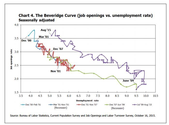
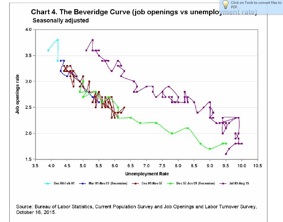
I have time series data (by month) with two data elements that I wish to display on the same exact curve. I want to display an entirely connected curve with differnet colors assigned to certain portions of the curve. I use the "group=
function to distinguish between the different portions of the data. What I need is in the first figure I have attached (someone did this in excel). What I've been able to do is in the 2nd figure: you see my "group=" function causes each portion of the series to display independently. Has anyone ever done a series like this? Below is my code. Can it be adapted to have an entirely connected curve, or will I need to go another route?
data Attrs;
length Value $30 MarkerColor $20 LineColor $20;
ID = "BCFMT";
Value = "Dec 00-Feb 01"; MarkerColor = "Cyan"; linecolor= "cyan"; output;
Value = "Mar 01-Nov 01 (Recession)"; MarkerColor = "Blue"; linecolor= "Blue"; output;
Value = "Dec 01-Nov 07"; MarkerColor = "Maroon"; linecolor= "maroon"; output;
Value = "Dec 07-Jun 09 (Recession)"; MarkerColor = "Lime"; linecolor= "Lime"; output;
Value = "Jul 09-Aug 15"; MarkerColor = "Purple"; linecolor= "Purple"; output;
run;
/*Chart4*/
ods pdf startpage=never;
ods graphics / reset width=700px height=600px imagename="gridsgplot" imagefmt=gif border=on;
ods escapechar='^';
proc sgplot data=c_jo pad=(bottom=2pct top=2pct) dattrmap=Attrs;
TITLE1 font="helvetica/bold" HEIGHT=1.5 JUSTIFY=LEFT " Chart 4. The Beveridge Curve (job openings vs unemployment rate)";
TITLE2 font="helvetica/bold" HEIGHT=1.3 JUSTIFY=LEFT " Seasonally adjusted";
series x=u_rate y=jo_rate / smoothcon25nect group=bc attrid=BCFMT markers markerattrs=(symbol=squarefilled size=5px);
xaxis label = 'Unemployment Rate' LABELATTRS=(Color=black Family=Arial Size=8 Weight=Bold)
values = (3.5 to 10.5 by .5) valueattrs=(size=8)
offsetmin=0.0 offsetmax=0.0
;
yaxis label = 'Job openings rate' LABELATTRS=(Color=black Family=Arial Size=8 Weight=Bold)
grid values = (1.5 to 4.0 by .5) valueattrs=(size=8)
offsetmin=0.0001 offsetmax=0.001
;
keylegend/noborder title='' valueattrs=(Family=Arial Size=6.5 Weight=Bold) LINELENGTH=.3cm;
footnote1 justify=left height=.25 ' ';
footnote2 justify=left height=2.0' ';
footnote3 justify=left font=arial height=1 "Source: Bureau of Labor Statistics, Current Population Survey and Job Openings and
Labor Turnover Survey, &PRdate., &refyear..";
footnote4 justify=left height=.8 ' ';
run;


- Mark as New
- Bookmark
- Subscribe
- Mute
- RSS Feed
- Permalink
- Report Inappropriate Content
You will have to provide an additional observation for the endpoint with the other series.
Since the data appears to be sorted by date you could use first. or last.processing to insert the additional obs with the other group setting.
Learn how use the CAT functions in SAS to join values from multiple variables into a single value.
Find more tutorials on the SAS Users YouTube channel.
SAS Training: Just a Click Away
Ready to level-up your skills? Choose your own adventure.


