- Home
- /
- Programming
- /
- Graphics
- /
- Re: How Do I Remove The Density Curve Labels from the PROC SGPLOT lege...
- RSS Feed
- Mark Topic as New
- Mark Topic as Read
- Float this Topic for Current User
- Bookmark
- Subscribe
- Mute
- Printer Friendly Page
- Mark as New
- Bookmark
- Subscribe
- Mute
- RSS Feed
- Permalink
- Report Inappropriate Content
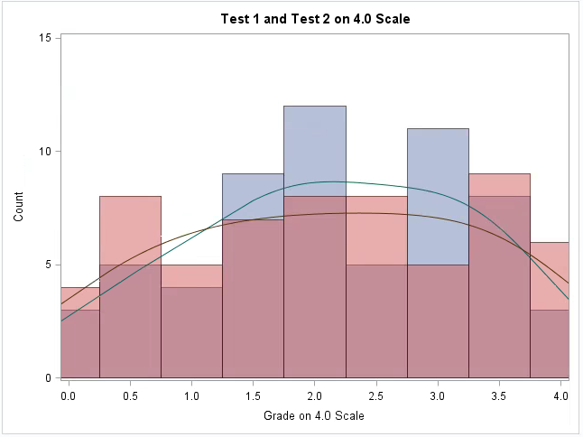
I am trying to create two histograms overlayed on one plot with their respective kernels. I want the variables in the legend, but I do NOT want the curve labels in the legend. I have tried using the KEYLEGEND feature, but when the commented out line is included, the entire legend is removed. Any help would be much appreciated.
PROC SGPLOT DATA=ALLFAKE;
HISTOGRAM GRADE1 / SCALE=COUNT BINSTART=0 BINWIDTH=0.5 TRANSPARENCY=0.5 LEGENDLABEL="Test 1";
HISTOGRAM GRADE2 / SCALE=COUNT BINSTART=0 BINWIDTH=0.5 TRANSPARENCY=0.5 LEGENDLABEL="Test 2";
DENSITY GRADE1 / TYPE=KERNEL ;
DENSITY GRADE2 / TYPE=KERNEL;
XAXIS label="Grade on 4.0 Scale" VALUES=(0 to 4 by 0.5);
YAXIS LABEL="Count" VALUES=(0 to 15 by 5);
Title "Test 1 and Test 2 on 4.0 Scale";
*KEYLEGEND "Grade1" "Grade2";
RUN;

- Mark as New
- Bookmark
- Subscribe
- Mute
- RSS Feed
- Permalink
- Report Inappropriate Content
Add the NAME=option to the histogram options and specify that in the KEYLEGEND statement as below
proc sgplot data = sashelp.class;
	histogram height / group = sex transparency = 0.5 Name = "Histogram";
	density height / type = kernel group = sex;
	keylegend "Histogram" / position = NE location = inside across = 1;
run;Learn how use the CAT functions in SAS to join values from multiple variables into a single value.
Find more tutorials on the SAS Users YouTube channel.
SAS Training: Just a Click Away
Ready to level-up your skills? Choose your own adventure.


