- Home
- /
- Programming
- /
- Graphics
- /
- Help Using GPlot to graph LS Means from Proc Mixed
- RSS Feed
- Mark Topic as New
- Mark Topic as Read
- Float this Topic for Current User
- Bookmark
- Subscribe
- Mute
- Printer Friendly Page
- Mark as New
- Bookmark
- Subscribe
- Mute
- RSS Feed
- Permalink
- Report Inappropriate Content
Hi SAS Community,
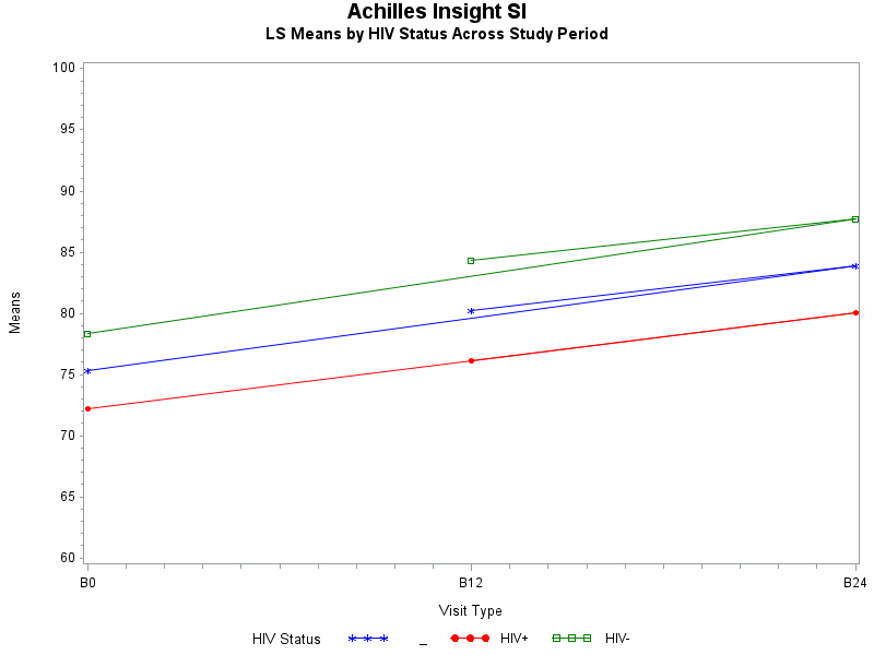
I am attempting to graph the LS Means from my mixed model in SAS 9.4. But for some reason the line doubles over back to the middle of the graph and I can't figure out why. I have attached my code for the model and graph as well as the means data that is being graphed and a photo of the problem graph. Thanks in advance for your advice!
Cara
SAS Output
| txgroup | HIV+ | _ | 76.1260 | 0.7518 | 399 | 101.25 | <.0001 | 0.05 | 74.6480 | 77.6041 |
| txgroup | HIV- | _ | 83.4853 | 0.7648 | 399 | 109.16 | <.0001 | 0.05 | 81.9818 | 84.9887 |
| visit | _ | B12 | 80.2343 | 0.7199 | 354 | 111.45 | <.0001 | 0.05 | 78.8185 | 81.6502 |
| visit | _ | B24 | 83.8852 | 0.7280 | 354 | 115.22 | <.0001 | 0.05 | 82.4534 | 85.3169 |
| visit | _ | B0 | 75.2974 | 0.6983 | 354 | 107.82 | <.0001 | 0.05 | 73.9240 | 76.6709 |
| txgroup*visit | HIV+ | B12 | 76.1335 | 1.0226 | 354 | 74.45 | <.0001 | 0.05 | 74.1224 | 78.1447 |
| txgroup*visit | HIV+ | B24 | 80.0197 | 1.0327 | 354 | 77.49 | <.0001 | 0.05 | 77.9886 | 82.0507 |
| txgroup*visit | HIV+ | B0 | 72.2249 | 1.0329 | 354 | 69.92 | <.0001 | 0.05 | 70.1934 | 74.2564 |
| txgroup*visit | HIV- | B12 | 84.3352 | 1.0136 | 354 | 83.20 | <.0001 | 0.05 | 82.3417 | 86.3287 |
| txgroup*visit | HIV- | B24 | 87.7507 | 1.0264 | 354 | 85.49 | <.0001 | 0.05 | 85.7320 | 89.7693 |
| txgroup*visit | HIV- | B0 | 78.3700 | 0.9401 | 354 | 83.37 | <.0001 | 0.05 | 76.5212 | 80.2188 |
ods output lsmeans=means1;
proc mixed data=ultrasound3 method=ml;
   class studyid;
   class txgroup (ref="HIV-");
   class visit (ref="B0");
   model insightstiff = txgroup visit visit*txgroup / s;
   repeated / type=cs subject=studyid group=txgroup;
   lsmeans txgroup visit visit*txgroup / cl adjust=tukey;
   format txgroup txgroupf. visit visitf.;
run;

proc print data=means1; run;

goptions reset=all;
symbol1 c=blue v=star h=.8 i=j;
symbol2 c=red v=dot h=.8 i=j;
symbol3 c=green v=square h=.8 i=j;
axis1 order=(60 to 100 by 5) label=(a=90 'Means');
Title1 'Achilles Insight SI';
Title2 'LS Means by HIV Status Across Study Period';
proc gplot data=means1;
  format estimate 8. visit visitf. txgroup txgroupf.;
  plot estimate*visit=txgroup / vaxis=axis1;
run;
quit;
- Tags:
- gplot
- MIXED MODEL
Accepted Solutions
- Mark as New
- Bookmark
- Subscribe
- Mute
- RSS Feed
- Permalink
- Report Inappropriate Content
You should use SGPLOT, not GPLOT.
It's much better quality graphics and easier to use.
It's graphing the data in the order it appears - try re-ordering your data or see the ORDER options on SGPLOT.
- Mark as New
- Bookmark
- Subscribe
- Mute
- RSS Feed
- Permalink
- Report Inappropriate Content
You should use SGPLOT, not GPLOT.
It's much better quality graphics and easier to use.
It's graphing the data in the order it appears - try re-ordering your data or see the ORDER options on SGPLOT.
Catch up on SAS Innovate 2026
Dive into keynotes, announcements and breakthroughs on demand.
Explore Now →Learn how use the CAT functions in SAS to join values from multiple variables into a single value.
Find more tutorials on the SAS Users YouTube channel.
SAS Training: Just a Click Away
Ready to level-up your skills? Choose your own adventure.


