- Home
- /
- Programming
- /
- Graphics
- /
- Help Using GPlot to graph LS Means from Proc Mixed
- RSS Feed
- Mark Topic as New
- Mark Topic as Read
- Float this Topic for Current User
- Bookmark
- Subscribe
- Mute
- Printer Friendly Page
- Mark as New
- Bookmark
- Subscribe
- Mute
- RSS Feed
- Permalink
- Report Inappropriate Content
Hi SAS Community,
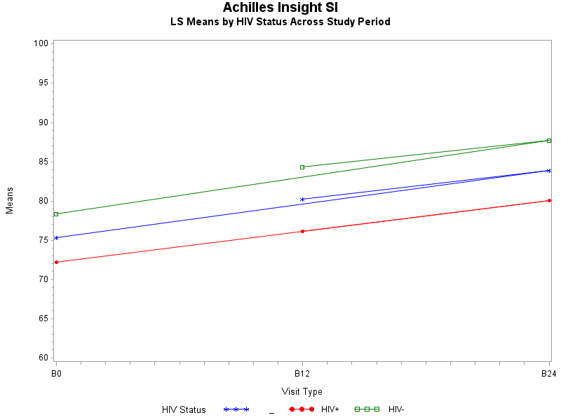
I am attempting to graph the LS Means from my mixed model in SAS 9.4. But for some reason the line doubles over back to the middle of the graph and I can't figure out why. I have attached my code for the model and graph as well as the means data that is being graphed and a photo of the problem graph. Thanks in advance for your advice!
Cara
SAS Output
| txgroup | HIV+ | _ | 76.1260 | 0.7518 | 399 | 101.25 | <.0001 | 0.05 | 74.6480 | 77.6041 |
| txgroup | HIV- | _ | 83.4853 | 0.7648 | 399 | 109.16 | <.0001 | 0.05 | 81.9818 | 84.9887 |
| visit | _ | B12 | 80.2343 | 0.7199 | 354 | 111.45 | <.0001 | 0.05 | 78.8185 | 81.6502 |
| visit | _ | B24 | 83.8852 | 0.7280 | 354 | 115.22 | <.0001 | 0.05 | 82.4534 | 85.3169 |
| visit | _ | B0 | 75.2974 | 0.6983 | 354 | 107.82 | <.0001 | 0.05 | 73.9240 | 76.6709 |
| txgroup*visit | HIV+ | B12 | 76.1335 | 1.0226 | 354 | 74.45 | <.0001 | 0.05 | 74.1224 | 78.1447 |
| txgroup*visit | HIV+ | B24 | 80.0197 | 1.0327 | 354 | 77.49 | <.0001 | 0.05 | 77.9886 | 82.0507 |
| txgroup*visit | HIV+ | B0 | 72.2249 | 1.0329 | 354 | 69.92 | <.0001 | 0.05 | 70.1934 | 74.2564 |
| txgroup*visit | HIV- | B12 | 84.3352 | 1.0136 | 354 | 83.20 | <.0001 | 0.05 | 82.3417 | 86.3287 |
| txgroup*visit | HIV- | B24 | 87.7507 | 1.0264 | 354 | 85.49 | <.0001 | 0.05 | 85.7320 | 89.7693 |
| txgroup*visit | HIV- | B0 | 78.3700 | 0.9401 | 354 | 83.37 | <.0001 | 0.05 | 76.5212 | 80.2188 |
ods output lsmeans=means1;
proc mixed data=ultrasound3 method=ml;
   class studyid;
   class txgroup (ref="HIV-");
   class visit (ref="B0");
   model insightstiff = txgroup visit visit*txgroup / s;
   repeated / type=cs subject=studyid group=txgroup;
   lsmeans txgroup visit visit*txgroup / cl adjust=tukey;
   format txgroup txgroupf. visit visitf.;
run;

proc print data=means1; run;

goptions reset=all;
symbol1 c=blue v=star h=.8 i=j;
symbol2 c=red v=dot h=.8 i=j;
symbol3 c=green v=square h=.8 i=j;
axis1 order=(60 to 100 by 5) label=(a=90 'Means');
Title1 'Achilles Insight SI';
Title2 'LS Means by HIV Status Across Study Period';
proc gplot data=means1;
  format estimate 8. visit visitf. txgroup txgroupf.;
  plot estimate*visit=txgroup / vaxis=axis1;
run;
quit;
- Tags:
- gplot
- MIXED MODEL
Accepted Solutions
- Mark as New
- Bookmark
- Subscribe
- Mute
- RSS Feed
- Permalink
- Report Inappropriate Content
You should use SGPLOT, not GPLOT.
It's much better quality graphics and easier to use.
It's graphing the data in the order it appears - try re-ordering your data or see the ORDER options on SGPLOT.
- Mark as New
- Bookmark
- Subscribe
- Mute
- RSS Feed
- Permalink
- Report Inappropriate Content
You should use SGPLOT, not GPLOT.
It's much better quality graphics and easier to use.
It's graphing the data in the order it appears - try re-ordering your data or see the ORDER options on SGPLOT.
Catch up on SAS Innovate 2026
Nearly 200 sessions are now available on demand with the SAS Innovate Digital Pass.
Explore Now →Learn how use the CAT functions in SAS to join values from multiple variables into a single value.
Find more tutorials on the SAS Users YouTube channel.
SAS Training: Just a Click Away
Ready to level-up your skills? Choose your own adventure.


