- Home
- /
- Programming
- /
- Graphics
- /
- Grouped Bar Charts:
- RSS Feed
- Mark Topic as New
- Mark Topic as Read
- Float this Topic for Current User
- Bookmark
- Subscribe
- Mute
- Printer Friendly Page
- Mark as New
- Bookmark
- Subscribe
- Mute
- RSS Feed
- Permalink
- Report Inappropriate Content
Hi--
I'm new to using SAS graph and I am trying to program a couple group bar charts. I have attached an example of of what I'm trying to accomplish (Chart Example.xlsx
I have a data set which looks like this:
| year | Month | PILOT_CATEGORY | MEDIA_METHOD | Touch_count |
| 2014 | February | Control | Direct Mail | 14096 |
| 2014 | February | Test | Direct Mail | 49801 |
| 2014 | February | Control | 811743 | |
| 2014 | February | Test | 745799 | |
| 2014 | March | Control | Direct Mail | 255563 |
| 2014 | March | Test | Direct Mail | 202191 |
| 2014 | March | Control | 1101510 | |
| 2014 | March | Test | 563655 |
This is what I have for syntax so far - which is not the desired output I'm looking for.
proc gchart data=have;
vbar Touch_count / group= PILOT_CATEGORY
patternid=group;
vbar Touch_count / subgroup=Month;
run;
quit;
Again, an example of what I'm looking for is attached. Any assistance is greatly appreciated. Thanks!
Accepted Solutions
- Mark as New
- Bookmark
- Subscribe
- Mute
- RSS Feed
- Permalink
- Report Inappropriate Content
Since you're using sas/graph gchart in your code, here's how to do it in gchart...
data have;
INFILE DATALINES DLM=',';
length month pilot_category media_method $20;
input year Month PILOT_CATEGORY MEDIA_METHOD Touch_count;
datalines;
2014,February,Control,Direct Mail,14096
2014,February,Test,Direct Mail,49801
2014,February,Control,Email,811743
2014,February,Test,Email,745799
2014,March,Control,Direct Mail,255563
2014,March,Test,Direct Mail,202191
2014,March,Control,Email,1101510
2014,March,Test,Email,563655
;
run;
proc sort data=have out=have;
by media_method;
run;
options nobyline;
title1 ls=1.5 "Marketing Touches Results: #byval(media_method)";
axis1 label=none major=(number=7) minor=none offset=(0,0);
axis2 label=none value=none;
axis3 label=none offset=(8,8);
legend1 label=(position=top color=white) position=(bottom center)
shape=bar(.15in,.15in);
pattern1 v=r color=red;
pattern2 v=s color=red;
goptions device=png xpixels=500 ypixels=400 gunit=pct htitle=4.0 htext=3.2;
proc gchart data=have;
by media_method;
format touch_count comma10.0;
vbar pilot_category / type=sum sumvar=touch_count legend=legend1
group=month subgroup=pilot_category outside=sum
width=15 space=0 gspace=8 coutline=same
raxis=axis1 maxis=axis2 gaxis=axis3 noframe
autoref clipref cref=graycc;
run;
And here are the 2 graphs the above code produces -- pretty much exactly like the ones in your excel spreadsheet...
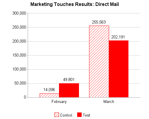
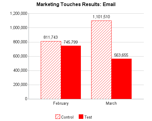
- Mark as New
- Bookmark
- Subscribe
- Mute
- RSS Feed
- Permalink
- Report Inappropriate Content
You can use the SGPLOT procedure to get similar graphs. While SAS graphics has its own defaults, you can get this look with some options.
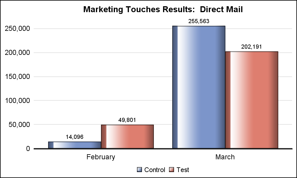
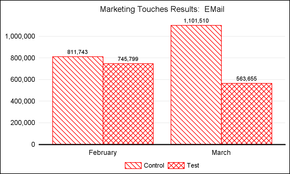
- Mark as New
- Bookmark
- Subscribe
- Mute
- RSS Feed
- Permalink
- Report Inappropriate Content
Since you're using sas/graph gchart in your code, here's how to do it in gchart...
data have;
INFILE DATALINES DLM=',';
length month pilot_category media_method $20;
input year Month PILOT_CATEGORY MEDIA_METHOD Touch_count;
datalines;
2014,February,Control,Direct Mail,14096
2014,February,Test,Direct Mail,49801
2014,February,Control,Email,811743
2014,February,Test,Email,745799
2014,March,Control,Direct Mail,255563
2014,March,Test,Direct Mail,202191
2014,March,Control,Email,1101510
2014,March,Test,Email,563655
;
run;
proc sort data=have out=have;
by media_method;
run;
options nobyline;
title1 ls=1.5 "Marketing Touches Results: #byval(media_method)";
axis1 label=none major=(number=7) minor=none offset=(0,0);
axis2 label=none value=none;
axis3 label=none offset=(8,8);
legend1 label=(position=top color=white) position=(bottom center)
shape=bar(.15in,.15in);
pattern1 v=r color=red;
pattern2 v=s color=red;
goptions device=png xpixels=500 ypixels=400 gunit=pct htitle=4.0 htext=3.2;
proc gchart data=have;
by media_method;
format touch_count comma10.0;
vbar pilot_category / type=sum sumvar=touch_count legend=legend1
group=month subgroup=pilot_category outside=sum
width=15 space=0 gspace=8 coutline=same
raxis=axis1 maxis=axis2 gaxis=axis3 noframe
autoref clipref cref=graycc;
run;
And here are the 2 graphs the above code produces -- pretty much exactly like the ones in your excel spreadsheet...


- Mark as New
- Bookmark
- Subscribe
- Mute
- RSS Feed
- Permalink
- Report Inappropriate Content
Thanks Robert! This is perfect. I appreciate it.
- Mark as New
- Bookmark
- Subscribe
- Mute
- RSS Feed
- Permalink
- Report Inappropriate Content
Hi Robert--
I have another questions if you have time. I am trying to incorporate the charts into a report - see my program below. I have to include a table and both charts in one page. Is it possible that I can shrink the charts and have them side by side horizontally? Any assistance will be greatly appreciated
proc sort data=touches_month_chart out=touches_month_chart;
by media_method;
run;
ods listing;
options leftmargin=".1 in" topmargin=".1 in"
rightmargin=".1 in" bottommargin=".1 in"
nodate nonumber orientation=portrait;
ods pdf file="U:\Matt Local\Programs\VLSS Programs\Report.pdf"
startpage=yes;
ods escapechar='^';
footnote;
/*This creates a table from another dataset*/
proc report
data=touches_month_table nowd headline headskip
style(column)={just=c font_size=11pt font_face= 'Arial Narrow' /*cellwidth=2.5in*/}
style(header)={font_size=11 pt font_face= 'Arial Narrow' FONT_WEIGHT =BOLD background=cxcccccc};
title1 "^S={font_face='Arial Narrow' font_weight=bold font_size=14pt}
Marketing Touches";
column ("^S={font_face='Arial Narrow' FONT_WEIGHT =BOLD background=CXDC143C just=c font_size=12pt} Frequency of Marketing Touches by Month ^S={}" Month MEDIA_METHOD Control Test);
define Month / group
style(column)={just=l cellwidth=.8in bordertopcolor=black borderrightcolor=black borderlefttcolor=black borderbottomcolor=black};
define MEDIA_METHOD / display
style(column)={just=l cellwidth=1in bordertopcolor=black borderrightcolor=black borderlefttcolor=black borderbottomcolor=black};
define Control / display
style(column)={just=c cellwidth=.7in bordertopcolor=black borderrightcolor=black borderlefttcolor=black borderbottomcolor=black};
define Test / display
style(column)={just=c cellwidth=.7in bordertopcolor=black borderrightcolor=black borderlefttcolor=black borderbottomcolor=black};
run;
ods pdf startpage=no;
options nobyline;
title1 ls=1.5 "Marketing Touches Results: #byval(media_method)";
axis1 label=none major=(number=7) minor=none offset=(0,0);
axis2 label=none value=none;
axis3 label=none offset=(8,8);
legend1 label=(position=top color=white) position=(bottom center)
shape=bar(.15in,.15in);
pattern1 v=r color=red;
pattern2 v=s color=red;
goptions device=png xpixels=500 ypixels=400 gunit=pct htitle=4.0 htext=3.2;
proc gchart data=touches_month_chart;
by media_method;
format touch_count comma10.0;
vbar pilot_category / type=sum sumvar=touch_count legend=legend1
group=month subgroup=pilot_category outside=sum
width=10 space=0 gspace=8 coutline=same
raxis=axis1 maxis=axis2 gaxis=axis3 noframe
autoref clipref cref=graycc;
run;
title;
ods _all_ close;
ods listing;
- Mark as New
- Bookmark
- Subscribe
- Mute
- RSS Feed
- Permalink
- Report Inappropriate Content
Sorry, but I don't know too much about generating pdf output with graphs.
If you don't get an answer on the forum, that might be a good question to send to Tech Support ![]()
- Mark as New
- Bookmark
- Subscribe
- Mute
- RSS Feed
- Permalink
- Report Inappropriate Content
Mgarret
You can take an idea from my contribution in
https://communities.sas.com/message/205231#205231
The program place a top area and then 2 maps side by side
and then again 2 areas with maps
So the trick is to remain on the same page
and the adjust your vsize hsize vorigin and horign goptions
HTH
Andre
Catch up on SAS Innovate 2026
Dive into keynotes, announcements and breakthroughs on demand.
Explore Now →Learn how use the CAT functions in SAS to join values from multiple variables into a single value.
Find more tutorials on the SAS Users YouTube channel.
SAS Training: Just a Click Away
Ready to level-up your skills? Choose your own adventure.


