- Home
- /
- Programming
- /
- Graphics
- /
- Generating a graph of comparative responses
- RSS Feed
- Mark Topic as New
- Mark Topic as Read
- Float this Topic for Current User
- Bookmark
- Subscribe
- Mute
- Printer Friendly Page

- Mark as New
- Bookmark
- Subscribe
- Mute
- RSS Feed
- Permalink
- Report Inappropriate Content
Hello Sas users,
I would appreciate any advice you could give on generating a particular graph.
To summarize my data structure I have different environmental measurements taken at 5 sampling units at different distances from a forest edge (1, 5, 10 30 and 60 meters). This sampling procedure was repeated at 4 edges (N1, N2, S1 and S2) at 3 sites.
For each site, I want to summarize the changes in environmental variables that occur along each edge to interior transect.
I generated one “band” of this graph using sgpanel, with the following code, for the environmental measurement “avg elev”.
proc sgpanel data=EvElev_dist;
panelby pertrans / LAYOUT=columnlattice UNISCALE=COLUMN ONEPANEL;
scatter x=dist y=avgelev ;
colaxis label="Distance from edge";
rowaxis label="Relative elevation (cm), n=2"; run;
run;
which produced the following graph:
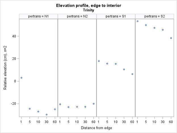
Each column (n1, n2, etc) is a different edge specified by the variable “pertrans”, and the variable on the x axis of each graph is the distance from the edge (1, 5, 10, 30 or 60m).
WHAT I NEED is to make a graph where I have the response of different environmental variables (besides elevation) stacked one on top of another. Essentially, I want the exact format shown in the previous graph, for each different environmental variable. Then I want them stacked in a panel so that I can compare how different envirionmental variables change over each edge-interior transect.
Any advice you could offer would be much appreciated.
Thank you,
Meghan

- Mark as New
- Bookmark
- Subscribe
- Mute
- RSS Feed
- Permalink
- Report Inappropriate Content
I don't have time to give a complete example, but let me outline an approach that might work. The basic idea is to move from "wide" format to "long" format. You want all of the response variables to be names VALUE and you want to create a new ID variable called VARIABLE that you can put on the PANELBY statement in order to build the vertical strata.
If the environmental variables are in different data sets, concatenate them together and create a new ID variable called VARIABLE.
For example, you might do something like this (code probably contains syntax errors):
data All;
set EvElev_dist(rename=(AveElev=Value) in=In1)
Data2(rename=(Var2=Value) in=In2)
...;
if in1 then Variable="Elevation";
else if in2 then Variable="Var2";
else ...;
run;
proc sgpanel data=All;
panelby pertrans Variable; /* VARIABLE is new PANELBY var */
scatter x=dist y=Value; /* VALUE is the response for all envornmental variables */
run;
- Mark as New
- Bookmark
- Subscribe
- Mute
- RSS Feed
- Permalink
- Report Inappropriate Content
Thanks Rick, sounds like that will work. I appreciate it!
- Mark as New
- Bookmark
- Subscribe
- Mute
- RSS Feed
- Permalink
- Report Inappropriate Content
Sorry, one last question. I successfully generated that graph, but now am wondering if there is a way, within sgpanel, to scale the values of each row of graphs to match the range of values for that data. For instance, although all of the variables values are now stored in one field "value", the range for each type of measurement is vastly different. For instance some environmental measurements range 0-1, while others range 0-100. I am wondering if there is an "easy" way to make sgpanel automatically scale the graph axis to reflect the range of the variables it is graphing.
Thanks again,
Meghan
- Mark as New
- Bookmark
- Subscribe
- Mute
- RSS Feed
- Permalink
- Report Inappropriate Content
Nevermind, I figured it out. The answer was to specify uniscale=column.
proc sgpanel data=ALLenv_plots;
by site;
panelby pertrans var/ LAYOUT=lattice onepanel uniscale=column;
scatter x=partrans y=value ;
run;
.jpg")
Catch up on SAS Innovate 2026
Nearly 200 sessions are now available on demand in the Innovate Hub.
Watch Now →Learn how use the CAT functions in SAS to join values from multiple variables into a single value.

Find more tutorials on the SAS Users YouTube channel.
SAS Training: Just a Click Away
Ready to level-up your skills? Choose your own adventure.
-
4 replies
-
04-23-2013 12:33 PM
-
3072 views
-
3 likes
-
2 in conversation
-
