- Home
- /
- Programming
- /
- Graphics
- /
- Re: Gaussian curves in SAS
- RSS Feed
- Mark Topic as New
- Mark Topic as Read
- Float this Topic for Current User
- Bookmark
- Subscribe
- Mute
- Printer Friendly Page
- Mark as New
- Bookmark
- Subscribe
- Mute
- RSS Feed
- Permalink
- Report Inappropriate Content
Hi all,
any idea how to create Guassian curves in sas. Any code sample?
I guess it's easy but it's new for me. My client wants that for a set of diagnosis ages in a DB (Number of cases, Mean, Standard Deviation)
Thanks
Accepted Solutions
- Mark as New
- Bookmark
- Subscribe
- Mute
- RSS Feed
- Permalink
- Report Inappropriate Content
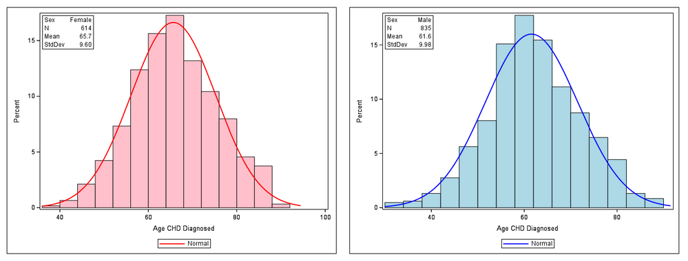
Addendum: Here's a somewhat crude example, again using sashelp.heart:
proc sql noprint;
select n(agechddiag), mean(agechddiag) format=4.1, std(agechddiag) format=5.2 into :n_F, :mean_F, :std_F
from sashelp.heart
where sex eqt 'F';
select n(agechddiag), mean(agechddiag) format=4.1, std(agechddiag) format=5.2 into :n_M, :mean_M, :std_M
from sashelp.heart
where sex eqt 'M';
quit;

proc sgplot data=sashelp.heart;
where sex=:'F';
histogram agechddiag / fillattrs=(color=pink);
density agechddiag / lineattrs=(color=red);
inset ("Sex"="Female" "N"="&n_F" "Mean"="&mean_F" "StdDev"="&std_F") / border;
run;

proc sgplot data=sashelp.heart;
where sex=:'M';
histogram agechddiag / fillattrs=(color=lightblue);
density agechddiag / type=normal lineattrs=(color=blue);
inset ("Sex"="Male" "N"="&n_M" "Mean"="&mean_M" "StdDev"="&std_M") / border;
run;
Result (combined into one .png file):
- Mark as New
- Bookmark
- Subscribe
- Mute
- RSS Feed
- Permalink
- Report Inappropriate Content
Hi @Anita_n,
PROC UNIVARIATE can produce histograms with overlaid Gaussian (and other) density curves (see HISTOGRAM statement).
Example:
ods graphics on;

proc univariate data=sashelp.heart;
var agechddiag;
histogram / normal;
inset n mean std;
run;
See also Examples 4.19 and 4.20 in the documentation.
- Mark as New
- Bookmark
- Subscribe
- Mute
- RSS Feed
- Permalink
- Report Inappropriate Content
- Mark as New
- Bookmark
- Subscribe
- Mute
- RSS Feed
- Permalink
- Report Inappropriate Content
Hi @FreelanceReinh ,
I tried that code, it worked alright. But I still have some questions: I added the by statement so that I get a seperate graph for female and male. I will like to assign different colors to these groups. How can I do that. I guess I can't use attrmaps here. How do I output the graph. I used output out=mygraph but it doesn't work
ods graphics on;
proc univariate data=mydat;
var age;
by sex;
histogram / normal ;
inset n mean std;
run;
- Mark as New
- Bookmark
- Subscribe
- Mute
- RSS Feed
- Permalink
- Report Inappropriate Content
With ODS graphics on, SAS normally creates .png files containing the histograms (see the corresponding entries in the Results window), at least if LISTING or HTML are the active ODS destinations.
With ODS graphics off, traditional (SAS/GRAPH) plots are created and GOPTIONS (such as DEVICE=) apply. There are options like CFILL= <color to fill the bars> of the HISTOGRAM statement which affect only traditional graphics.
I think you'll have better control of the colors in ODS graphics if you create the histograms and density curves with PROC SGPLOT rather than PROC UNIVARIATE. All this is explained nicely with code examples in this 2012 post by Cynthia_sas.
- Mark as New
- Bookmark
- Subscribe
- Mute
- RSS Feed
- Permalink
- Report Inappropriate Content
okay, thanks
- Mark as New
- Bookmark
- Subscribe
- Mute
- RSS Feed
- Permalink
- Report Inappropriate Content
Addendum: Here's a somewhat crude example, again using sashelp.heart:
proc sql noprint;
select n(agechddiag), mean(agechddiag) format=4.1, std(agechddiag) format=5.2 into :n_F, :mean_F, :std_F
from sashelp.heart
where sex eqt 'F';
select n(agechddiag), mean(agechddiag) format=4.1, std(agechddiag) format=5.2 into :n_M, :mean_M, :std_M
from sashelp.heart
where sex eqt 'M';
quit;

proc sgplot data=sashelp.heart;
where sex=:'F';
histogram agechddiag / fillattrs=(color=pink);
density agechddiag / lineattrs=(color=red);
inset ("Sex"="Female" "N"="&n_F" "Mean"="&mean_F" "StdDev"="&std_F") / border;
run;

proc sgplot data=sashelp.heart;
where sex=:'M';
histogram agechddiag / fillattrs=(color=lightblue);
density agechddiag / type=normal lineattrs=(color=blue);
inset ("Sex"="Male" "N"="&n_M" "Mean"="&mean_M" "StdDev"="&std_M") / border;
run;
Result (combined into one .png file):
- Mark as New
- Bookmark
- Subscribe
- Mute
- RSS Feed
- Permalink
- Report Inappropriate Content
Thankyou
- Mark as New
- Bookmark
- Subscribe
- Mute
- RSS Feed
- Permalink
- Report Inappropriate Content
CLASS sex ;
instead of
BY sex ;
Catch up on SAS Innovate 2026
Dive into keynotes, announcements and breakthroughs on demand.
Explore Now →Learn how use the CAT functions in SAS to join values from multiple variables into a single value.
Find more tutorials on the SAS Users YouTube channel.
SAS Training: Just a Click Away
Ready to level-up your skills? Choose your own adventure.


