- Home
- /
- Programming
- /
- Graphics
- /
- GTL barchart with too much labels for time xaxis
- RSS Feed
- Mark Topic as New
- Mark Topic as Read
- Float this Topic for Current User
- Bookmark
- Subscribe
- Mute
- Printer Friendly Page

- Mark as New
- Bookmark
- Subscribe
- Mute
- RSS Feed
- Permalink
- Report Inappropriate Content
Hi,
I need to create a barchart for every week since 5 years.
But the xaxis is displaying every label and they are too much.
I have a dataset with weeks in date format (the dates are the sunday of the beginning week)
and a value for each week.
(This dataset was the created with PROC TIMESERIES.)
I have a problem with the display of the XAXIS : every week label is displayed and is not at all readable.
What can I do to avoid this ?
Any help would be very much appreciated.
thank you in advance

I'am using GTL
proc template;
define statgraph BooleanTimeBarChart;
begingraph / border=false;
layout overlay /
yaxisopts=(label='Cases / week'
griddisplay=on
display=(label tickvalues))
xaxisopts=(label='week'
griddisplay=off
display=(tickvalues ticks));
barchart x=DateUsedForStatistics y=Cases /
group=isAugmenting
index=gdataColor
barwidth=1
name='NameBarchart'
outlineattrs=(thickness=0 color=white)
datatransparency=.2
legendlabel='Color'
grouporder=descending;
discretelegend 'NameBarchart'/
border=false
title='isAugmenting';
endlayout;
endgraph;
end;
run;
art
I attach the dataset from this chart used in the PROC sgrender

- Mark as New
- Bookmark
- Subscribe
- Mute
- RSS Feed
- Permalink
- Report Inappropriate Content
What you are seeing is the Discrete axis, where all values are shown. Bar Chart always creates a discrete axis. You have two options. Set the TickValueFitPolicy on the xaxis DiscreteOpts to trim the tick values. Or, Instead of a bar chart, use a NeedlePlot or HighLowPlot with a real time axis. This article may be timely for you: Grouped Timeline - Graphically Speaking
- Mark as New
- Bookmark
- Subscribe
- Mute
- RSS Feed
- Permalink
- Report Inappropriate Content
Thank you Sanjay
TickValueFitPolicy=thin seems to work but it modifies the chart :
(other TickValueFitPolicy values I picked from examples i found, produce errors)
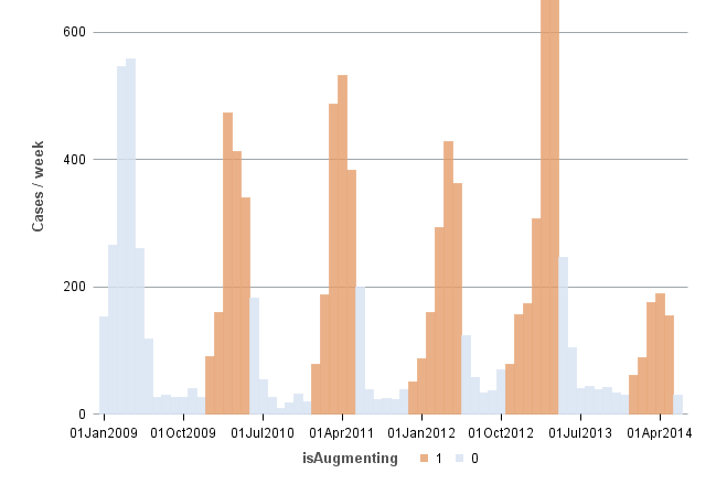
I'll have a look at the article and try to reproduce that.
- Mark as New
- Bookmark
- Subscribe
- Mute
- RSS Feed
- Permalink
- Report Inappropriate Content
I don't know what is the cause, but when I ran the program again today with
DiscreteOpts=(TickValueFitPolicy=thin)
, it was correct :
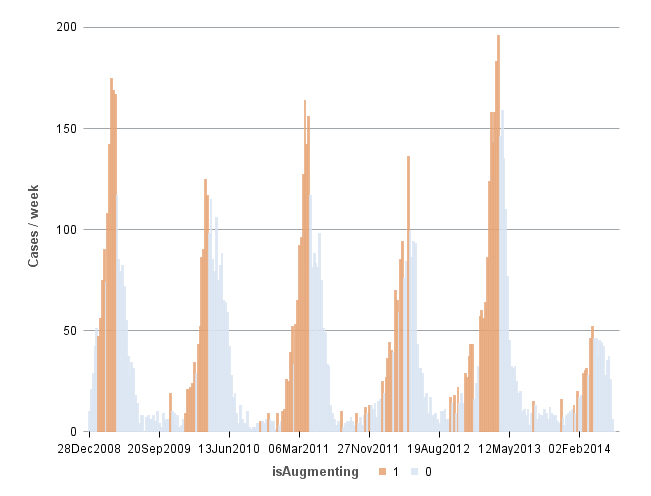
thank you !
Is there a way to force the intervals to be at the beginning of each year ?
- Mark as New
- Bookmark
- Subscribe
- Mute
- RSS Feed
- Permalink
- Report Inappropriate Content
This the best I can do with the HIGHLOW
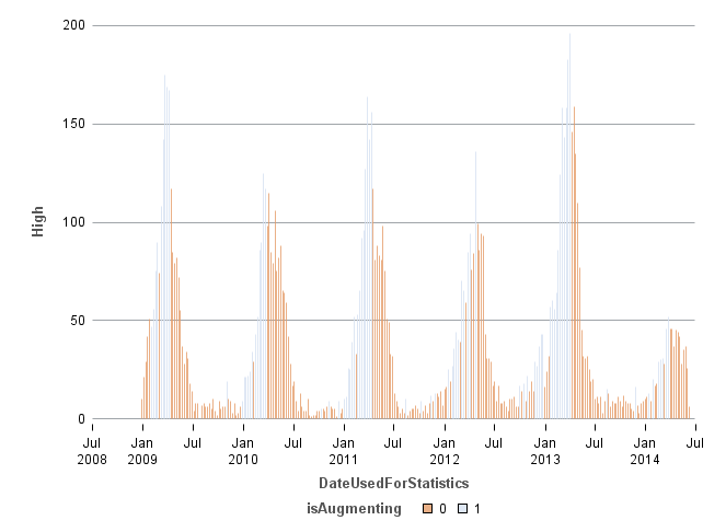
+ data ticks are much better
- barwidth=1 does not work, I can play with intervalbarwidth but its an absolute value, thus not dynamic
- group colors are inverted, whatever comes first determines the color
Code
proc sgplot data=HIGHLOWPLOT ;
*where DateUsedForStatistics>'01jan2013'd;
highlow x=DateUsedForStatistics low=low high=high /
group=isAugmenting
name='a'
type=bar
barwidth=1
discreteoffset=0
fill
nooutline
transparency=.2
/*intervalbarwidth=3*/
;
*keylegend 'a' / title='Virus' location=inside position=topright across=1;
xaxis type=time interval=semiyear offsetmin=0 offsetmax=0;
yaxis grid display=(NOTICKS);
run;
This is the best I can do with the NEEDLE
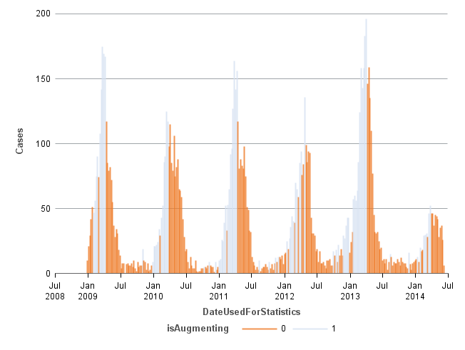
same advantages and disadvantages than highlow
- lines are drawn in the legend
Code
proc sgplot data=HIGHLOWPLOT ;
*where DateUsedForStatistics>'01jan2013'd;
needle x=DateUsedForStatistics y=Cases /
group=isAugmenting
lineattrs=(thickness=2 pattern=solid)
transparency=.2
;
*keylegend 'a' / title='Virus' location=inside position=topright across=1;
xaxis type=time interval=semiyear offsetmin=0 offsetmax=0;
yaxis grid display=(NOTICKS);
run;
- Mark as New
- Bookmark
- Subscribe
- Mute
- RSS Feed
- Permalink
- Report Inappropriate Content
For HighLow plot, with TYPE=bar the default bar width is 85% of the minimum spacing from data. There is a bug that is preventing changing bar width as a % when axis is numeric. But you can provide IntervalBarWidth=value in pixels (or other dimension) to change the default.
Colors are normally assigned in the order the groups are encountered in the data. You can control this by using a Discrete Attributes Map where you can define the colors (and other attributes) by the group VALUE. In your case, for values '0' and '1', you can specify that '0' should be blue and '1' should be green.
You can specify the axis start, end and other details.

- Mark as New
- Bookmark
- Subscribe
- Mute
- RSS Feed
- Permalink
- Report Inappropriate Content
If you can't get what you want with GTL, you might try this trick I sometimes use in SAS/Graph Gchart. I suppress all the bar text values/labels, and then programmatically annotate the specific ones I want. Here are two examples that show the general technique:
http://robslink.com/SAS/democd71/executions.htm
http://robslink.com/SAS/democd71/executions_info.htm
http://robslink.com/SAS/democd71/fisa_surveillance_orders.htm
http://robslink.com/SAS/democd71/fisa_surveillance_orders_info.htm
.jpg")
Catch up on SAS Innovate 2026
Nearly 200 sessions are now available on demand with the SAS Innovate Digital Pass.
Explore Now →Learn how use the CAT functions in SAS to join values from multiple variables into a single value.

Find more tutorials on the SAS Users YouTube channel.
SAS Training: Just a Click Away
Ready to level-up your skills? Choose your own adventure.
-
6 replies
-
06-17-2014 11:34 AM
-
4034 views
-
3 likes
-
3 in conversation
-
