- Home
- /
- Programming
- /
- Graphics
- /
- Force Arrow Head on HIGHLOW Plot HIGHCAP Option
- RSS Feed
- Mark Topic as New
- Mark Topic as Read
- Float this Topic for Current User
- Bookmark
- Subscribe
- Mute
- Printer Friendly Page

- Mark as New
- Bookmark
- Subscribe
- Mute
- RSS Feed
- Permalink
- Report Inappropriate Content
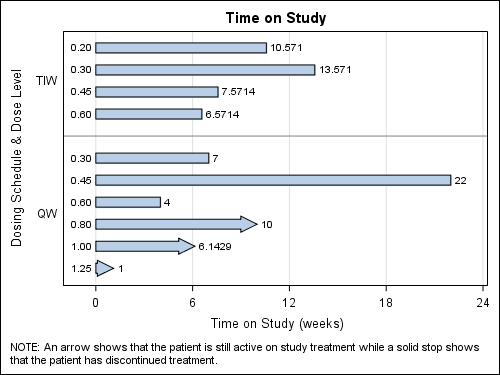
I am creating a swimmer plot using the HIGHLOW statement in PROC SGPLOT to show how long a subject has been on our study. In addition, I want to add an arrow on the end of a bar to denote that a subject is still active on our study; otherwise, there is a flat end. My issue is that if a subject has recently joined our study, their time on study will be quite short (e.g., see row 11 in the data below--only on study for 1 week). A short study time will result in the arrow not showing up as the end cap.
I was reading through the SAS documentation for PROC SGPLOT, and I found the following statement:
"Restriction:Arrow heads are not displayed for very short bars. Bar height must be at least twice the size of the arrow heads in order for the arrow heads to appear. "
My question here is this: Is there a work around for this restriction, or do I need to manually watch for these and maybe add an asterisk using the highlabel option and footnote the bars that are influenced?
I have thought about adding a condition to automatically add the asterisk, but I think the length of the bar will change every time I increase the length of the x-axis, so it isn't very consistent. I'm not sure how to accommodate that.
proc format;
value schedule
2.5='TIW'
8.5='QW';
run;
data swimmer;
input N SCHEDULE $ DOSE TIMEONSTUDY ACTIVE $;
format N schedule. dose 5.2;
if active='Y' then ACTIVECAP='FilledArrow';
BASE=0;
cards;
1 TIW 0.2 10.5714 N
2 TIW 0.3 13.5714 N
3 TIW 0.45 7.5714 N
4 TIW 0.6 6.5714 N
6 QW 0.3 7 N
7 QW 0.45 22 N
8 QW 0.6 4 N
9 QW 0.8 10 Y
10 QW 1.0 6.1429 Y
11 QW 1.25 1 Y
;
run;
proc sgplot data=swimmer;
title 'Time on Study';
footnote1 j=l height=.9 'NOTE: An arrow shows that the patient is still active on study treatment while a solid stop shows that the patient has discontinued treatment.';
highlow y=n low=base high=timeonstudy / type=bar highcap=activecap lowlabel=dose;
refline 5;
xaxis min=-2 max=24 grid label='Time on Study (weeks)' values=(0 to 24 by 6);
yaxis reverse display=(noticks) min=1 max=11 valueshint values=(2.5 8.5) label='Dosing Schedule & Dose Level';
run;

- Mark as New
- Bookmark
- Subscribe
- Mute
- RSS Feed
- Permalink
- Report Inappropriate Content
This is only a work around. Using an iterative process "SwimmerTest", I find the smallest value of TimeOnStudy (T) that will show the arrowhead. I copy TimeOnStudy to TOS, setting values < T to T. Then I draw the graph using HIGH=TOS. I displayed the actual value of TimeOnStudy as HighLabel.
I am unable to add the resulting image due to some bug in the "add Image" tool.
ods html close;
ods listing gpath='C:\Work\SASUser' image_dpi=100;
proc format;
value schedule
2.5='TIW'
8.5='QW';
run;
data swimmer;
input N SCHEDULE $ DOSE TIMEONSTUDY ACTIVE $;
format N schedule. dose 5.2;
if active='Y' then ACTIVECAP='FilledArrow';
BASE=0;
cards;
1 TIW 0.2 10.5714 N
2 TIW 0.3 13.5714 N
3 TIW 0.45 7.5714 N
4 TIW 0.6 6.5714 N
6 QW 0.3 7 N
7 QW 0.45 22 N
8 QW 0.6 4 N
9 QW 0.8 10 Y
10 QW 1.0 6.1429 Y
11 QW 1.25 1.0 Y
;
run;
proc print;run;
data swimmer2;
input N SCHEDULE $ DOSE TIMEONSTUDY ACTIVE $;
format N schedule. dose 5.2;
if active='Y' then ACTIVECAP='FilledArrow';
BASE=0;
cards;
1 TIW 0.2 10.5714 N
2 TIW 0.3 13.5714 N
3 TIW 0.45 7.5714 N
4 TIW 0.6 6.5714 N
6 QW 0.3 7 N
7 QW 0.45 1.3 Y
8 QW 0.6 1.2 Y
9 QW 0.8 1.1 Y
10 QW 1.0 1.0 Y
11 QW 1.25 0.9 Y
;
run;
proc print;run;
ods graphics / reset width=5in imagename='SwimmerTest';
proc sgplot data=swimmer2;
title 'Time on Study';
footnote1 j=l height=.9 'NOTE: An arrow shows that the patient is still active on study treatment while a solid stop shows that the patient has discontinued treatment.';
highlow y=n low=base high=timeonstudy / type=bar highcap=activecap
lowlabel=dose highlabel=timeonstudy;
refline 5;
xaxis min=-2 max=24 grid label='Time on Study (weeks)' values=(0 to 24 by 6);
yaxis reverse display=(noticks) min=1 max=11 valueshint values=(2.5 8.5) label='Dosing Schedule & Dose Level';
run;
data swimmer3;
set swimmer;
tos=timeonstudy;
if timeonstudy < 1.1 then tos=1.1;
run;
proc print;run;
ods graphics / reset width=5in imagename='Swimmer';
proc sgplot data=swimmer3;
title 'Time on Study';
footnote1 j=l height=.9 'NOTE: An arrow shows that the patient is still active on study treatment while a solid stop shows that the patient has discontinued treatment.';
highlow y=n low=base high=tos / type=bar highcap=activecap
lowlabel=dose highlabel=timeonstudy;
refline 5;
xaxis min=-2 max=24 grid label='Time on Study (weeks)' values=(0 to 24 by 6);
yaxis reverse display=(noticks) min=1 max=11 valueshint values=(2.5 8.5) label='Dosing Schedule & Dose Level';
run;
- Tags:
- swimmer plot
- Mark as New
- Bookmark
- Subscribe
- Mute
- RSS Feed
- Permalink
- Report Inappropriate Content
.jpg")
Catch up on SAS Innovate 2026
Nearly 200 sessions are now available on demand in the Innovate Hub.
Watch Now →Learn how use the CAT functions in SAS to join values from multiple variables into a single value.

Find more tutorials on the SAS Users YouTube channel.
SAS Training: Just a Click Away
Ready to level-up your skills? Choose your own adventure.
-
2 replies
-
06-19-2015 03:40 PM
-
5309 views
-
5 likes
-
2 in conversation
-
