- Home
- /
- Programming
- /
- Graphics
- /
- Re: Drawing Shapes on a page
- RSS Feed
- Mark Topic as New
- Mark Topic as Read
- Float this Topic for Current User
- Bookmark
- Subscribe
- Mute
- Printer Friendly Page
- Mark as New
- Bookmark
- Subscribe
- Mute
- RSS Feed
- Permalink
- Report Inappropriate Content
I am working on a project which requires drawing multiple shapes and creating a .pdf file. The shapes will mostly be rectangles and the dimensions for each of the shapes are varied and contained in a dataset. Within the boundary of each shape I will need to add text. I am wondering what the best way is to render the shapes to a page and print to a .pdf file. I'm currently using SAS 9.4
As an added question, I will need to maximize the shapes onto the paper. Any suggestions are greatly appreciated.
- Mark as New
- Bookmark
- Subscribe
- Mute
- RSS Feed
- Permalink
- Report Inappropriate Content
SGPLOT has POLYGON and TEXT statements. You can use them. Here is an example of shapes but not rectangles. Scroll down for polygon examples.
You can learn about SGPLOT from the documentation and from here.
support.sas.com/documentation/prod-p/grstat/9.4/en/PDF/odsbasicg.pdf
- Mark as New
- Bookmark
- Subscribe
- Mute
- RSS Feed
- Permalink
- Report Inappropriate Content
SGPLOT POLYGON statement supports any shape that you can define as a polygon, and has a builtin LABEL option to place text at center of polygon, with many options. https://blogs.sas.com/content/graphicallyspeaking/2013/12/24/new-polygon-plot/
- Mark as New
- Bookmark
- Subscribe
- Mute
- RSS Feed
- Permalink
- Report Inappropriate Content
Interesting, something like a CONSORT diagram?
PROC CALIS can do path diagrams.
The more details you can provide the better we can direct you.
What version of SAS are you using?
Is this a template that needs to be designed once or are you designing a process that needs to be automoated?
There’s a macro for annotating rectangles and text that can be put can be put together to develop what you want, I suspect placement will be the issue though that’s a matter of math really.
http://support.sas.com/resources/papers/proceedings16/SAS5300-2016.pdf
- Mark as New
- Bookmark
- Subscribe
- Mute
- RSS Feed
- Permalink
- Report Inappropriate Content
I am using SAS 9.4 and I am designing a process that needs to be automated. Basically putting rectangular measurements on the page (e.g. 4 1/2 inches by 7 inches) - It's not a graph or a diagram just a series of rectangles of varying dimensions.
My SAS skills are pretty basic so any code direction is much appreciated.
Thanks for your help and response!
- Mark as New
- Bookmark
- Subscribe
- Mute
- RSS Feed
- Permalink
- Report Inappropriate Content
You may find (or not) Annotation easier.
The Xs and Ys from your data set are used by adding information around them, like function, color, style.
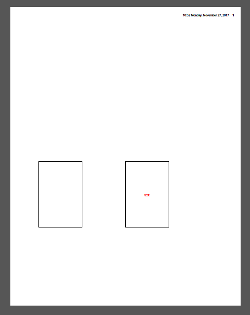
Here is what SAS/Graph annotations look like:
goptions vsize=10in hsize=8in dev=png;
ods pdf file="%sysfunc(pathname(WORK))\f.pdf" ;

data DRAW;
  length STYLE COLOR FUNCTION $8 TEXT $50;
  retain XSYS XYS '3' POS '5';

  STYLE='e'; COLOR='black';
  X=10; Y=20; FUNCTION='move'; output;  * Position in % of area ;
  X=30; Y=40; FUNCTION='bar';  output;  * Draw rectangle        ;
  X=10; Y=20; FUNCTION='bar';  output;  * Close rectangle       ;

  STYLE='e'; COLOR='black';
  X=50; Y=40; FUNCTION='move'; output;
  X=70; Y=20; FUNCTION='bar';  output;
  X=50; Y=40; FUNCTION='bar';  output;

  STYLE='"Arial"'; COLOR='red';         * Write text            ;
  X=60; Y=30; TEXT='test'; FUNCTION='label'; output;

run;

proc ganno annotate=DRAW;
run;
- Mark as New
- Bookmark
- Subscribe
- Mute
- RSS Feed
- Permalink
- Report Inappropriate Content
Catch up on SAS Innovate 2026
Nearly 200 sessions are now available on demand with the SAS Innovate Digital Pass.
Explore Now →Learn how use the CAT functions in SAS to join values from multiple variables into a single value.
Find more tutorials on the SAS Users YouTube channel.
SAS Training: Just a Click Away
Ready to level-up your skills? Choose your own adventure.


