- Home
- /
- Programming
- /
- Graphics
- /
- Draw Histogram and obtain 95% quantile verticle line
- RSS Feed
- Mark Topic as New
- Mark Topic as Read
- Float this Topic for Current User
- Bookmark
- Subscribe
- Mute
- Printer Friendly Page
- Mark as New
- Bookmark
- Subscribe
- Mute
- RSS Feed
- Permalink
- Report Inappropriate Content
Hi,
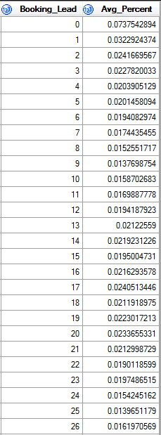
I have a data set named A including two columns:
I wuld like to draw histogram which reflects 'Booking_Lead' and its corresponding 'Avg_Percent'. Besides, I would like to draw a 90% quantile that starting from the largest 'Booking_Lead', and in this example, it is between 0 and 1, but near 1. And output the result called Table B.
I have tried the following:
ods graphics off;
proc univariate data=A noprint;
var Booking_Lead;
histogram Booking_Lead /BARLABEL=percent STATREF=P 90 STATREFLABEL="90th Pctl";
output out=B p90=p90pct;
run;
But this is not correct, How could I change the code, please?
Thank you!
- Mark as New
- Bookmark
- Subscribe
- Mute
- RSS Feed
- Permalink
- Report Inappropriate Content
It looks like your data is a summarization of the raw data. Does the avg_percent column sum to 1? Do you have the raw data? If so, please post as a DATA step, not as an image file.
If you don't have the raw data, then compute the cumulative proportions by summing the avg_percent column:
data want;
set A;
cum_percent + avg_percent;
run;
The first observation for which cum_percent >= 0.9 is an estimate of the 90th percentile.
- Mark as New
- Bookmark
- Subscribe
- Mute
- RSS Feed
- Permalink
- Report Inappropriate Content
Hi Rick,
Thank you! The 'Avg_Percent' column sum to 1. And my prior code to obtain this data is as below:
Proc Sql;
Create Table Work.A
as select distinct
Operating_Div_CD,
Chain_Cd,
LOC_ID,
Booking_Lead,
avg(Percentage) as Avg_Percent
from Work.A_1
group by 1, 2, 3, 4
order by 4 desc;
Quit;
And I figured out the corresponding 'Booking_Lead' versus 90% quantile from your hint.
Thank you
- Mark as New
- Bookmark
- Subscribe
- Mute
- RSS Feed
- Permalink
- Report Inappropriate Content
The simpler way is to use
proc histogram data=A_1;
histogram Percentage;
etc.
Catch up on SAS Innovate 2026
Dive into keynotes, announcements and breakthroughs on demand.
Explore Now →Learn how use the CAT functions in SAS to join values from multiple variables into a single value.
Find more tutorials on the SAS Users YouTube channel.
SAS Training: Just a Click Away
Ready to level-up your skills? Choose your own adventure.


