- Home
- /
- Programming
- /
- Graphics
- /
- Created 100% stacked Bar chart using proc sgplot
- RSS Feed
- Mark Topic as New
- Mark Topic as Read
- Float this Topic for Current User
- Bookmark
- Subscribe
- Mute
- Printer Friendly Page
- Mark as New
- Bookmark
- Subscribe
- Mute
- RSS Feed
- Permalink
- Report Inappropriate Content
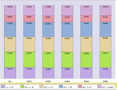
Currently, I want to produce a 100% stacked Bar chart as below using sgplot
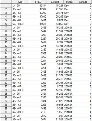
Here is the data table
The graph above is the result from Gchart procedure, now I want to use Sgplot instead. I've been struggled with this recently but still can't find a way to work this out. Can somebody point me in the way how I would set this up?
Thanks!!
- Mark as New
- Bookmark
- Subscribe
- Mute
- RSS Feed
- Permalink
- Report Inappropriate Content
- Mark as New
- Bookmark
- Subscribe
- Mute
- RSS Feed
- Permalink
- Report Inappropriate Content
In addition to the techniques referred to by Rick, you can also by-pass externally computing the percentage values by using a combination of STAT=PCT and PCTLEVEL=GROUP.
proc sgplot data=sashelp.cars pctlevel=group;
vbar origin / group=type stat=pct seglabel;
run;
Hope this helps!
Dan
- Mark as New
- Bookmark
- Subscribe
- Mute
- RSS Feed
- Permalink
- Report Inappropriate Content
@DanH_sas In which version of SAS was this option introduced?
- Mark as New
- Bookmark
- Subscribe
- Mute
- RSS Feed
- Permalink
- Report Inappropriate Content
The PCT stat and PCTLEVEL option where introduced in SAS 9.4. The SEGLABEL option was introduced in SAS 9.4m2.
Thanks!
Dan
Catch up on SAS Innovate 2026
Dive into keynotes, announcements and breakthroughs on demand.
Explore Now →Learn how use the CAT functions in SAS to join values from multiple variables into a single value.
Find more tutorials on the SAS Users YouTube channel.
SAS Training: Just a Click Away
Ready to level-up your skills? Choose your own adventure.


