- Home
- /
- Programming
- /
- Graphics
- /
- SAS GCHART
- RSS Feed
- Mark Topic as New
- Mark Topic as Read
- Float this Topic for Current User
- Bookmark
- Subscribe
- Mute
- Printer Friendly Page
- Mark as New
- Bookmark
- Subscribe
- Mute
- RSS Feed
- Permalink
- Report Inappropriate Content
I have to chart 5 years of usage data, one bar for each month. A request has come to show all 5 years worth of bars, but only have quarterly values appear on the horizontal axis. Is there an easy way to do this?
- Mark as New
- Bookmark
- Subscribe
- Mute
- RSS Feed
- Permalink
- Report Inappropriate Content
What do you mean by:
but only have quarterly values appear on the horizontal axis
Are you looking to change the aggregation from monthly to quarterly or to just change the labels on the axes?
- Mark as New
- Bookmark
- Subscribe
- Mute
- RSS Feed
- Permalink
- Report Inappropriate Content
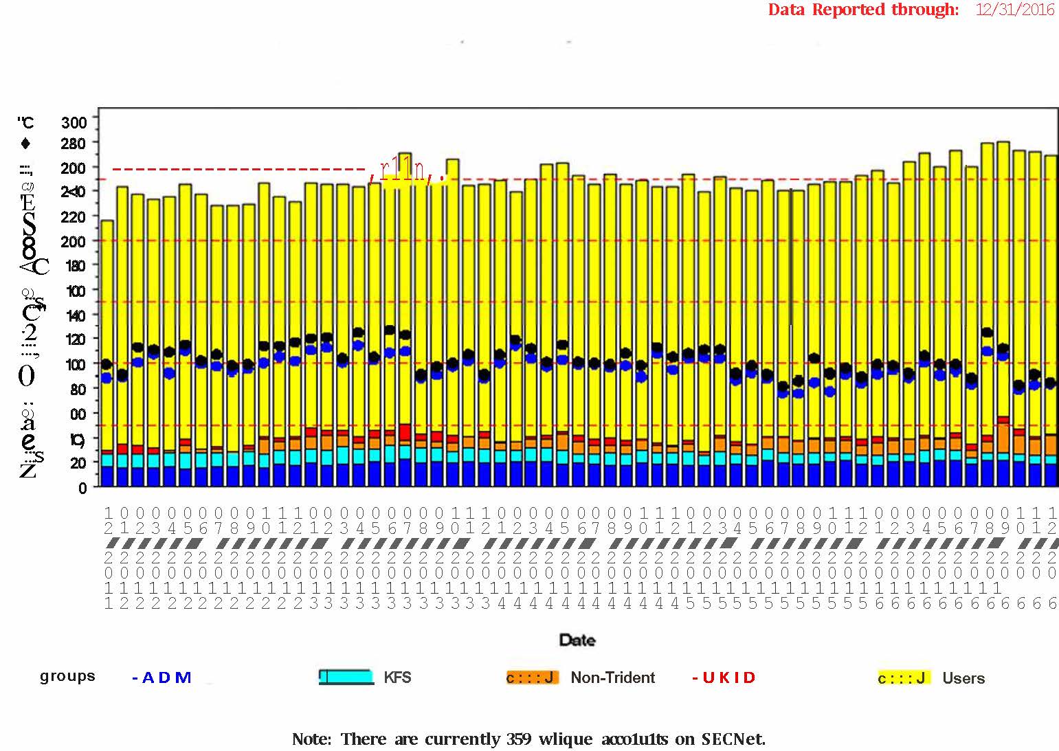
Right now, I have this:
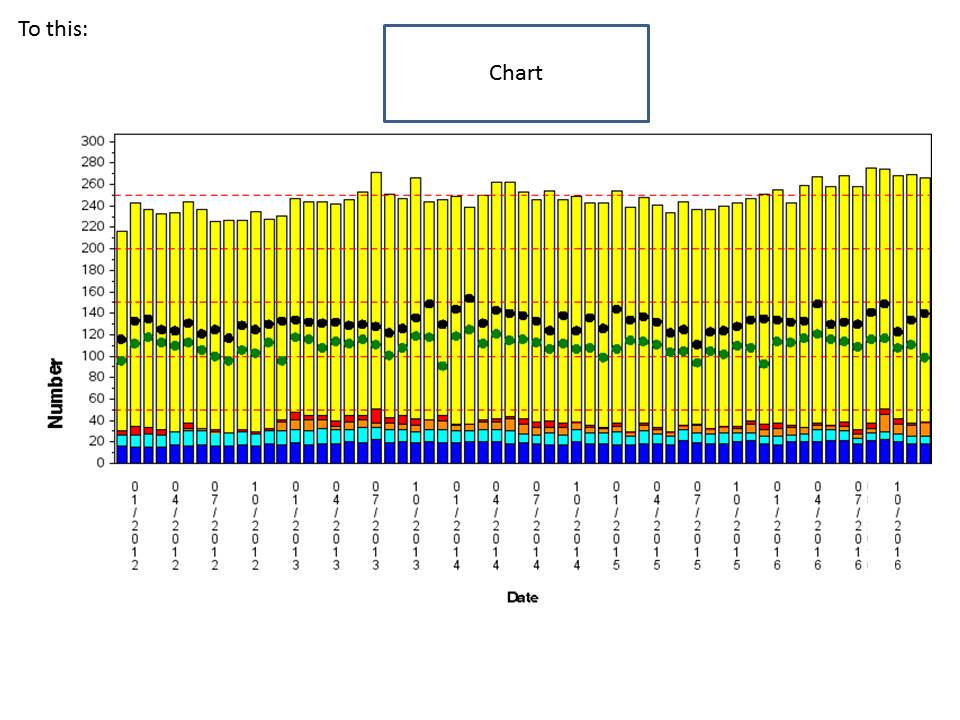
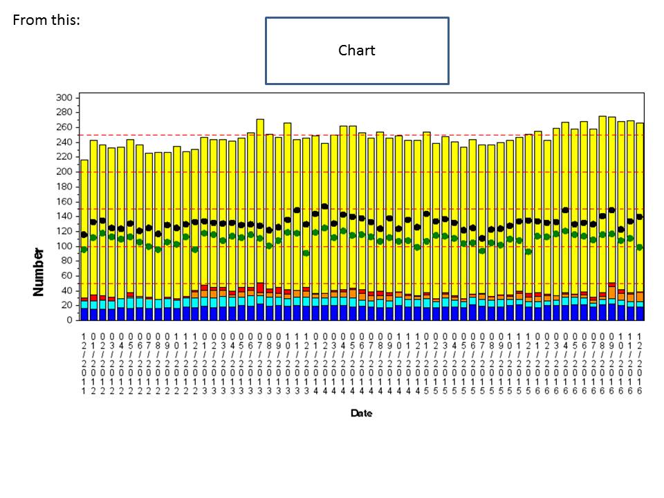
The request is to replace all the mm/yyyy with one mmyyyy value for each quarter.
- Mark as New
- Bookmark
- Subscribe
- Mute
- RSS Feed
- Permalink
- Report Inappropriate Content
GCHART AXIS statement controls the number of tickmarks and the values displayed. Likely to get this to work you will need DATE values for your x axis. Is that the case?
And due to interaction it might help to show your current GCHART code.
Or consider changing to Proc SGPLOT. If you consider this option we need to know which version of SAS you are running as there have been many changes to options in the past few releases.
- Mark as New
- Bookmark
- Subscribe
- Mute
- RSS Feed
- Permalink
- Report Inappropriate Content
see the sample JPG I posted in the response to the previous response
- Mark as New
- Bookmark
- Subscribe
- Mute
- RSS Feed
- Permalink
- Report Inappropriate Content
Change your aggregations to quarterly. If you're doing aggregations in the GCHART (can't even remember if that's possible) format your date with a quarter format and see if that changes things.
If you're aggregating your data outside of the GCHART proc then change it there.
Also, consider switching to SGPLOT if that's an option. Much better quality graphics.
- Mark as New
- Bookmark
- Subscribe
- Mute
- RSS Feed
- Permalink
- Report Inappropriate Content
I will give it a try. I will also look at the SGPLOT options.
- Mark as New
- Bookmark
- Subscribe
- Mute
- RSS Feed
- Permalink
- Report Inappropriate Content
As Ballardw asked earlier, what is the release of SAS (with maintenance level) are you using. This is important. With SAS 9.40M3, you can make bar charts on interval or time axis, that may allow you more flexibility.
See: http://blogs.sas.com/content/graphicallyspeaking/2015/08/12/bar-chart-on-interval-axis-sas-9-40m3/
- Mark as New
- Bookmark
- Subscribe
- Mute
- RSS Feed
- Permalink
- Report Inappropriate Content
we are using 9.4M3. Will look at your blog. Thanks.
- Mark as New
- Bookmark
- Subscribe
- Mute
- RSS Feed
- Permalink
- Report Inappropriate Content
@mbsuther wrote:
see the sample JPG I posted in the response to the previous response
I don't see any code.
How you are summarizing data affects the options available.
What is your current raxis definition? Also you did not show whether your date varaible is actually a date or not. If your variable is not a date then the syntax for an AXIS statement, or the equivalent for SGPLOT is nastier.
And is the desire to show "one value per quarter" or "one tick mark per quarter with the month data as previous"? And what format should that tick value show: 01/2012, Jan 2012, 2012 Q1 or something else? Should the position be at the first, middle or last of a calendar quarter?
- Mark as New
- Bookmark
- Subscribe
- Mute
- RSS Feed
- Permalink
- Report Inappropriate Content
I did not make myself very clear. I need to use PROC GCHART. I want to go to/from:
- Mark as New
- Bookmark
- Subscribe
- Mute
- RSS Feed
- Permalink
- Report Inappropriate Content
As someone else already mentioned look at the AXIS statement to control the tick values. Post your code, ideally with some sample data, if you need help with the code.
- Mark as New
- Bookmark
- Subscribe
- Mute
- RSS Feed
- Permalink
- Report Inappropriate Content
[Edited: Sorry, unsure how I got to open this old question 😕 ].
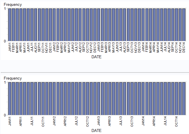
Like this?
goptions xpixels=640 ypixels=200;

data PLOT;
  format DATE monyy.;
  do DATE='01jan2011'd to '01jan2015'd by 31;
    output;
  end;
run;

proc gchart;
   vbar DATE /discrete ;
   run;
quit;

data _null_;
  set PLOT end=LASTOBS;
  if _N_=1 then call execute('axis1 value=(');
  call execute(quote(ifc(month(DATE) in(1,4,7,10),put(DATE,monyy.),' ')));
  if LASTOBS then call execute(');');
run;

proc gchart;
   vbar DATE /discrete maxis=axis1;
   run;
quit;
- Mark as New
- Bookmark
- Subscribe
- Mute
- RSS Feed
- Permalink
- Report Inappropriate Content
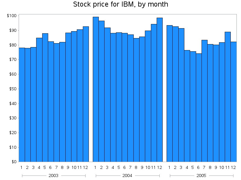
One thing I would recommend for this graph is using a 'grouped bar chart' (grouping by year).
That will clean up the axis a lot (rather than repeating the year in the label of each bar).
Here's a simple example that might be helpful:
data mydata; set sashelp.stocks (where=(stock='IBM' and date>='01jan2003'd));
year=.; year=year(date);
run;
goptions gunit=pct htitle=4 htext=2.25;
axis1 value=(angle=0) label=none;
axis2 label=none;
axis3 label=none minor=none;
pattern1 v=s c=dodgerblue;
title1 "Stock price for IBM, by month";
proc gchart data=mydata;
format date month.;
format close dollar8.0;
vbar date / discrete type=sum sumvar=close
group=year nozero space=0 maxis=axis1 gaxis=axis2 raxis=axis3;
run;
Catch up on SAS Innovate 2026
Nearly 200 sessions are now available on demand with the SAS Innovate Digital Pass.
Explore Now →Learn how use the CAT functions in SAS to join values from multiple variables into a single value.
Find more tutorials on the SAS Users YouTube channel.
SAS Training: Just a Click Away
Ready to level-up your skills? Choose your own adventure.
