- Home
- /
- Programming
- /
- Graphics
- /
- Create a line graph with multiple pair-wise p values
- RSS Feed
- Mark Topic as New
- Mark Topic as Read
- Float this Topic for Current User
- Bookmark
- Subscribe
- Mute
- Printer Friendly Page
- Mark as New
- Bookmark
- Subscribe
- Mute
- RSS Feed
- Permalink
- Report Inappropriate Content
Hi,
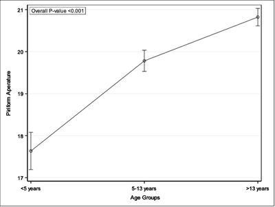
I am trying to create a line graph using Proc SGPLOT with both overall p-value and pair-wise p-values. I was able to add the overall p-value using the INSET statement.
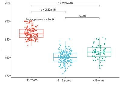
However, I also want to add the pair-wise p-values for 3 different age groups (above graph) similar to the plot below:
Is there any way to add the pair-wise p-values to the plot in SAS? Thanks.
-Sandyzman1
Accepted Solutions
- Mark as New
- Bookmark
- Subscribe
- Mute
- RSS Feed
- Permalink
- Report Inappropriate Content
I have done a graph like this several times, but it is always a lot of manual setup to do. There might be a better way to automate it but I haven't looked into it. This method manually creates the four points of each line using SERIES plots and plots the p-values with TEXT plots where the y coordinates are also manually entered. I typically plot the boxplot or whatever kind of graph first to see where good places to put the lines would be. Here is some example code using the CARS dataset.
data cars;
    set sashelp.cars (where=(origin^='USA') in=a1)
        sashelp.cars (where=(origin^='Asia') in=a2)
        sashelp.cars (where=(origin^='Europe') in=a3);
    if a1 then set=1;
    else if a2 then set=2;
    else if a3 then set=3;
run;


proc npar1way data=cars;
    by set;
    class origin;
    var msrp;
    output out=pvalues;
run;

data lines;
    /**Manually create start/stop points for three series lines**/
    length x $10.;
    group=1;/**Asia/Europe**/
    x='Asia';y=95000;output;
             y=100000;output;
    x='Europe';output;
             y=95000;output;
    group=2;/**Europe/USA**/;
    x='Europe';y=110000;output;
             y=115000;output;
    x='USA';output;
             y=110000;output;
    group=3;/**Asia/USA**/
    x='Asia';y=130000;output;
             y=135000;output;
    x='USA';output;
             y=130000;output;
run;

data plot;
    merge sashelp.cars
        lines
        pvalues (in=a);
    length xp $10.;
    if a then do;
        if set=1 then do;
            xp='Asia';
            yp=100000;/**Asia/Europe pvalue**/
        end;
        else if set=2 then do;
            xp='Europe';
            yp=115000;/**Europe/USA**/
        end;
        else if set=3 then do;
            xp='Europe';
            yp2=135000;/**Asia/USA**/
        end;
        pvalue=catx(' ','p-value: ',p_kw);
    end;
run;


ods graphics /reset;
proc sgplot data=plot noautolegend;
    series x=x y=y /group=group lineattrs=(color=black pattern=1);
    text x=xp y=yp text=pvalue / position=top discreteoffset=0.5;
    text x=xp y=yp2 text=pvalue / position=top discreteoffset=0;
    vbox msrp / category=origin nooutliers;
    yaxis max=160000;
run;
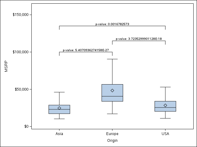
And the resulting graph:
Note that the text going into the PVALUES variable can be controlled by you for different formats, pretext, etc. The height of the lines and amount of drop they have is also controlled by you manually. You can add other plots like the scatter plot in your example on top of this.
- Mark as New
- Bookmark
- Subscribe
- Mute
- RSS Feed
- Permalink
- Report Inappropriate Content
- Mark as New
- Bookmark
- Subscribe
- Mute
- RSS Feed
- Permalink
- Report Inappropriate Content
I realize that you are asking a question about adding lines and text to a graphic, but if you would like to learn about alternative graphical methods in SAS for visualizing multiple comparisons of means, see "The diffogram and other graphs for multiple comparisons of means."
Catch up on SAS Innovate 2026
Dive into keynotes, announcements and breakthroughs on demand.
Explore Now →Learn how use the CAT functions in SAS to join values from multiple variables into a single value.
Find more tutorials on the SAS Users YouTube channel.
SAS Training: Just a Click Away
Ready to level-up your skills? Choose your own adventure.


