- Home
- /
- Programming
- /
- Graphics
- /
- Controlling time intervals in the x axis
- RSS Feed
- Mark Topic as New
- Mark Topic as Read
- Float this Topic for Current User
- Bookmark
- Subscribe
- Mute
- Printer Friendly Page
- Mark as New
- Bookmark
- Subscribe
- Mute
- RSS Feed
- Permalink
- Report Inappropriate Content
Hi everyone,
I'm trying to create a graph, that delineates everything by year.
proc sgplot data=HW2.earthquakes(where=(year >= 2000));
  	XAXIS interval = year;
	Scatter X = year Y = magnitude;
	Title 'Magnitude of Earthquakes occuring in 2000 and beyond';
run;
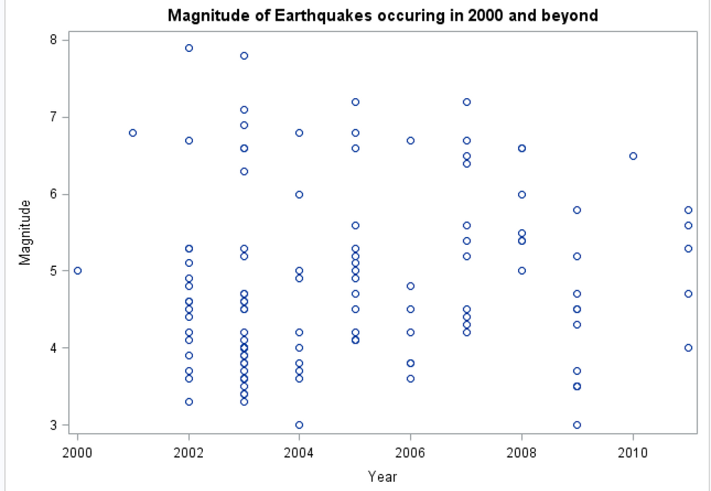
When I run this code, I wind up with up with a graph that still shows ticks in two year increments.
How do I get it to show a tick for every year?
Accepted Solutions
- Mark as New
- Bookmark
- Subscribe
- Mute
- RSS Feed
- Permalink
- Report Inappropriate Content
Judging by the plot, YEAR is not really a datetime variable, so INTERVAL will not work for you. For this case, I think you just want to set TYPE=DISCRETE on the XAXIS statement instead of using the default linear axis for numeric data.
Hope this helps!
Dan
- Mark as New
- Bookmark
- Subscribe
- Mute
- RSS Feed
- Permalink
- Report Inappropriate Content
It worked great, thank you!
- Mark as New
- Bookmark
- Subscribe
- Mute
- RSS Feed
- Permalink
- Report Inappropriate Content
To force display of tick mark values add a VALUES option to the XAXIS statement such as VALUES=(2000 to 2011 by 1) instead of INTERVAL.
It may be that just removing INTERVAL= would work but depending on the range of values and the display size each year may not receive a tick mark.
The interval option is going to want a DATE, TIME or DATETIME valued variable for the x value and yours is very likely not from the display and values shown.
Catch up on SAS Innovate 2026
Dive into keynotes, announcements and breakthroughs on demand.
Explore Now →Learn how use the CAT functions in SAS to join values from multiple variables into a single value.
Find more tutorials on the SAS Users YouTube channel.
SAS Training: Just a Click Away
Ready to level-up your skills? Choose your own adventure.


