- Home
- /
- Programming
- /
- Graphics
- /
- Compare two variables distribution using same axis
- RSS Feed
- Mark Topic as New
- Mark Topic as Read
- Float this Topic for Current User
- Bookmark
- Subscribe
- Mute
- Printer Friendly Page

- Mark as New
- Bookmark
- Subscribe
- Mute
- RSS Feed
- Permalink
- Report Inappropriate Content
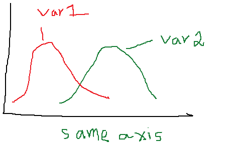
Hi all,
I have 2 variables, which capture similiar information but their distributions are different. I want to plot their distribution on same axis. The distribution could be a histogram.
Thanks for help.
Amit
output wanted:
Sample Data:
| Index | Var1 | Var2 |
| 1 | 0.7469 | 1.025641 |
| 2 | 0.3797 | 0.474684 |
| 3 | 0.4603 | 0.854430 |
| 4 | 0.5670 | 0.974729 |
| 5 | 0.5190 | 0.622837 |
| 6 | 0.5941 | 0.693069 |
| 7 | 0.4348 | 0.869565 |
| 8 | 0.6548 | 1.014085 |
| 9 | 0.3175 | 0.476190 |
| 10 | 0.4167 | 0.555556 |

- Mark as New
- Bookmark
- Subscribe
- Mute
- RSS Feed
- Permalink
- Report Inappropriate Content
data TwoVar;
input Index Var1 Var2;
datalines;
1 0.7469 1.025641
2 0.3797 0.474684
3 0.4603 0.854430
4 0.5670 0.974729
5 0.5190 0.622837
6 0.5941 0.693069
7 0.4348 0.869565
8 0.6548 1.014085
9 0.3175 0.476190
10 0.4167 0.555556
;
run;
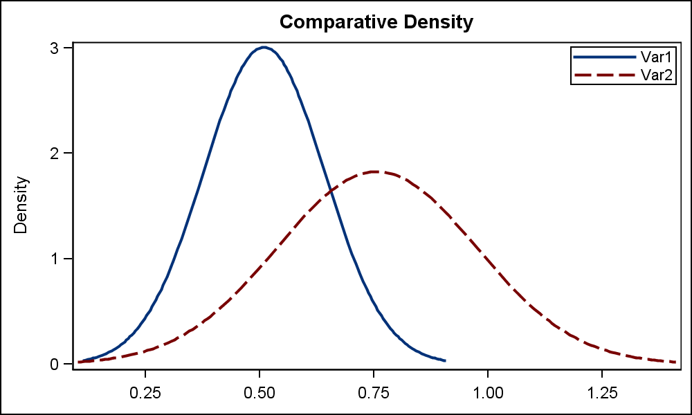
ods graphics / reset width=5in height=3in imagename='TwoDist';
title 'Comparative Density';
proc sgplot data=TwoVar;
density var1 / legendlabel='Var1';
density var2 / legendlabel='Var2';
keylegend / across=1 location=inside position=topright;
xaxis display=(nolabel);
run;
- Mark as New
- Bookmark
- Subscribe
- Mute
- RSS Feed
- Permalink
- Report Inappropriate Content
Hi Sanjay,
Thanks for your reply. I have a follow up question.
Which option made the two density on same axis?
Also could you do a histogram on same axis?
Regards,
Amit
- Mark as New
- Bookmark
- Subscribe
- Mute
- RSS Feed
- Permalink
- Report Inappropriate Content
The axis are a union of the data automatically. You don't have to specify anything extra. ![]()
Yes, you can have histograms. Just replace the "density" statements with the "histogram" statements.
You can have histograms AND density plots at the same time. You just have to a bit more to control the transparencies, colors and legends.
See below.
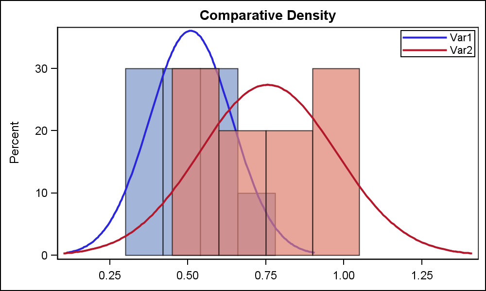
title 'Comparative Density';
proc sgplot data=TwoVar nocycleattrs;
histogram var1 / legendlabel='Var1' fillattrs=graphdata1 transparency=0.3;
density var1 / legendlabel='Var1' lineattrs=graphdata1(pattern=solid) name='1';
histogram var2 / legendlabel='Var2' fillattrs=graphdata2 transparency=0.3;
density var2 / legendlabel='Var2' lineattrs=graphdata2(pattern=solid) name='2';
keylegend '1' '2' / across=1 location=inside position=topright;
xaxis display=(nolabel);
run;

- Mark as New
- Bookmark
- Subscribe
- Mute
- RSS Feed
- Permalink
- Report Inappropriate Content
Hi Sanjay@SAS,
Great demonstration! I am wondering if this can be easily done using EG? I am new to EG and have played with it aiming at this target with no avail.
Thanks in advance!
Haikuo
- Mark as New
- Bookmark
- Subscribe
- Mute
- RSS Feed
- Permalink
- Report Inappropriate Content
Yes, you can write proc SGPLOT code programs in EG.
- Mark as New
- Bookmark
- Subscribe
- Mute
- RSS Feed
- Permalink
- Report Inappropriate Content
Hi Sanjay,
Sorry I did not make myself clear at the first place. I am curious if the same can be done using menu-driven method in EG. If possible, how?
Thanks,
Haikuo
- Mark as New
- Bookmark
- Subscribe
- Mute
- RSS Feed
- Permalink
- Report Inappropriate Content
May be easier if you post the question to the EG track.

- Mark as New
- Bookmark
- Subscribe
- Mute
- RSS Feed
- Permalink
- Report Inappropriate Content
What if I need to statistically compare these two curves or find the area under them. Could you please advise with this

- Mark as New
- Bookmark
- Subscribe
- Mute
- RSS Feed
- Permalink
- Report Inappropriate Content
For additional options, see Overlay density estimates on a plot - The DO Loop
Also, notice that the default SGPLOT behavior is to use separate bin widths for each variable, which is often not what you want. In 9.3, you can control this behavior from SGPLOT. If you are still using 9.2, see this post to set the bin widths to be equal: Overlaying two histograms in SAS - The DO Loop
.jpg")
Catch up on SAS Innovate 2026
Nearly 200 sessions are now available on demand in the Innovate Hub.
Watch Now →Learn how use the CAT functions in SAS to join values from multiple variables into a single value.

Find more tutorials on the SAS Users YouTube channel.
SAS Training: Just a Click Away
Ready to level-up your skills? Choose your own adventure.
-
9 replies
-
10-29-2012 12:49 PM
-
10486 views
-
0 likes
-
5 in conversation
-
