- Home
- /
- Programming
- /
- Graphics
- /
- Changing GPLOT to SGPLOT?
- RSS Feed
- Mark Topic as New
- Mark Topic as Read
- Float this Topic for Current User
- Bookmark
- Subscribe
- Mute
- Printer Friendly Page
- Mark as New
- Bookmark
- Subscribe
- Mute
- RSS Feed
- Permalink
- Report Inappropriate Content
Hello,
I am trying to get acquainted with SAS Studio even as I need for my course. I have code for gplot, but none of my instructors know how to use SAS studio either??? Here is the necessary code can anyone help with translating this regression scatter plot to studio speak!
PROC GPLOT DATA=lead;
PLOT iq*miles = first2y / VAXIS=axis1 HAXIS=axis2 LEGEND=legend1;
SYMBOL1 I=rl VALUE=circle COLOR=black LINE=3 WIDTH=2;
SYMBOL2 I=rl VALUE=dot COLOR=black LINE=1 WIDTH=2;
AXIS1 LABEL = (FONT=ARIAL HEIGHT=2.5 ANGLE=90 POSITION=center)
VALUE= (FONT=ARIAL HEIGHT=2;
AXIS2 LABEL = (FONT=ARIAL HEIGHT=2.5 POSITION=center)
VALUE= (FONT=ARIAL HEIGHT=2;
LEGEND1 FRAME LABEL=(FONT=ARIAL HEIGHT= 1.5) VALUE=(FONT=ARIAL HEIGHT=1.5)
POSITION=(bottom inside right) ACROSS=1;
FORMAT first2y yes1no2.;
RUN;
Accepted Solutions
- Mark as New
- Bookmark
- Subscribe
- Mute
- RSS Feed
- Permalink
- Report Inappropriate Content
Since your original request was for a regression fit, it requires only a small change to the code given by Reeza:
proc sgplot data=lead;
reg x=miles y=iq/group=first2y;
format first2y yes1no2.;
run;- Mark as New
- Bookmark
- Subscribe
- Mute
- RSS Feed
- Permalink
- Report Inappropriate Content
I'm assuming SAS UE, otherwise the following may not apply.
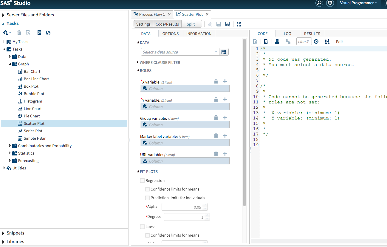
Take a look at the Snippets for graphs or the Tasks for graphs. If your graph fits one of those criteria you can use the point and click interface to generate your plot. The code is then available for you to customize. The options tab is there for further customization.
- Mark as New
- Bookmark
- Subscribe
- Mute
- RSS Feed
- Permalink
- Report Inappropriate Content
Yes, I found these choices too, but with all the information presented in the multple regression coupled with the fact that I am just learning that too makes feel like I would not place all the information in the correct places.
- Mark as New
- Bookmark
- Subscribe
- Mute
- RSS Feed
- Permalink
- Report Inappropriate Content
There's really only 1 line to copy/recode, the rest is styling and formatting it to look the way you want.
PLOT iq*miles = first2y / VAXIS=axis1 HAXIS=axis2 LEGEND=legend1;Which is in the format
y*x=group
So
x=miles
y=iq
Group=first2y
proc sgplot data=lead;
scatter x=miles y=iq/group=first2y;
format first2y yes1no2.;
run;- Mark as New
- Bookmark
- Subscribe
- Mute
- RSS Feed
- Permalink
- Report Inappropriate Content
Problem solved for now thank you!
- Mark as New
- Bookmark
- Subscribe
- Mute
- RSS Feed
- Permalink
- Report Inappropriate Content
Since your original request was for a regression fit, it requires only a small change to the code given by Reeza:
proc sgplot data=lead;
reg x=miles y=iq/group=first2y;
format first2y yes1no2.;
run;- Mark as New
- Bookmark
- Subscribe
- Mute
- RSS Feed
- Permalink
- Report Inappropriate Content
You will find this website very useful if learning SGPLOT and GTL:
http://blogs.sas.com/content/graphicallyspeaking/
There are thousands of examples of code for most graph types. Also, please don't code all in upcase, it makes it very hard to read. Use consistent casing, indentations etc. (note you can use the {i} symbol above the post to put code in as this keeps formatting), for example:
proc gplot data=lead;
  plot iq*miles = first2y / vaxis=axis1 haxis=axis2 legend=legend1;
  symbol1 i=rl value=circle color=black line=3 width=2;
  symbol2 i=rl value=dot color=black line=1 width=2;
  axis1 label = (font=arial height=2.5 angle=90 position=center) value= (font=arial height=2;
  axis2 label = (font=arial height=2.5 position=center) value= (font=arial height=2;
  legend1 frame label=(font=arial height= 1.5) value=(font=arial height=1.5) position=(bottom inside right) across=1;
  format first2y yes1no2.;
run;
Catch up on SAS Innovate 2026
Nearly 200 sessions are now available on demand with the SAS Innovate Digital Pass.
Explore Now →Learn how use the CAT functions in SAS to join values from multiple variables into a single value.
Find more tutorials on the SAS Users YouTube channel.
SAS Training: Just a Click Away
Ready to level-up your skills? Choose your own adventure.


