- Home
- /
- Programming
- /
- Graphics
- /
- Change font and font size in proc sgpanel
- RSS Feed
- Mark Topic as New
- Mark Topic as Read
- Float this Topic for Current User
- Bookmark
- Subscribe
- Mute
- Printer Friendly Page
- Mark as New
- Bookmark
- Subscribe
- Mute
- RSS Feed
- Permalink
- Report Inappropriate Content
Hello, I'm new to SAS and am using SAS studio. Thanks in advance for the help!
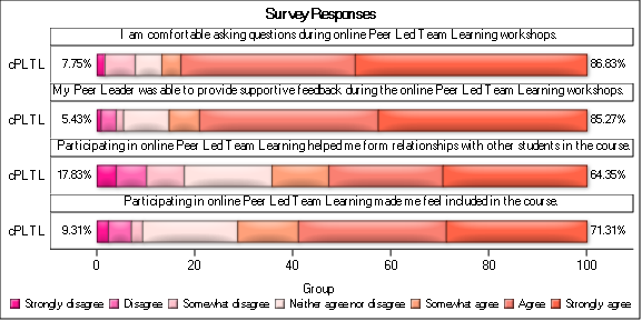
I am using the following code to make a graph that represents some Likert-scale data I collected:
ods graphics / reset width=6in height=3in imagename='Likert_Panel_';
title 'Student perceptions of the social aspects of cPLTL';
proc sgpanel data=all;
	styleattrs datacolors=(deeppink hotpink pink MistyRose lightSalmon salmon Tomato)
		datacontrastcolors=(black);
	panelby question / layout=panel columns=1 onepanel novarname noborder nowall;
	highlow y=cPLTL low=low high=high / group=group type=bar nooutline
		lowlabel=sumdisagree highlabel=sumagree dataskin=matte;
    rowaxis display=(nolabel noticks ) fitpolicy=none;
colaxis display=(nolabel);
    keylegend / noborder;
    where category = "social";
run;
The resulting image looks like this:
Is there a way to change the font style and font size of the whole graph to make it easier to read? Also, is there a way to get rid of the boxes around each panel? Thanks!
- Mark as New
- Bookmark
- Subscribe
- Mute
- RSS Feed
- Permalink
- Report Inappropriate Content
Try changing the STYLE of the ods destination (HTML, RTF, LISTING, or PDF) to affect all aspects of the graph, you are probably using a style that is not appropriate for your destination.
Look here
Try using option NOHEADERBORDER in the panelby statement.
- Mark as New
- Bookmark
- Subscribe
- Mute
- RSS Feed
- Permalink
- Report Inappropriate Content
Thanks, The NOHEADERBORDER option worked! I'm still struggling to change the font, though. I tried changing the RTF output style by clicking on tools --> preferences --> results and then changing "RTF output style". I then run the code and download the results as a word document. It seems like the colors on the figure change depending on the style but not the fonts...
- Mark as New
- Bookmark
- Subscribe
- Mute
- RSS Feed
- Permalink
- Report Inappropriate Content
If you have the fonts installed then you can change the font with options such as LABELATTRS=(family='Arial') or something of the like for each component of the graph.
I will also note that it looks like you're pasting an EMF graph which would potentially be made if you're saving to RTF (given the default OUTPUTFMT=STATIC). If you want something easier to read then you could switch it to PNG or JPEG for now. Add OUTPUTFMT=PNG or OUTPUTFMT=JPEG to your ODS GRAPHICS statement to change the image type. EMF files are great for scalable vector graphs (if you zoom in they will look nice) but look pretty terrible zoomed out. PNG and JPEG graphs look better when zoomed out but terrible when zoomed in. Saving the image to PDF instead of RTF would also make the text easier to read as long as OUTPUTFMT=STATIC and would look the same zoomed in or out.
- Mark as New
- Bookmark
- Subscribe
- Mute
- RSS Feed
- Permalink
- Report Inappropriate Content
@mcmaxwell wrote:
Thanks, The NOHEADERBORDER option worked! I'm still struggling to change the font, though. I tried changing the RTF output style by clicking on tools --> preferences --> results and then changing "RTF output style". I then run the code and download the results as a word document. It seems like the colors on the figure change depending on the style but not the fonts...
Actually they do. RTF uses a larger default font for most purposes.
If your list of styles includes Meadow, Festival or Seaside, or the Printer versions of same, you should get somewhat smaller print. If you are specifying an ods destination you can change the style without having to use the options menus.
ods rtf style=festival file='path\file.rtf' ;
will set the style in the output file to Festival without changing your default for the system.
One thing to consider when you start changing the display area of graphs with the ODS Graphics statement is that the default option of SCALE is likely in effect, which means that as the image size is increased the font sizes increase. So depending on which way you are adjusting ODS Graphics it may be worth testing the NOSCALE option. ODS graphics options also persist until changed or reset. So be responsible for resetting after customizing appearance for a specific job so you know where things are to start a job.
ods graphics/ show;
will display your current settings in the log.
- Mark as New
- Bookmark
- Subscribe
- Mute
- RSS Feed
- Permalink
- Report Inappropriate Content
If you can't find a way to change the font size overall, perhaps you could change it using various 'attrs' size= in the code. See the bolded code in my sample below, for example...
proc sgpanel data=reported_data noautolegend;
format date monname1.;
panelby county_name / columns=4 rows=5 sort=data novarname noheader spacing=10 border uniscale=all;
needle y=cases_this_day_per_100k x=date / displaybaseline=off
 lineattrs=(color=pink) tip=none;
series y=avg x=date / group=county_name
 lineattrs=(color=blue thickness=1.5 pattern=solid) tip=none;
inset county_name / position=top nolabel textattrs=(color=gray33 size=10pt);
rowaxis display=(nolabel noline noticks)
 values=(0 to 200 by 50)
 valuesdisplay=(' ' '50' '100' '150' '200')
 valueattrs=(color=gray33) grid
 offsetmin=0 offsetmax=0;
colaxis display=(nolabel noline noticks /*novalues*/)
 values=('01mar2020'd to '01apr2021'd by month)
 valueattrs=(color=gray33 size=7pt) grid
 offsetmin=0 offsetmax=0;
run;
Catch up on SAS Innovate 2026
Dive into keynotes, announcements and breakthroughs on demand.
Explore Now →Learn how use the CAT functions in SAS to join values from multiple variables into a single value.
Find more tutorials on the SAS Users YouTube channel.
SAS Training: Just a Click Away
Ready to level-up your skills? Choose your own adventure.


