- Home
- /
- Programming
- /
- Graphics
- /
- Boxplot (multiple variable) connecting stats using Annotate
- RSS Feed
- Mark Topic as New
- Mark Topic as Read
- Float this Topic for Current User
- Bookmark
- Subscribe
- Mute
- Printer Friendly Page
- Mark as New
- Bookmark
- Subscribe
- Mute
- RSS Feed
- Permalink
- Report Inappropriate Content
Following the script given in http://blogs.sas.com/content/graphicallyspeaking/2015/12/06/boxplot-with-connect-using-annotate/, I managed to create a boxplot with multiple connect lines for Q1 and Q3 statistics running through 10 categories. However, I need to repeat this for several other response variables. Is there an easy way to create multiple boxplots with Annotate? My attempt in creating three boxplots with one sgplot code (using the by statement) failed miserably as only one boxplot was created but with 6 lines going through the different categories. Can anybody help? Thanks!
proc sgplot data=residrank sganno=sganno noautolegend;
vbox student / category=rank_linearpred;
by resp_name;
run;
Accepted Solutions
- Mark as New
- Bookmark
- Subscribe
- Mute
- RSS Feed
- Permalink
- Report Inappropriate Content
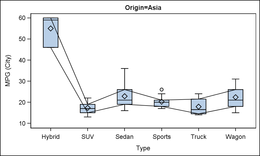
Maybe there is a simpler solution. No annotation is required. Three graphs are generated by Origin.
proc sort data=sashelp.cars out=cars;
by origin;
run;
proc sgplot data=cars nocycleattrs noautolegend;
by origin;
vbox mpg_city / category=type connect=q1;
vbox mpg_city / category=type nofill connect=q3;
run;
- Mark as New
- Bookmark
- Subscribe
- Mute
- RSS Feed
- Permalink
- Report Inappropriate Content
Well, Sanjay is the best man to answer that one as he's the graph master. From my side, I would split the graph up. I would first do the box plot as you have. Then for each other line you require, do a series plot for that data, overlaying each result:
proc sgplot data=residrank sganno=sganno noautolegend;
  vbox student / category=rank_linearpred;
  series x=... y=...;
  by resp_name;
run;
You should have the data elements in your data.
- Mark as New
- Bookmark
- Subscribe
- Mute
- RSS Feed
- Permalink
- Report Inappropriate Content
Can you share the data sets (main and anno) you have generated for this program? That will save us some time. Also, which release of SAS are you using?
- Mark as New
- Bookmark
- Subscribe
- Mute
- RSS Feed
- Permalink
- Report Inappropriate Content
Maybe there is a simpler solution. No annotation is required. Three graphs are generated by Origin.
proc sort data=sashelp.cars out=cars;
by origin;
run;
proc sgplot data=cars nocycleattrs noautolegend;
by origin;
vbox mpg_city / category=type connect=q1;
vbox mpg_city / category=type nofill connect=q3;
run;
- Mark as New
- Bookmark
- Subscribe
- Mute
- RSS Feed
- Permalink
- Report Inappropriate Content
Great! Thanks for the solution!
- Mark as New
- Bookmark
- Subscribe
- Mute
- RSS Feed
- Permalink
- Report Inappropriate Content
See new article in Graphically Speaking: http://blogs.sas.com/content/graphicallyspeaking/2016/01/20/easy-box-plot-with-connect/
- Mark as New
- Bookmark
- Subscribe
- Mute
- RSS Feed
- Permalink
- Report Inappropriate Content
Hi Sanjay,
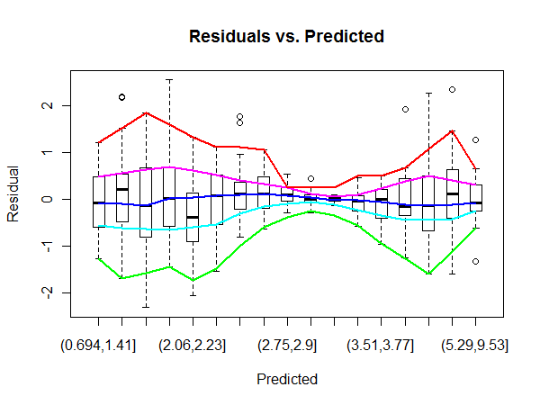
I found this graph on the web and this is actually what I was aiming for (smoothed Q1 and Q3 done by lowess as connect lines). In this case, I believe there's no recourse but to use annotate, is that correct? And how to do that for multiple response variables?
Would truly appreciate your help on this one.

- Mark as New
- Bookmark
- Subscribe
- Mute
- RSS Feed
- Permalink
- Report Inappropriate Content
- Mark as New
- Bookmark
- Subscribe
- Mute
- RSS Feed
- Permalink
- Report Inappropriate Content
Which release of SAS are you using? That can make a big difference. With 9.4M3 you can use the SPLINE statement. Else you would need to compute the spline cureve yourself using Annotate. Can be done, but more work.
- Mark as New
- Bookmark
- Subscribe
- Mute
- RSS Feed
- Permalink
- Report Inappropriate Content
- Mark as New
- Bookmark
- Subscribe
- Mute
- RSS Feed
- Permalink
- Report Inappropriate Content
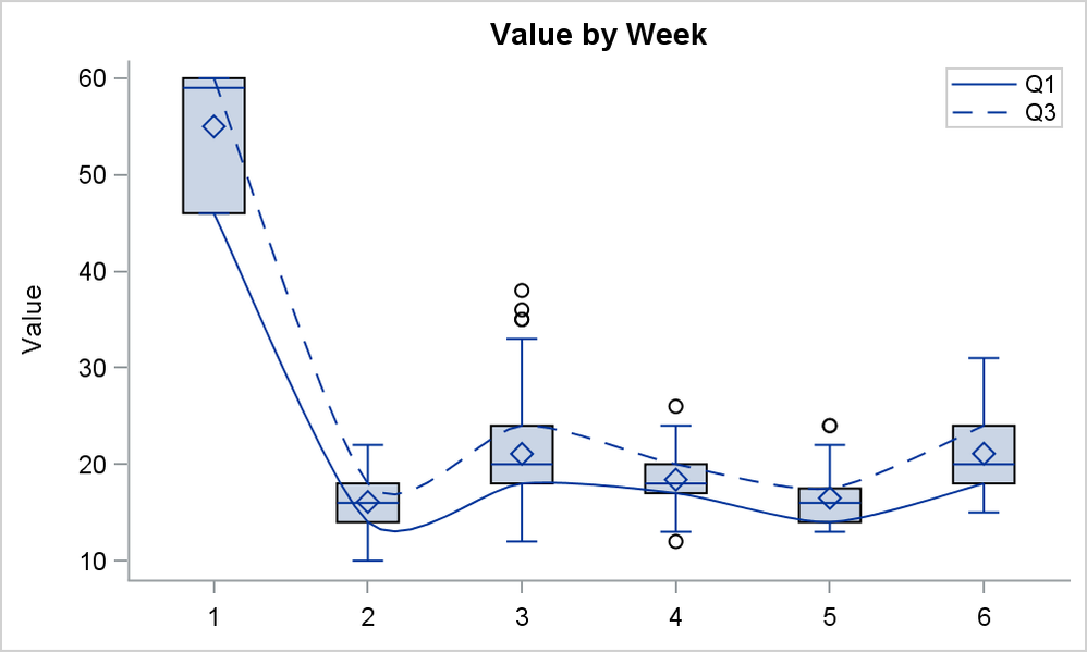
GTL SERIESPLOT supports SMOOTHCONNECT. This is a poor cousin of SPLINE, but may work for you. I will write up a blog post on how to do this. My simple use case works without BY variable. Will need work for BY variable support. Also, SAS 9.4 output is nicer since it uses SUBPIXEL. SAS 9.3 does not use SUBPIXEL, so the curve is not as nice.
I changed the data so x axis is numeric. Connect makes more sense with numeric x axis. Note however, that the smooth connect line overshoots the value when the curvature is sharp, as seen at Week 2.

- Mark as New
- Bookmark
- Subscribe
- Mute
- RSS Feed
- Permalink
- Report Inappropriate Content
@JulieM Just because someone creates a graph does not mean it's a good idea. In the graph you present, it looks like the X axis is actually continuous, but was binned to create categorical varlues for the box plots. The "connecting curves" look like an attempt to approximate quantile regression curves. You can learn more about the plot you provided and why quantile regression is a better idea in the article "Quantile regression: Better than connecting the sample quantiles of binned data."
The QUANTREG procedure can create this kinds of plots automatically, and the curves that it creates are better estimates for the quantities that it looks like you are interested in.
Instead of telling us the graph you want to make, why not describe the data and the statistical questions you are trying to visualize? If quantile regression is the answer, there are many experts in the Statistical Procedures Support Community who can advise you with syntax. The article I mentioned previously has sample syntax.
- Mark as New
- Bookmark
- Subscribe
- Mute
- RSS Feed
- Permalink
- Report Inappropriate Content
Hi @Rick_SAS,
I'm actually exploring ways to visualize the presence/absence of heteroskedasticity of residuals in a linear model. It seemed a good idea to do that using boxplots of bins of equal counts across the range of the linear predictors (with smoothed connecting curves to emphasize the general overall pattern). I'll have a look at quantile regressions.
Thanks for the tip!
Catch up on SAS Innovate 2026
Dive into keynotes, announcements and breakthroughs on demand.
Explore Now →Learn how use the CAT functions in SAS to join values from multiple variables into a single value.
Find more tutorials on the SAS Users YouTube channel.
SAS Training: Just a Click Away
Ready to level-up your skills? Choose your own adventure.


