- Home
- /
- Programming
- /
- Graphics
- /
- Biplots of 95% confidence Intervals
- RSS Feed
- Mark Topic as New
- Mark Topic as Read
- Float this Topic for Current User
- Bookmark
- Subscribe
- Mute
- Printer Friendly Page
- Mark as New
- Bookmark
- Subscribe
- Mute
- RSS Feed
- Permalink
- Report Inappropriate Content
Hey guys,
I can't seem to find this anywhere online, but R directions are out there so i figured there must exist a way for SAS to do it too.
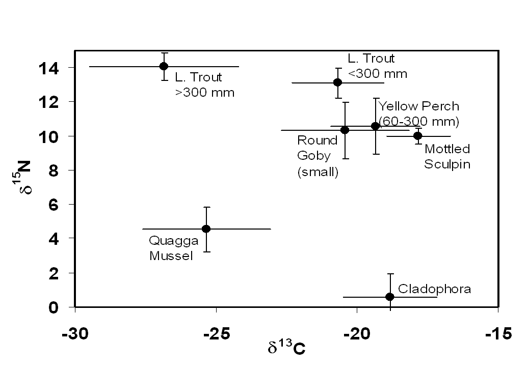
Basically I have 2 quantitative variables and one classification variable. I am looking to be able to make a plot of the means of both Q-variables and their respective confidence intervals for each class. Is there something else these are called? Its basically a scatter plot but I cant seem to get it to work correctly (Below is what I am trying to make)
Any direction is appreciated.
Thanks,
Austin

Accepted Solutions
- Mark as New
- Bookmark
- Subscribe
- Mute
- RSS Feed
- Permalink
- Report Inappropriate Content
proc sgplot data=mydata;
scatter x=meanX y=MeanY / XERRORLOWER=lowerX XERRORUPPER=upperX
YERRORLOWER=lowerY YERRORUPPER=upperY DATALABEL=FishName;
run;
- Mark as New
- Bookmark
- Subscribe
- Mute
- RSS Feed
- Permalink
- Report Inappropriate Content
proc sgplot data=mydata;
scatter x=meanX y=MeanY / XERRORLOWER=lowerX XERRORUPPER=upperX
YERRORLOWER=lowerY YERRORUPPER=upperY DATALABEL=FishName;
run;
Learn how use the CAT functions in SAS to join values from multiple variables into a single value.
Find more tutorials on the SAS Users YouTube channel.
SAS Training: Just a Click Away
Ready to level-up your skills? Choose your own adventure.


