- Home
- /
- Programming
- /
- Graphics
- /
- Bar chart
- RSS Feed
- Mark Topic as New
- Mark Topic as Read
- Float this Topic for Current User
- Bookmark
- Subscribe
- Mute
- Printer Friendly Page
- Mark as New
- Bookmark
- Subscribe
- Mute
- RSS Feed
- Permalink
- Report Inappropriate Content
Hi,
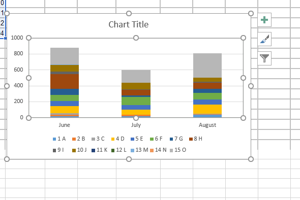
I have a dataset which I want to create a bar chart looks like this
and this is the dataset I'm using
| Obs | study_name | June | July | August |
| 1 | A | 20 | 16 | 39 |
| 2 | B | 18 | 18 | 6 |
| 3 | C | 19 | 1 | 5 |
| 4 | D | 87 | 65 | 115 |
| 5 | E | 63 | 55 | 62 |
| 6 | F | 81 | 104 | 87 |
| 7 | G | 73 | 19 | 49 |
| 8 | H | 189 | 69 | 79 |
| 9 | I | 28 | 6 | 8 |
| 10 | J | 87 | 83 | 52 |
| 11 | K | 0 | 0 | 0 |
| 12 | L | 0 | 0 | 0 |
| 13 | M | 4 | 1 | 1 |
| 14 | N | 1 | 0 | 2 |
| 15 | O | 212 | 159 | 304 |
data have;
input study_name $ June July August;
datalines;
A 20 16 39
B 18 18 6
C 19 1 5
D 87 65 115
E 63 55 62
F 81 104 87
G 73 19 49
H 189 69 79
I 28 6 8
J 87 83 52
K 0 0 0
L 0 0 0
M 4 1 1
N 1 0 2
O 212 159 304
;
Accepted Solutions
- Mark as New
- Bookmark
- Subscribe
- Mute
- RSS Feed
- Permalink
- Report Inappropriate Content
Transpose the data so you have a single "month" variable to reference as the axis variable in a VBAR statement in proc sgplot.
data have;
input study_name $ June July August;
datalines;
A 20 16 39
B 18 18 6
C 19 1 5
D 87 65 115
E 63 55 62
F 81 104 87
G 73 19 49
H 189 69 79
I 28 6 8
J 87 83 52
K 0 0 0
L 0 0 0
M 4 1 1
N 1 0 2
O 212 159 304
;

proc transpose data=have out=trans
   name=Month;
by study_name;
var June July August;
run;

Proc sgplot data=trans;
   vbar month / response=col1 group=study_name;
run;
The get the legend entries to read "1 A" either make a variable with that value and transpose using it or create a format to show values of Study_name that way and apply the format in the Proc. Assign labels to Col1 and month to get nicer text or suppress entirely with XAXIS and YAXIS statements.
- Mark as New
- Bookmark
- Subscribe
- Mute
- RSS Feed
- Permalink
- Report Inappropriate Content
Please provide data as a data step for this example.
Also, include anything you've tried to plot this so far.
- Mark as New
- Bookmark
- Subscribe
- Mute
- RSS Feed
- Permalink
- Report Inappropriate Content
- Mark as New
- Bookmark
- Subscribe
- Mute
- RSS Feed
- Permalink
- Report Inappropriate Content
Looks like a vertical version of the Likert graph.
https://blogs.sas.com/content/graphicallyspeaking/2014/10/30/likert-graphs/
https://blogs.sas.com/content/graphicallyspeaking/2016/08/01/likert-graph-revisited/
- Mark as New
- Bookmark
- Subscribe
- Mute
- RSS Feed
- Permalink
- Report Inappropriate Content
Transpose the data so you have a single "month" variable to reference as the axis variable in a VBAR statement in proc sgplot.
data have;
input study_name $ June July August;
datalines;
A 20 16 39
B 18 18 6
C 19 1 5
D 87 65 115
E 63 55 62
F 81 104 87
G 73 19 49
H 189 69 79
I 28 6 8
J 87 83 52
K 0 0 0
L 0 0 0
M 4 1 1
N 1 0 2
O 212 159 304
;

proc transpose data=have out=trans
   name=Month;
by study_name;
var June July August;
run;

Proc sgplot data=trans;
   vbar month / response=col1 group=study_name;
run;
The get the legend entries to read "1 A" either make a variable with that value and transpose using it or create a format to show values of Study_name that way and apply the format in the Proc. Assign labels to Col1 and month to get nicer text or suppress entirely with XAXIS and YAXIS statements.
Catch up on SAS Innovate 2026
Dive into keynotes, announcements and breakthroughs on demand.
Explore Now →Learn how use the CAT functions in SAS to join values from multiple variables into a single value.
Find more tutorials on the SAS Users YouTube channel.
SAS Training: Just a Click Away
Ready to level-up your skills? Choose your own adventure.


