- Home
- /
- Programming
- /
- Graphics
- /
- Bar Charts - remove gaps between bars
- RSS Feed
- Mark Topic as New
- Mark Topic as Read
- Float this Topic for Current User
- Bookmark
- Subscribe
- Mute
- Printer Friendly Page
- Mark as New
- Bookmark
- Subscribe
- Mute
- RSS Feed
- Permalink
- Report Inappropriate Content
Hi,
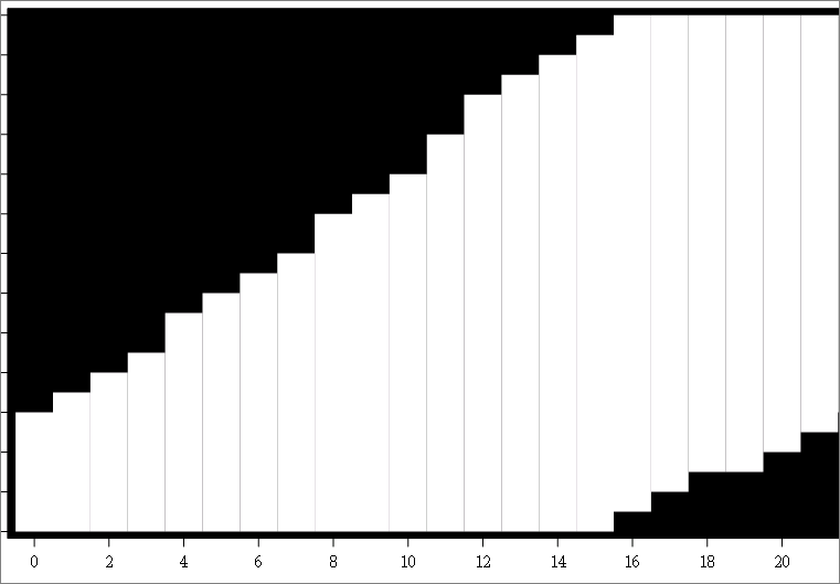
I created this plot using sgplot-highlow with type=BAR. I want to remove the space between each bars so that i don't see the individual bars .
Regards
San
Accepted Solutions
- Mark as New
- Bookmark
- Subscribe
- Mute
- RSS Feed
- Permalink
- Report Inappropriate Content
RTF uses vector graphics converted into EMF+. So, the mapping may not be perfect since you have black background (seeping through the gaps). You may be better off using a BAND with TYPE=Step. This will give you a continuous plot without gaps.
- Mark as New
- Bookmark
- Subscribe
- Mute
- RSS Feed
- Permalink
- Report Inappropriate Content
@hello28 wrote:
Hi,
I created this plot using sgplot-highlow with type=BAR. I want to remove the space between each bars so that i don't see the individual bars .
Regards
San
It helps to show the code you used so we don't suggest something that conflicts with the options you have already used.
If the xaxis is descrete perhaps you want the option BARWITH=1 on the HIGHLOW statement.
- Mark as New
- Bookmark
- Subscribe
- Mute
- RSS Feed
- Permalink
- Report Inappropriate Content
proc sgplot data=plotx ;
highlow x=xbar low=ybar_low high=ybar_high /type=bar barwidth=1 dataskin= NONE fillattrs=(transparency=0.5) ;
xaxis values=(0 to 26 by 2) label='Label of X';
yaxis values=(0 to 26 by 2) label='Label of y' ;
styleattrs wallcolor=black;
run;
i need the high and low of each points connected (without showing each individual bars).
i do get this in proc gplot with plot and plot2 for high and low. however i need the wall color in black which i dont know how to get while i use gplot.
- Mark as New
- Bookmark
- Subscribe
- Mute
- RSS Feed
- Permalink
- Report Inappropriate Content
Did you try
highlow................/ noborder
- Mark as New
- Bookmark
- Subscribe
- Mute
- RSS Feed
- Permalink
- Report Inappropriate Content
noborder is throwing a syntax error in 9.4
- Mark as New
- Bookmark
- Subscribe
- Mute
- RSS Feed
- Permalink
- Report Inappropriate Content
Use NOOUTLINE.
data foo;
do i=0 to 10;
low=i+10;
high=low+5;
output;
end;
run;
proc sgplot data=foo;
highlow x=i low=low high=high / type=bar barwidth=1 nooutline;
run;
- Mark as New
- Bookmark
- Subscribe
- Mute
- RSS Feed
- Permalink
- Report Inappropriate Content
Hi Sanjay,
It Works fine in SAS Output . However when i output the image in RTF , there are some random lines.
Do you know why these are coming up?
- Mark as New
- Bookmark
- Subscribe
- Mute
- RSS Feed
- Permalink
- Report Inappropriate Content
RTF uses vector graphics converted into EMF+. So, the mapping may not be perfect since you have black background (seeping through the gaps). You may be better off using a BAND with TYPE=Step. This will give you a continuous plot without gaps.
- Mark as New
- Bookmark
- Subscribe
- Mute
- RSS Feed
- Permalink
- Report Inappropriate Content
Thanks Sanjay, it worked. 🙂
- Mark as New
- Bookmark
- Subscribe
- Mute
- RSS Feed
- Permalink
- Report Inappropriate Content
Thanks to KSharp for follow-up post.
- Mark as New
- Bookmark
- Subscribe
- Mute
- RSS Feed
- Permalink
- Report Inappropriate Content
Here is Sanjay suggested.
data foo;
do i=0 to 10;
low=i+10;
high=low+5;
output;
end;
run;


proc sgplot data=foo;
styleattrs wallcolor=black;
band x=i lower=low upper=high / type=step   ;
run;- Mark as New
- Bookmark
- Subscribe
- Mute
- RSS Feed
- Permalink
- Report Inappropriate Content
Hi,
I have a situation now.
Is it possible to plot two ranges or bands for same point on the 'x' axis. ?
From above Example: i=2; low = 12; high=14;
i=2; low = 16; high=17;
- Mark as New
- Bookmark
- Subscribe
- Mute
- RSS Feed
- Permalink
- Report Inappropriate Content
Make two variables and two BAND statements.
i=2; low = 12; high=14;
_i=2; _low = 16; _high=17;
band x=i lower=low upper=high / type=step ;
band x=_i lower=_low upper=_high / type=step ;
- Mark as New
- Bookmark
- Subscribe
- Mute
- RSS Feed
- Permalink
- Report Inappropriate Content
My data is like,
x=0, y=0;
x=0, y=1;
x=0, y=2;
x=1, y=0;
x=1, y=1;
x=1, y=2;
x=2, y=0;
x=2, y=1;
x=2, y=2;
x=2, y=3;
When i use Band plot , it plots the coordinates on Xaxis and connects the next coordinates
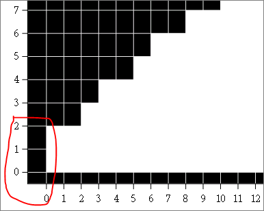
I want to fill the grids where these points meets on x and y. For x=0 and y=0,1,2, i want to fill the three grids shown in the picture
- Mark as New
- Bookmark
- Subscribe
- Mute
- RSS Feed
- Permalink
- Report Inappropriate Content
Not clear to me. But if you want to fill the grids, you could use a HeatMap or HeatMapParm and indicate the grids that are filled and empty. X & Y bins can be interval or discrete. Bins can be marked at center or on edges.
You can also use HEATMAP in SGPLOT.
Also, it is preferable to start a new thread for a new issue.
Learn how use the CAT functions in SAS to join values from multiple variables into a single value.
Find more tutorials on the SAS Users YouTube channel.
SAS Training: Just a Click Away
Ready to level-up your skills? Choose your own adventure.


