- Home
- /
- Programming
- /
- Graphics
- /
- Re: Annotate Gchart help?
- RSS Feed
- Mark Topic as New
- Mark Topic as Read
- Float this Topic for Current User
- Bookmark
- Subscribe
- Mute
- Printer Friendly Page
- Mark as New
- Bookmark
- Subscribe
- Mute
- RSS Feed
- Permalink
- Report Inappropriate Content
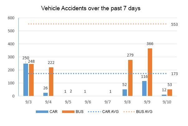
I've got a bar chart showing car and bus accidents over the past week. Cars and Busses have an average daily rate. What i'd like to do is annotate the bar graph to add a dotted line for the Car average and the Bus average. I've marked up the bar graph to show how i'd like it to look (See attached graphic)
I'm not sure how to set up the annotate dataset to add the dotted average lines. Can anybody help?

Accepted Solutions
- Mark as New
- Bookmark
- Subscribe
- Mute
- RSS Feed
- Permalink
- Report Inappropriate Content
Instead of GCHART can you use SGPLOT with VBAR and VLINE instead?
Example is here.
https://support.sas.com/documentation/cdl/en/grstatproc/62603/HTML/default/viewer.htm#a003199396.htm
Add a group to vbar/vline to get your two different lines/bars.
Catch up on SAS Innovate 2026
Nearly 200 sessions are now available on demand with the SAS Innovate Digital Pass.
Explore Now →Learn how use the CAT functions in SAS to join values from multiple variables into a single value.
Find more tutorials on the SAS Users YouTube channel.
SAS Training: Just a Click Away
Ready to level-up your skills? Choose your own adventure.


