- Home
- /
- Programming
- /
- Graphics
- /
- How to construct line graph of complication rate by BMI percent
- RSS Feed
- Mark Topic as New
- Mark Topic as Read
- Float this Topic for Current User
- Bookmark
- Subscribe
- Mute
- Printer Friendly Page
- Mark as New
- Bookmark
- Subscribe
- Mute
- RSS Feed
- Permalink
- Report Inappropriate Content
This seems like such a simple thing to do, yet I am not understanding how to do this and would appreciate some help. First, I have a dataset of 1000 patients. What I am trying to do is construct a line graph of the number of patients who have urinary tract infection (y-axis) vs. BMI % (x-axis) and number of patients who have sepsis (y-axis) vs. BMI % (x-axis). The dataset has UTI (yes/no) and sepsis (yes/no) as well as a column for BMI percentage (I also have available variables giving the number of occurrences of UTI and sepsis). What I want is the rate of sepsis by BMI % and the rate of UTI by BMI %. I also want to combine sepsis and UTI and call it "complications" and then look at rate of complication by BMI %. How do I set up my data to do this and which SAS code can help me accomplish this? Like I said, this seems very simple to me, but for some reason I can't figure this out. Thanks in advance.
- Mark as New
- Bookmark
- Subscribe
- Mute
- RSS Feed
- Permalink
- Report Inappropriate Content
- Mark as New
- Bookmark
- Subscribe
- Mute
- RSS Feed
- Permalink
- Report Inappropriate Content
Also with any rate you want to consider your denominator. When you say BMI, since that is likely to be a continuous measure and depending on precision of measurement and calculation method could very well have no duplicates for a sample as small as 1000.
You may need to round your BMI into useable ranges of values that make sense for the project.
And a first step would be to have your UTI and SEPSIS variables as numeric coded 1 for yes and 0 for no. Then when you take the MEAN of UTI or sepsis within any group the result is a percentage.
- Mark as New
- Bookmark
- Subscribe
- Mute
- RSS Feed
- Permalink
- Report Inappropriate Content
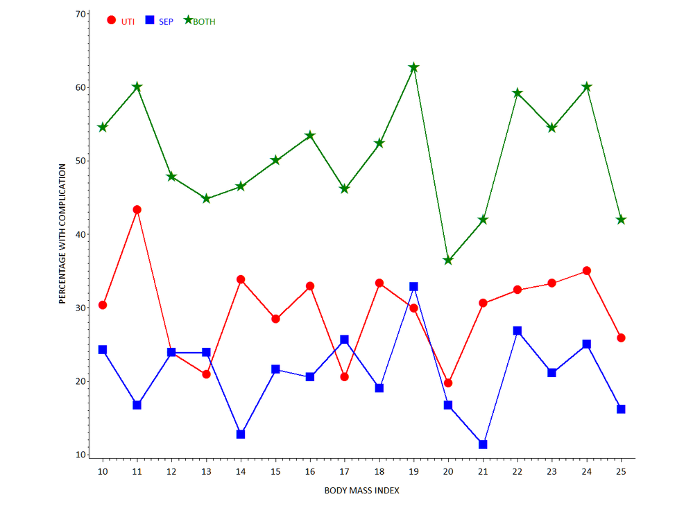
Hi, here's an idea using GPLOT (someone else can do SGPLOT) ...
* some fake data;
data x;
do _n_=1 to 1000;
uti = ifn(ranuni(99) lt 0.3, 1, 0);
sep = ifn(ranuni(99) lt 0.2, 1, 0);
bmi = round(10 + (15*ranuni(99)));
output;
end;
run;
* calculate percent URI and SEP within BMI groups;
proc summary data=x nway;
class bmi;
var uti sep;
output out=mydata (drop=_:) mean=;
run;
* rescale percentages (0 to 100);
data mydata;
set mydata;
uti = round(100*uti,.1);
sep = round(100*sep,.1);
comps = uti+sep;
run;
* GPLOT (someone else can do SGPLOT);
goptions reset=all ftext='calibri' htext=2 gunit=pct;
* choose some graphics options;
symbol1 i=j f='wingdings' v='6c'x h=3 c=red w=3;
symbol2 i=j f='wingdings' v='6e'x h=3 c=blue w=3;
symbol3 i=j f='wingdings' v='ab'x h=3.5 c=green w=3;
legend1 position=(top inside left) label=none offset=(3,)
value=(j=c c=red 'UTI' c=blue 'SEP' c=green 'BOTH') shape=symbol(.0001,3);
axis1 offset=(2,2)pct label=('BODY MASS INDEX');
axis2 label=(a=90 'PERCENTAGE WITH COMPLICATION');
* whitespace left/right;
title1 a=90 ls=5;
title2 a=-90 ls=5;
proc gplot data=mydata;
plot (uti sep comps) * bmi / legend=legend1 vaxis=axis2 haxis=axis1 overlay noframe;
run;
quit;

- Mark as New
- Bookmark
- Subscribe
- Mute
- RSS Feed
- Permalink
- Report Inappropriate Content
Something like this (untested)?
data HAVE;
  do UTI    ='Y','N';
  do SEPSIS ='Y','N';
    do BMI = 0.05 to 0.95 by 0.05;
      NBCASES=round(ranuni(0)*100);
      output;
    end;
  end;
  end;
run;

proc sql;
 create table RATES as
   select BMI
        , sum(NBCASES*(UTI    ='Y'))          /sum(NBCASES) as RATE_UTI
        , sum(NBCASES*(SEPSIS ='Y'))          /sum(NBCASES) as RATE_SEPSIS
        , sum(NBCASES*(SEPSIS ='Y')*(UTI='Y'))/sum(NBCASES) as RATE_COMPLIC
  from HAVE
  group by BMI;
quit;

proc plot data=RATES;
  plot (RATE_UTI RATE_SEPSIS RATE_COMPLIC)*BMI / overlay ;
  format RATE: percent.;
  run;
quit;
Catch up on SAS Innovate 2026
Dive into keynotes, announcements and breakthroughs on demand.
Explore Now →Learn how use the CAT functions in SAS to join values from multiple variables into a single value.
Find more tutorials on the SAS Users YouTube channel.
SAS Training: Just a Click Away
Ready to level-up your skills? Choose your own adventure.


