- Home
- /
- Programming
- /
- Graphics
- /
- 2 datasets/series in one graph
- RSS Feed
- Mark Topic as New
- Mark Topic as Read
- Float this Topic for Current User
- Bookmark
- Subscribe
- Mute
- Printer Friendly Page
- Mark as New
- Bookmark
- Subscribe
- Mute
- RSS Feed
- Permalink
- Report Inappropriate Content
Hi All
I am trying to make the attached graph in SAS - that is I want to make a proc gchart vbar on one dataset and a proc sqplot on another dataset and then combine the two graphs using proc greplay, but it just doesnt look pretty - does anybody have any other ideas ?
Accepted Solutions
- Mark as New
- Bookmark
- Subscribe
- Mute
- RSS Feed
- Permalink
- Report Inappropriate Content
Hi
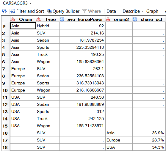
You combine the data that needs to be plotted into one data set using different varibale names, see below for an example
You then can use the appropriate plot statements of Proc SGPLOT that are compatible with each other, for your example they are VBARPARM and SCATTER
See also this blog entry http://blogs.sas.com/content/graphicallyspeaking/2013/03/09/parametric-bar-charts/ by @Jay54
Here is a code sample that creates two tables with the data to be plotted, they are combined and then used with Proc SGPLOT
proc sql;
  create table carsAggr1 as
  select
    origin
    , type
    , mean(horsePower) as avg_horsePower
  from
    sashelp.cars

  group by
    origin
    , type
  ;
quit;

proc sql;
  create table carsAggr2 as
  select
    origin as origin2
    , count(*) / (select count(*) from sashelp.cars) as share_pct format=percent9.1
  from
    sashelp.cars

  group by
    origin
  ;
quit;

data carsAggr3;
  set carsAggr1 carsAggr2;
  *
  * fill it, so we do not get an additional legend entry
  *;
  if type = " " then do;
    type = "SUV";
  end;
run;

proc sgplot data=carsAggr3;
  vbarparm category=Origin response=avg_horsePower / group=Type name="bar";
  scatter x=origin2 y=share_pct /
    y2axis
    markerattrs=(symbol= squarefilled)
    name="scatter"
    datalabel
    datalabelpos=top
  ;
  keylegend "bar" "scatter" /
    location=outside
    position=right
    noborder
  ;
  y2axis values=(0 to 1.2 by 0.2);
run;
Bruno
- Mark as New
- Bookmark
- Subscribe
- Mute
- RSS Feed
- Permalink
- Report Inappropriate Content
Hi Bruno
Thank you very much for the help - it worked 🙂
Anette
Catch up on SAS Innovate 2026
Nearly 200 sessions are now available on demand with the SAS Innovate Digital Pass.
Explore Now →Learn how use the CAT functions in SAS to join values from multiple variables into a single value.
Find more tutorials on the SAS Users YouTube channel.
SAS Training: Just a Click Away
Ready to level-up your skills? Choose your own adventure.


