- Home
- /
- Programming
- /
- Developers
- /
- Meta-plot
- RSS Feed
- Mark Topic as New
- Mark Topic as Read
- Float this Topic for Current User
- Bookmark
- Subscribe
- Mute
- Printer Friendly Page
- Mark as New
- Bookmark
- Subscribe
- Mute
- RSS Feed
- Permalink
- Report Inappropriate Content
Dear all,
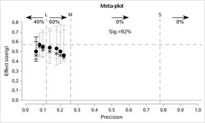
these days I was reading an article in which the authors, first name Marcel A.L.M. van Assen, create with the R software a very interesting graph, meta-plot, to be used when doing meta-analysis.
Could this graph be made with SAS?
I write here the link https://osf.io/eayfr/ where to find the R code and all the material used by the authors.
The title of the paper is: The Meta-Plot A graphical tool for interpreting the results of a meta-analysis.
Thank you very much
Giuseppe
- Mark as New
- Bookmark
- Subscribe
- Mute
- RSS Feed
- Permalink
- Report Inappropriate Content
So which parts do need help in SAS? Summarizing the data? Making the Plots?
What have you tried so far?
Where is your data?
- Mark as New
- Bookmark
- Subscribe
- Mute
- RSS Feed
- Permalink
- Report Inappropriate Content
Thanks for your answer
- Mark as New
- Bookmark
- Subscribe
- Mute
- RSS Feed
- Permalink
- Report Inappropriate Content
data have;
infile cards truncover;
input group x y lclm uclm   x0 y0 lclm0 uclm0  ;
cards;
1 0.08 0.57 0.46 0.69
1 0.1  0.55 0.45 0.70
1 0.14 0.54 0.44 0.71
1 0.18 0.53 0.43 0.72
1 0.2  0.5  0.4  0.7
1 0.22 0.46 0.4 0.72
2 0.08 0.55 0.45 0.66
2 0.1  0.52 0.44 0.72
2 0.14 0.5 0.38 0.74
2 0.18 0.48 0.36 0.76
2 0.2  0.46  0.38  0.78
2 0.22 0.44 0.4 0.77
1 .    .    .   .    0.06 0.5  0.42 0.65
2 .    .    .   .    0.06 0.46 0.4 0.6
;


%sganno

data sganno;
%SGARROW( X1=0.1,  Y1=0.85,X2=0,    Y2=0.85,LINETHICKNESS=1,SCALE=0.1,LINECOLOR="black",DRAWSPACE="DATAVALUE",SHAPE= "BARBED")
%SGARROW( X1=0.14, Y1=0.85,X2=0.24, Y2=0.85,LINETHICKNESS=1,SCALE=0.1,LINECOLOR="black",DRAWSPACE="DATAVALUE",SHAPE= "BARBED")
%SGARROW( X1=0.5,  Y1=0.85,X2=0.6,  Y2=0.85,LINETHICKNESS=1,SCALE=0.1,LINECOLOR="black",DRAWSPACE="DATAVALUE",SHAPE= "BARBED")
%SGARROW( X1=0.85, Y1=0.85,X2=0.95, Y2=0.85,LINETHICKNESS=1,SCALE=0.1,LINECOLOR="black",DRAWSPACE="DATAVALUE",SHAPE= "BARBED")

%SGTEXT(LABEL="40%", DRAWSPACE="DATAVALUE",X1=0.08,Y1=0.8)
%SGTEXT(LABEL="60%", DRAWSPACE="DATAVALUE",X1=0.17,Y1=0.8)
%SGTEXT(LABEL="0%",  DRAWSPACE="DATAVALUE",X1=0.55,Y1=0.8)
%SGTEXT(LABEL="0%",  DRAWSPACE="DATAVALUE",X1=0.9,Y1=0.8)
%SGTEXT(LABEL="Sig.=92%",  DRAWSPACE="DATAVALUE",X1=0.55,Y1=0.7,WIDTH=0.4,WIDTHUNIT="DATA")

run;

title 'Meta-plot';
ods graphics /width=5in height=3in  attrpriority=none ;
proc sgplot data=have noautolegend sganno=sganno;
styleattrs AXISEXTENT=data datasymbols=(circlefilled Asterisk);
symbolchar name=right char='2192'x;
symbolchar name=left  char='2190'x;

scatter x=x y=y/group=group yerrorlower=lclm yerrorupper=uclm
 markerattrs=(size=10 color=black) ERRORBARATTRS=(color=graybb);
scatter x=x0 y=y0/group=group yerrorlower=lclm0 yerrorupper=uclm0
 markerattrs=(size=10 color=black) ERRORBARATTRS=(color=black);

refline 0/axis=y;
refline 0.57/axis=y lineattrs=(pattern=dash);
refline 0.12/axis=x label='L' lineattrs=(pattern=dash);
refline 0.26/axis=x label='M' lineattrs=(pattern=dash);
refline 0.78/axis=x label='S' lineattrs=(pattern=dash);

yaxis values=(0 to 0.8 by 0.1) label='Effect size(g)';
xaxis values=(0 to 1 by 0.1)   label='Precision';
run;
- Mark as New
- Bookmark
- Subscribe
- Mute
- RSS Feed
- Permalink
- Report Inappropriate Content
Thanks for your answer.
FANTASTIC and WONDERFUL.
Giuseppe
Learn how use the CAT functions in SAS to join values from multiple variables into a single value.
Find more tutorials on the SAS Users YouTube channel.
SAS Training: Just a Click Away
Ready to level-up your skills? Choose your own adventure.


