- Home
- /
- Analytics
- /
- Stat Procs
- /
- proc genmod graphics for count data model fit assessment
- RSS Feed
- Mark Topic as New
- Mark Topic as Read
- Float this Topic for Current User
- Bookmark
- Subscribe
- Mute
- Printer Friendly Page
- Mark as New
- Bookmark
- Subscribe
- Mute
- RSS Feed
- Permalink
- Report Inappropriate Content
Hello,
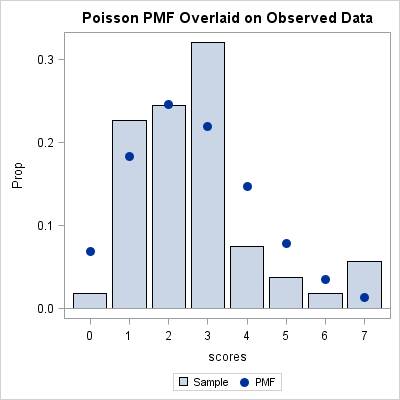
I am a beginner stat student. I am trying to plot observed and predicted Poisson and negative binomial probabilities against the
data observed. I have no experience or prior knowledge of graphing. I am getting lost in all complex explanations.
Can you please help me in simplest way of accomplishing this task?
Below is my syntax. How do I plot predicted Poisson and negative binomial probabilities against the sample below?
data world;
input scores @@;
datalines;
5 1 6 3 2 1 2 1 1 2 1 3 3 3 3
4 1 1 1 2 1 3 2 2 3 7 3 3 7
4 3 3 3 2 4 2 0 3 3 3 2 4 2
1 1 1 3 7 3 2 2 2 5
;
proc means data=world n mean var;
run;
/* Mean= 2.67 and Variance=2.56. The data is a good canfidate for poisson distribution. */
proc genmod data=world;
model scores= /dist=poisson link=log;
run;
Accepted Solutions
- Mark as New
- Bookmark
- Subscribe
- Mute
- RSS Feed
- Permalink
- Report Inappropriate Content
Another example that produces both an observed vs. expected plot (using PROC COUNTREG) and a test of the fit (using PROC FREQ) is shown in this note.
- Mark as New
- Bookmark
- Subscribe
- Mute
- RSS Feed
- Permalink
- Report Inappropriate Content
Follow the example in the article "Fitting a Poisson distribution to data in SAS."
The only difference is that your response is named 'scores' instead of 'N' and your counts are 0-7 instead of 0-13.
- Mark as New
- Bookmark
- Subscribe
- Mute
- RSS Feed
- Permalink
- Report Inappropriate Content
Can you please share the link again? It is not working.
- Mark as New
- Bookmark
- Subscribe
- Mute
- RSS Feed
- Permalink
- Report Inappropriate Content
- Mark as New
- Bookmark
- Subscribe
- Mute
- RSS Feed
- Permalink
- Report Inappropriate Content
Another example that produces both an observed vs. expected plot (using PROC COUNTREG) and a test of the fit (using PROC FREQ) is shown in this note.
ANOVA, or Analysis Of Variance, is used to compare the averages or means of two or more populations to better understand how they differ. Watch this tutorial for more.
Find more tutorials on the SAS Users YouTube channel.


