- Home
- /
- Analytics
- /
- Stat Procs
- /
- Re: The mean excess plot in SAS
- RSS Feed
- Mark Topic as New
- Mark Topic as Read
- Float this Topic for Current User
- Bookmark
- Subscribe
- Mute
- Printer Friendly Page
- Mark as New
- Bookmark
- Subscribe
- Mute
- RSS Feed
- Permalink
- Report Inappropriate Content
How could we create a mean excess plot (Hill estimator, etc.) in SAS ?
Accepted Solutions
- Mark as New
- Bookmark
- Subscribe
- Mute
- RSS Feed
- Permalink
- Report Inappropriate Content
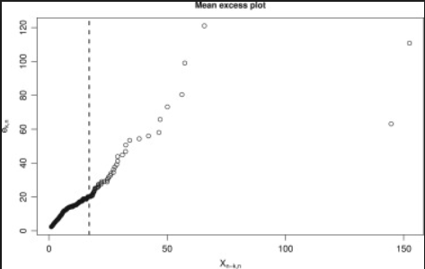
If you already know how to generate the X and Y variables in the plot from the data and the location of the dashed line, then you can create the plot as follows:
   title "Mean excess plot";
   proc sgplot data=Have;
      scatter x=X y=Y;
      refline 20 / axis=x lineattrs=(pattern=dash);
   run;
If your question is not about how to CREATE the plot but how to COMPUTE the values for the plot, then we'll need a reference and an explanation of the two quantities in the graph. A "reference" mensa a link to a paper or web site that explains the details that are required to understand how to generate the plot.
- Mark as New
- Bookmark
- Subscribe
- Mute
- RSS Feed
- Permalink
- Report Inappropriate Content
Please provide a link to the plot and some context about where it is encountered or what it shows.
- Mark as New
- Bookmark
- Subscribe
- Mute
- RSS Feed
- Permalink
- Report Inappropriate Content
I mean this plot :
(mean excess plot form extreme value theory)
- Mark as New
- Bookmark
- Subscribe
- Mute
- RSS Feed
- Permalink
- Report Inappropriate Content
If you already know how to generate the X and Y variables in the plot from the data and the location of the dashed line, then you can create the plot as follows:
   title "Mean excess plot";
   proc sgplot data=Have;
      scatter x=X y=Y;
      refline 20 / axis=x lineattrs=(pattern=dash);
   run;
If your question is not about how to CREATE the plot but how to COMPUTE the values for the plot, then we'll need a reference and an explanation of the two quantities in the graph. A "reference" mensa a link to a paper or web site that explains the details that are required to understand how to generate the plot.
Catch up on SAS Innovate 2026
Nearly 200 sessions are now available on demand with the SAS Innovate Digital Pass.
Explore Now →ANOVA, or Analysis Of Variance, is used to compare the averages or means of two or more populations to better understand how they differ. Watch this tutorial for more.
Find more tutorials on the SAS Users YouTube channel.


