- Home
- /
- Analytics
- /
- Stat Procs
- /
- Re: Convex hull without IML repeat
- RSS Feed
- Mark Topic as New
- Mark Topic as Read
- Float this Topic for Current User
- Bookmark
- Subscribe
- Mute
- Printer Friendly Page
- Mark as New
- Bookmark
- Subscribe
- Mute
- RSS Feed
- Permalink
- Report Inappropriate Content
Hi, I see from previous posts that there is a convex hull in IML. I do hot have this available.. I'm just checking to see if there are some other ideas.
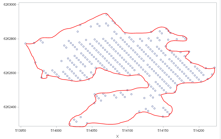
What I want is briefly described in the graph.
The points are actually defined in proc modeclus, which give me a good separation of different clusters. I was hoping that the Boundary would give me the edges but this only give edges towards other clusters. If anybody has any idea without IML I would be gratefull.
Thanks Pål N
- Mark as New
- Bookmark
- Subscribe
- Mute
- RSS Feed
- Permalink
- Report Inappropriate Content
I don't understand what you want. The red curve is NOT the convex hull (note that it is not convex. What is the red curve and how do want to compute it?
- Mark as New
- Bookmark
- Subscribe
- Mute
- RSS Feed
- Permalink
- Report Inappropriate Content
Thanks for a prompt response.
Sry for the confusion, What I really want is to find the points that markes the outer boundaries of the shape. Another way of saying this is to find the minimal irregular polygon that contains all the points.
The shown points is a cluster from Modeclus that seem to give really good separtion of different areas in a large X-Y grid. For subsequent use a polygon that can be used in a map is benfical. Then for insatnce Ginside can be used to find other features and ares.
Thanks for your help.
- Mark as New
- Bookmark
- Subscribe
- Mute
- RSS Feed
- Permalink
- Report Inappropriate Content
What do you mean by "minimal"? Minimal area? Minimal perimeter? Do you have a reference paper or article that describes this procedure, or is this something that you are making up?
Here are some data. I can think of multiple ways to put a polygon around these points. Please describe the rules for the polygon that you want in terms of the data.
data Pts;
input x y @@;
datalines;
-2 3   -1 1  -2 0   0 1    1 1
 0 1.5  1 3   0 2  -1 1.5 -1 2
;

proc sgplot data=Pts;
scatter x=x y=y;
xaxis grid; yaxis grid;
run;- Mark as New
- Bookmark
- Subscribe
- Mute
- RSS Feed
- Permalink
- Report Inappropriate Content
Hi, thanks. No I don't have a paper. I'm looking for ways to simplify a part visualization, part how to analyze data problem. The challenge is that the data is part of a 680,000 point grid. for each of these grid points there are 13 measurements over time. By combining two regression methods we have found a way to identify when slope changes. In some cases it is possible to associate this with nearby activity. Pure plotting and eye balling kind of works but get you biased towards the known activities. One thought was that we could make polygons we could easily test if there are activities inside. The we could find the areas where there are no activity. But from your kind answers it is obvious that the problem does not have a precise definition. We are also looking at Esri tools for this.
Another wish for polygons is that it would then be possible to use map functions in VA and use these as subsetting and start mechanisms for more advanced analytical techniques within the area.
Thinking about this it might be a solution to make a square from max and min X and max and min y divide this into equal points close to the original grid of the data.. Then some combinations of distance can give the edge.
And we do not have an article.
Thanks again
- Mark as New
- Bookmark
- Subscribe
- Mute
- RSS Feed
- Permalink
- Report Inappropriate Content
I don't fully understand your problem, but here are some links to procedures that are used for analyzing spatial data, in case the links might be useful for you:
PROC ADAPTIVEREG documentation
PROC SPP (spatial point processes) and an example from my blog
Maybe someone else will have an idea. Best wishes for your success.
- Mark as New
- Bookmark
- Subscribe
- Mute
- RSS Feed
- Permalink
- Report Inappropriate Content
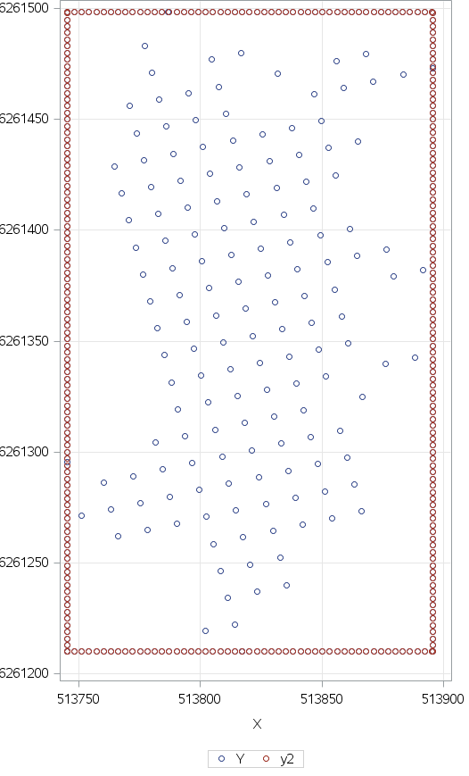
Thanks. As you helped me see there is no precise definition of "outer edges". From your blog of nearest neighbours I tried enclosing the data in the closest rectangle
I then used modeclus and calculated n nearest neighbours. Whenever I had a near neighbour to the added frame I could partly find "outer" ponts. Was hard to find cut-off values for the number of nearest neighbours and bad results when the data were not close to a rectangle.
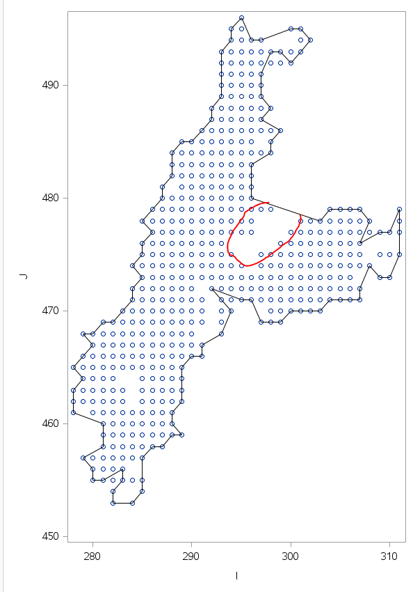
As the data are gridded from the outset I used the precise grid definitions which is in a different coordinate system called i,j. For these i found the min and max for j for each i and min and max for i for each j. This give me global outer edges. Then to draw the polygon I ordered the point using the travelling sales man network solver.
As can be seen from the picture above the results are reasonable. The red area is still a challenge. I know I can solve this by using adaptivereg on each i and j line with some postprocessing rules. However, at the moment I think the given solution is OK. Having tested on 15 different point shapes it seems as if there is a reasonable generalization.
- Mark as New
- Bookmark
- Subscribe
- Mute
- RSS Feed
- Permalink
- Report Inappropriate Content
Maybe PROC KDE could give you somthing.
ods graphics on;
proc kde data=bivnormal;
bivar x y / plots=(contour surface);
run;
ods graphics off;
- Mark as New
- Bookmark
- Subscribe
- Mute
- RSS Feed
- Permalink
- Report Inappropriate Content
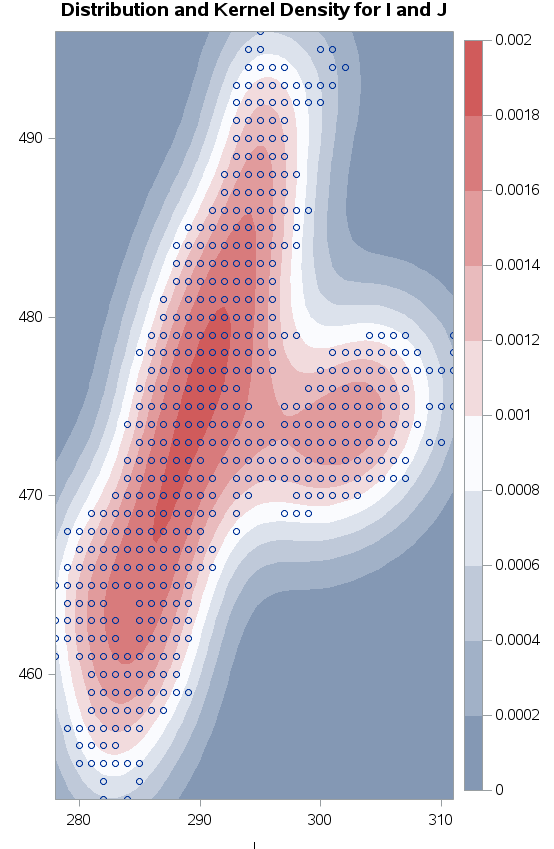
Thanks. The picture show results for some of my real data. The kernel traces reasonably well. I had a hard time finidng an efficent way to get the kernel lines into a polygon shape.
Really nice for visualization though.
- Mark as New
- Bookmark
- Subscribe
- Mute
- RSS Feed
- Permalink
- Report Inappropriate Content
I don't know if the following code could give you a help.
I also want know how to plot these contour lines.
ods trace on;
ods output ContourPlot=ContourPlot Controls=Controls Inputs=Inputs;
proc kde data=sashelp.class;
bivar weight height / plots=contour;
run;
ods trace off;- Mark as New
- Bookmark
- Subscribe
- Mute
- RSS Feed
- Permalink
- Report Inappropriate Content
Thanks I've tried that one but did not get very much further.
- Mark as New
- Bookmark
- Subscribe
- Mute
- RSS Feed
- Permalink
- Report Inappropriate Content
It now sounds like you might be interested in the contours/boundaries of the highest-density regions. See the article "Compute highest density regions in SAS" for code to compute these regions.
- Mark as New
- Bookmark
- Subscribe
- Mute
- RSS Feed
- Permalink
- Report Inappropriate Content
Thanks, I'm going on vactaion today so I do not have time to try this before I leave. Also from your blosg it seems as if I have to fight to get IML into the licence again.:-)
Catch up on SAS Innovate 2026
Nearly 200 sessions are now available on demand with the SAS Innovate Digital Pass.
Explore Now →ANOVA, or Analysis Of Variance, is used to compare the averages or means of two or more populations to better understand how they differ. Watch this tutorial for more.
Find more tutorials on the SAS Users YouTube channel.


