- Home
- /
- Analytics
- /
- Stat Procs
- /
- Re: Box Plot for multiple variables in SAS
- RSS Feed
- Mark Topic as New
- Mark Topic as Read
- Float this Topic for Current User
- Bookmark
- Subscribe
- Mute
- Printer Friendly Page
- Mark as New
- Bookmark
- Subscribe
- Mute
- RSS Feed
- Permalink
- Report Inappropriate Content
PROC BOXPLOT DATA=SAS-data-set;
PLOT analysis-variable*group-variable ;
RUN;
I'd like to know if its possible to produce box plot as in SPSS when I've say 7-8 variables.Could u give an e.g.
regards ,
markc
- Mark as New
- Bookmark
- Subscribe
- Mute
- RSS Feed
- Permalink
- Report Inappropriate Content
boxplot multiple variables site:sas.com
Scott Barry
SBBWorks, Inc.
- Mark as New
- Bookmark
- Subscribe
- Mute
- RSS Feed
- Permalink
- Report Inappropriate Content
>
> PROC BOXPLOT DATA=SAS-data-set;
> PLOT analysis-variable*group-variable ;
> RUN;
>
> I'd like to know if its possible to produce box plot
> as in SPSS when I've say 7-8 variables.Could u give
> an e.g.
Could you give a further explanation of what it means to have a box plot with 7-8 variables? I have never heard of such a thing. Thanks.
- Mark as New
- Bookmark
- Subscribe
- Mute
- RSS Feed
- Permalink
- Report Inappropriate Content
regards ,
markc
- Mark as New
- Bookmark
- Subscribe
- Mute
- RSS Feed
- Permalink
- Report Inappropriate Content
- Mark as New
- Bookmark
- Subscribe
- Mute
- RSS Feed
- Permalink
- Report Inappropriate Content
Second, the answer depends on which version of SAS you have. In 9.2 it is easy. In earlier versions, not so much.
- Mark as New
- Bookmark
- Subscribe
- Mute
- RSS Feed
- Permalink
- Report Inappropriate Content
There's quite a difference between a scatter plot matrix and the output from PROC BOXPLOT:
BOXPLOT:
http://support.sas.com/documentation/cdl/en/statug/63033/HTML/default/statug_boxplot_sect027.htm
Scatter Plot Matrix from PROC SGSCATTER:
http://support.sas.com/documentation/cdl/en/grstatdesign/61690/HTML/default/p15vesgmtvqg6un1vku8kqip...
If you are running in SAS 9.2, then it is quite easy to create a scatter plot matrix, as described in the documentation above.
In SAS 9.1.3, I believe that products such as SAS/Insight and SAS/Lab were able to produce Scatter Plot Matrices:
http://support.sas.com/documentation/cdl/en/sgug/59902/HTML/default/two_sect3.htm
http://support.sas.com/documentation/cdl/en/lab/60951/HTML/default/sumscats_graphica.htm#csumscatsfg...
Again, reading the documentation and finding out what version of SAS and SAS products you have available will lead you to the correct procedure/product to produce a scatter plot matrix.
cynthia
- Mark as New
- Bookmark
- Subscribe
- Mute
- RSS Feed
- Permalink
- Report Inappropriate Content
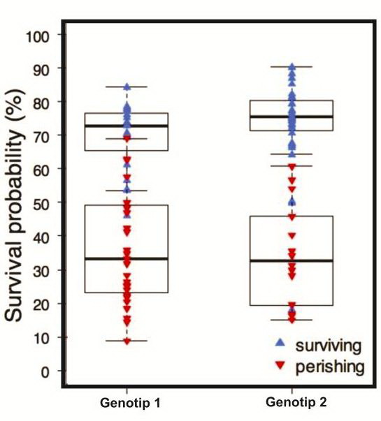
My experiment arranged in Split Plot design. How to make a Charts/ Boxplots for Proportions of a Binary Variable ?
data Survival;
input A $ B $ Block Y; if Y=1 then 1='Survive'; else 0='Died';
datalines;
A1 B1 1 0
A1 B1 2 1
A1 B1 3 0
A1 B1 4 0
A1 B1 5 0
A1 B2 1 1
A1 B2 2 1
A1 B2 3 1
A1 B2 4 1
A1 B2 5 0
A1 B3 1 1
A1 B3 2 0
A1 B3 3 0
A1 B3 4 1
A1 B3 5 1
A2 B1 1 0
A2 B1 2 0
A2 B1 3 0
A2 B1 4 0
A2 B1 5 0
A2 B2 1 1
A2 B2 2 0
A2 B2 3 0
A2 B2 4 1
A2 B2 5 0
A2 B3 1 1
A2 B3 2 1
A2 B3 3 1
A2 B3 4 0
A2 B3 5 1
A3 B1 1 1
A3 B1 2 0
A3 B1 3 1
A3 B1 4 0
A3 B1 5 0
A3 B2 1 0
A3 B2 2 1
A3 B2 3 1
A3 B2 4 1
A3 B2 5 0
A3 B3 1 0
A3 B3 2 1
A3 B3 3 0
A3 B3 4 1
A3 B3 5 1
;
Is it true when it displayed in as shown below ? how to write the codes ?
Please help me it is so important for me...
- Mark as New
- Bookmark
- Subscribe
- Mute
- RSS Feed
- Permalink
- Report Inappropriate Content
Could you please start a new thread instead of extending a thread from 2010? A lot has changed in five years. Thanks.
Catch up on SAS Innovate 2026
Dive into keynotes, announcements and breakthroughs on demand.
Explore Now →ANOVA, or Analysis Of Variance, is used to compare the averages or means of two or more populations to better understand how they differ. Watch this tutorial for more.
Find more tutorials on the SAS Users YouTube channel.


