- Home
- /
- Programming
- /
- Web Report Studio
- /
- How can I sort a crosstab by a dynamically generated %?
- RSS Feed
- Mark Topic as New
- Mark Topic as Read
- Float this Topic for Current User
- Bookmark
- Subscribe
- Mute
- Printer Friendly Page

- Mark as New
- Bookmark
- Subscribe
- Mute
- RSS Feed
- Permalink
- Report Inappropriate Content
Hi everyone,
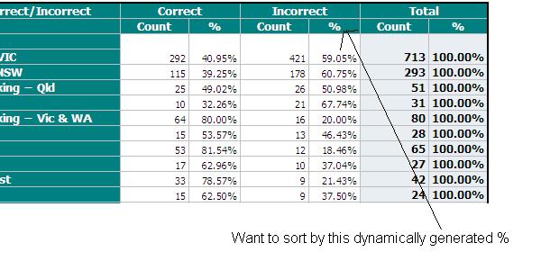
In my information map I have a measure called count that is always =1. Then 2 categories Flag and Region. Flag can take the values ('Correct'/'Incorrect') and region can be any of about 100 regions. My dataset contains about 2,000 rows each row has a value for region and a flag value of 'Correct' or 'Incorrect'.
So from this I create a crosstab. In the columns I have the flag, then count, then % (generated dynamically as a "Row Total percent" on the measure count). In the Rows I have Region.
I then apply a rank showing the top 25 regions where flag = Incorrect. But what I would really like is a ranking of the top 25 regions with the highest percentage of flag = Incorrect. I can sort by count but not by %. Is there a way to do this is in Web Report Studio? I'd also like to add a column called rank with rank values 1-25. I'd also like to sort by percentage in a bar graph.
Any help on this would be greatly appreciated.
Thanks,
Chickenhouse

- Mark as New
- Bookmark
- Subscribe
- Mute
- RSS Feed
- Permalink
- Report Inappropriate Content
Code used to generate the existing table?
- Mark as New
- Bookmark
- Subscribe
- Mute
- RSS Feed
- Permalink
- Report Inappropriate Content
I'm not sure what you mean. A SAS DI Studio job generated the data for the table through a complex series of joins. The data was loaded into Information Map Studio, (count was a measure generated in here). Then SAS Web Report Studio created the table by just dragging stuff around it's virtually codeless.
.jpg")
Catch up on SAS Innovate 2026
Nearly 200 sessions are now available on demand in the Innovate Hub.
Watch Now →Learn how use the CAT functions in SAS to join values from multiple variables into a single value.

Find more tutorials on the SAS Users YouTube channel.
SAS Training: Just a Click Away
Ready to level-up your skills? Choose your own adventure.
-
2 replies
-
01-31-2013 02:19 AM
-
2307 views
-
0 likes
-
2 in conversation
-
