- Home
- /
- Programming
- /
- Web Report Studio
- /
- BI dashboard - chart problems
- RSS Feed
- Mark Topic as New
- Mark Topic as Read
- Float this Topic for Current User
- Bookmark
- Subscribe
- Mute
- Printer Friendly Page
- Mark as New
- Bookmark
- Subscribe
- Mute
- RSS Feed
- Permalink
- Report Inappropriate Content
Hey
I am having problems using BI Dashboard to create a simple chart.
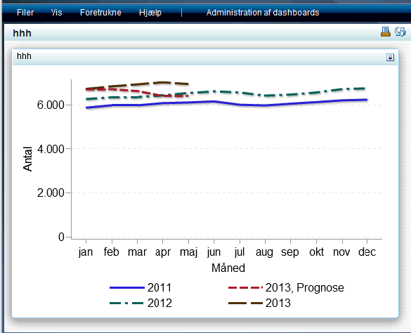
The range of my y axis is between 5.000 to 6.000 and the chart insist on placing the lines rigth at the top of the chart.
I have to drag the axis to be able to see the details.
Does anyone have the same problem.
I have attached a png file to demonstrate the problem.
Ivan

- Mark as New
- Bookmark
- Subscribe
- Mute
- RSS Feed
- Permalink
- Report Inappropriate Content
Hi Ivan
We have the same problem, it looks like BI Dashboard is not able to adjust the Y axis. When your using single line plot it not that bad, but when using multiple lines (who are close to each other) we have the problems. Hopefully someone from SAS can comment on this ![]()
Martin
- Mark as New
- Bookmark
- Subscribe
- Mute
- RSS Feed
- Permalink
- Report Inappropriate Content
Hej Martin
I just attended theSAS Forum in Copenhagen, an in one af the presentations they said that in v. 9.4 the scaling problem would be fixed.
So just upgrade to 9.4.
Hopefully this will help
Ivan
Learn how use the CAT functions in SAS to join values from multiple variables into a single value.
Find more tutorials on the SAS Users YouTube channel.
SAS Training: Just a Click Away
Ready to level-up your skills? Choose your own adventure.


