- Home
- /
- SAS Viya
- /
- Visual Analytics
- /
- dual axis line bar chart combined with stacking in stead of clustering
- RSS Feed
- Mark Topic as New
- Mark Topic as Read
- Float this Topic for Current User
- Bookmark
- Subscribe
- Mute
- Printer Friendly Page

- Mark as New
- Bookmark
- Subscribe
- Mute
- RSS Feed
- Permalink
- Report Inappropriate Content
Hi,
normally when I use a regular bar chart I use the 'grouping' option to stack category items. Now I need a dual axis line bar chart . I have created one using the custom chart option, and replaced 'clustering' with ' stacking ' in the bar chart properties. However, when I use this chart in a report, the category cannot be added to a grouping option. Is there another way to do this?
Thanks for your input

- Mark as New
- Bookmark
- Subscribe
- Mute
- RSS Feed
- Permalink
- Report Inappropriate Content
JPinkman,
In the custom graph that you built, did you create a shared group role for the two bar charts? I was able to create a stacked bar chart with dual axis, but with my data it isn't the best visual:
-shawn

- Mark as New
- Bookmark
- Subscribe
- Mute
- RSS Feed
- Permalink
- Report Inappropriate Content
Hi,
I'm fairly new to SAS VA and have the same question to create a stacked bar-line chart through custom graph builder (and to correctly use it in the report designer). Would you please provide some instruction on this topic (or point me where I can find the instruction)?
Thank you!

- Mark as New
- Bookmark
- Subscribe
- Mute
- RSS Feed
- Permalink
- Report Inappropriate Content
The previous post appears to answer this question. Is there something not clear about the explanation?
-------------------------------------------------------------------------
Four tips to remember when you contact SAS Technical Support
Tricks for SAS Visual Analytics Report Builders
SAS Visual Analytics Learning Center
- Mark as New
- Bookmark
- Subscribe
- Mute
- RSS Feed
- Permalink
- Report Inappropriate Content
Thanks so much for the reply! I tried to mimic what was shown in the previous post, but the bar charts weren't stacked. I also tried to save the graph and opened it in the Report Designer, and it didn't work too. Do you have any instruction video like the 'butterfly example' for this topic? That video is very helpful.
Thank you!
- Mark as New
- Bookmark
- Subscribe
- Mute
- RSS Feed
- Permalink
- Report Inappropriate Content
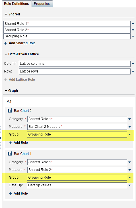
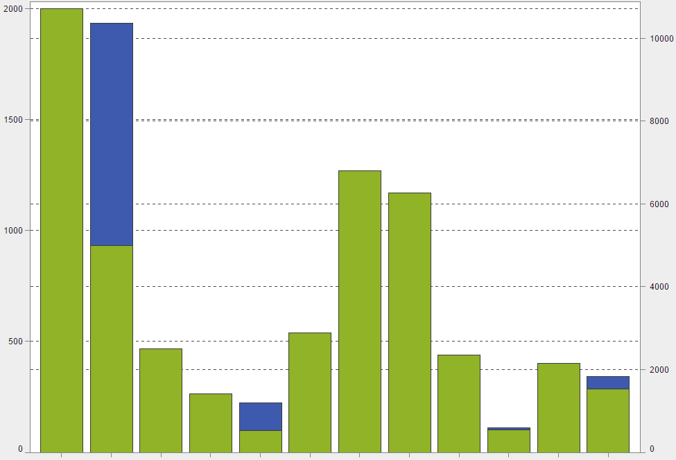
I was able to create a bar-line chart where the bar is stacked. This is a very specific request and I am not aware of any videos available. So, here are the steps
- In the custom graph builder, I placed a line chart and a bar chart on top of each other.
- On the Properties tab, I selected the Bar Chart from the drop-down list at the top and changed the Grouping Style to Stack.
- On the Role Definitions, I added a new Shared Role for a Category that I called Shared Group Role.
- For the Line Chart, I selected + Add Role > Group. After clicking OK, I immediately clicked the down arrow next to that role and changed it to my Shared Group Role.
- I did the same steps for my Bar Chart.
This is what the Role Definitions tab looked like:
- I saved the custom graph and noted the location.
- In Visual Analytics Designer, on the Objects tab, I clicked the down arrow and selected Show or Hide Objects.
- I clicked Custom and navigated to where I saved the custom graph. Clicked OK to return to the Show or Hide Objects dialog box, and then clicked OK. The graph was then available to select on the Objects tab at the bottom beneath the Custom heading.
- I added the graph to the report and assigned my data items to the roles. This is what it looked like for me:


-------------------------------------------------------------------------
Four tips to remember when you contact SAS Technical Support
Tricks for SAS Visual Analytics Report Builders
SAS Visual Analytics Learning Center
- Mark as New
- Bookmark
- Subscribe
- Mute
- RSS Feed
- Permalink
- Report Inappropriate Content
Thank you for such a detailed instruction! I was able to modify what you're doing here and got the graph I need.
Much appreciated!

- Mark as New
- Bookmark
- Subscribe
- Mute
- RSS Feed
- Permalink
- Report Inappropriate Content
Thanks for your post!
I have the same type of graph but I'd like to see the values of each category inside my stacked bar (in your example: see the exactly number of sedan in USA inside that green bar,i.e.) , and I don't find how to do it!
Any help would be really appreciate.
(I'm using web graph builder: 7.5.1 version )
Regards,
Jose L.
- Mark as New
- Bookmark
- Subscribe
- Mute
- RSS Feed
- Permalink
- Report Inappropriate Content
Segment labels are not available for custom bar-line graphs. I would suggest entering a SASWare Ballot request for this feature.
https://communities.sas.com/t5/SASware-Ballot-Ideas/idb-p/sas_ideas/label-name/sas%20visual%20analyt...
-------------------------------------------------------------------------
Four tips to remember when you contact SAS Technical Support
Tricks for SAS Visual Analytics Report Builders
SAS Visual Analytics Learning Center
.jpg")
Catch up on SAS Innovate 2026
Nearly 200 sessions are now available on demand with the SAS Innovate Digital Pass.
Explore Now →See how to use one filter for multiple data sources by mapping your data from SAS’ Alexandria McCall.

Find more tutorials on the SAS Users YouTube channel.
-
8 replies
-
03-19-2015 02:30 PM
-
6856 views
-
2 likes
-
5 in conversation
-
