- Home
- /
- SAS Viya
- /
- Visual Analytics
- /
- Y axis Tick Values inside the graph
- RSS Feed
- Mark Topic as New
- Mark Topic as Read
- Float this Topic for Current User
- Bookmark
- Subscribe
- Mute
- Printer Friendly Page

- Mark as New
- Bookmark
- Subscribe
- Mute
- RSS Feed
- Permalink
- Report Inappropriate Content
Dear community support,
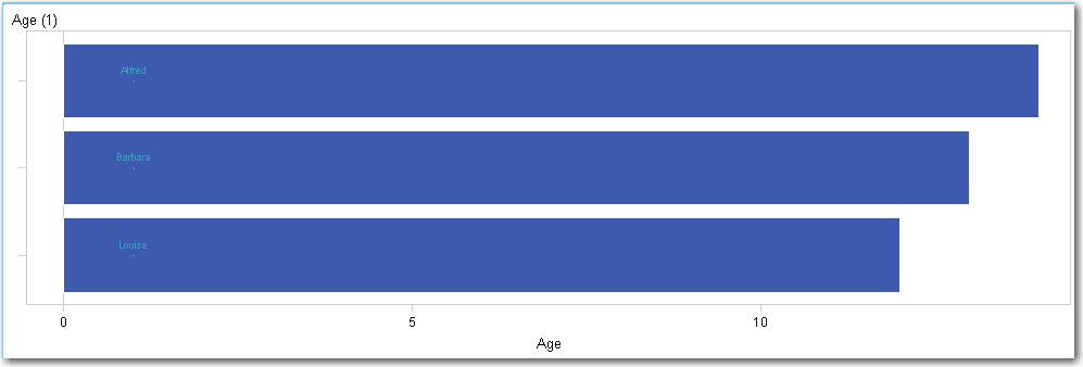
Is it possible to use the graph builder to create a custom horizontal bar chart with the Y axis tick values inside the graph?
Normally the Y axis tick values appear on the left of the Y axis, I want them inside the graph, on the right, with the data "on top" of the Y tick values.
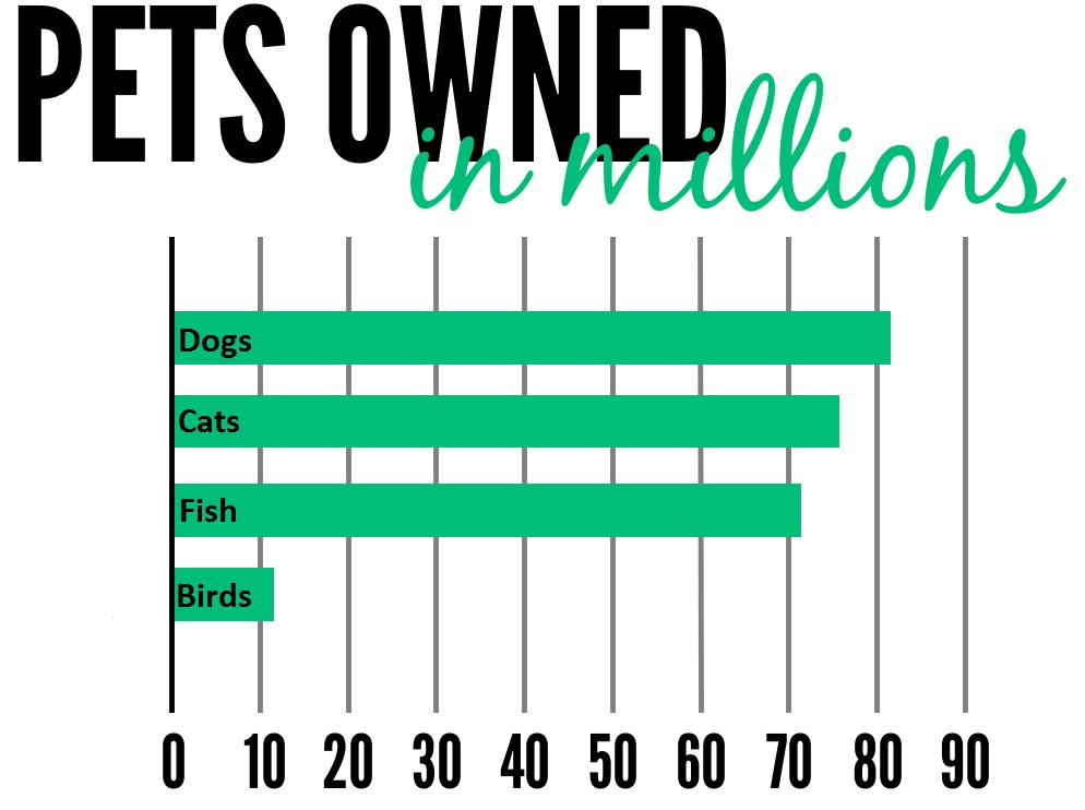
As an example I found this image.
Any replies would be greatly appreciated.
Best regards,
Stefan

- Mark as New
- Bookmark
- Subscribe
- Mute
- RSS Feed
- Permalink
- Report Inappropriate Content
Hi Stefan,
One thing you can try is overlaying a scatterplot on top of the barchart. You can then add a datalabel role to the scatterplot and make its type=character. Next, you would need to turn off the display of the y axis tickmarks for the barchart and use the datalabels from the scatterplot in their place. This method would require you to create a dummy dataset for the scatter plot so that you can position the labels exactly where you want them. You might also have to make some changes to the properties of the scatterplot markers so that they would not be visible. (Maybe make them the same color as the barchart fill color). Attached is a very rudimentary example that illustrates a path you can follow in attempt to solve your problem. Hopefully others can share more possibilities.
Scott
- Mark as New
- Bookmark
- Subscribe
- Mute
- RSS Feed
- Permalink
- Report Inappropriate Content
Dear Scott,
Thank you for your detailed reply. Unfortunatly the method doesnt work as my data sets are too big to create a scatterplot.
I will keep fiddling and if I find a solution I will post it here too. Maybe its a nice feature to implement in coming versions as the Y tick lables are being generated already, its just a matter of mirroring their horizontal position to the other side of the Y axis.
.jpg")
Catch up on SAS Innovate 2026
Nearly 200 sessions are now available on demand in the Innovate Hub.
Watch Now →See how to use one filter for multiple data sources by mapping your data from SAS’ Alexandria McCall.

Find more tutorials on the SAS Users YouTube channel.
-
2 replies
-
04-15-2015 08:12 AM
-
2847 views
-
1 like
-
2 in conversation
-
