- Home
- /
- SAS Viya
- /
- Visual Analytics
- /
- Re: X axis labeling with two labels in same graph
- RSS Feed
- Mark Topic as New
- Mark Topic as Read
- Float this Topic for Current User
- Bookmark
- Subscribe
- Mute
- Printer Friendly Page
- Mark as New
- Bookmark
- Subscribe
- Mute
- RSS Feed
- Permalink
- Report Inappropriate Content
Hi all,
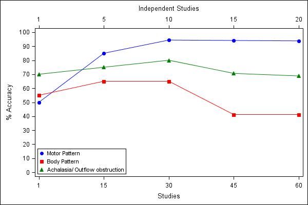
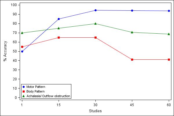
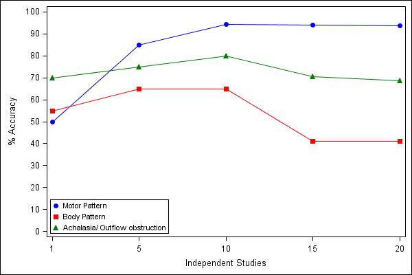
I am looking for help in creating graphs with two sets of labeling for X-axis. I am attaching my excel sheet, SAS code and the graphs I had generated. Basicially I want two X-axis labeling (Independent Studies and Studies) in the same graph.
Thanks for all the help,
Satish
ods listing close;
ods graphics / reset width=600px height=400px imagename='Fig 1' imagefmt=jpeg;
ods html file='Surg.html' path='E:\HRM\Revised\Revised18_New' style=journal;

/*ods html file='ap.html' path='C:\' style=journal; */
 proc sgplot data=graphs;
 scatter X=Studies Y=MP /  markerattrs=(color=blue symbol=CircleFilled size=8) name="scat" legendlabel="Motor Pattern";
 series X=Studies Y=MP /  lineattrs=(color=blue pattern=1) ;
scatter X=Studies Y=BP /  markerattrs=(color=red symbol=SquareFilled size=8) name="scat1" legendlabel="Body Pattern";
 series X=Studies Y=BP /  lineattrs=(color=red pattern=1) ;
scatter X=Studies Y=OutOb /  markerattrs=(color=green symbol=TriangleFilled size=8) name="scat2" legendlabel="Achalasia/ Outflow obstruction";
 series X=Studies Y=OutOb /  lineattrs=(color=green pattern=1) ;

 XAXIS TYPE = DISCRETE ;
 YAXIS LABEL = '% Accuracy'    VALUES = (0 TO 100 BY 10);
keylegend "scat" "scat1" "scat2"  "scat4"  / position=bottomleft
across=1 location=inside ;
 run;
ods html close;
ods listing;


ods listing close;
ods graphics / reset width=600px height=400px imagename='Fig 1_New' imagefmt=jpeg;
ods html file='Surg.html' path='E:\HRM\Revised\Revised18_New' style=journal;

/*ods html file='ap.html' path='C:\' style=journal; */
 proc sgplot data=graphs;
 scatter  X=Independent_Studies Y=MP /  markerattrs=(color=blue symbol=CircleFilled size=8) name="scat" legendlabel="Motor Pattern";
 series  X=Independent_Studies Y=MP /  lineattrs=(color=blue pattern=1) ;
scatter  X=Independent_Studies Y=BP /  markerattrs=(color=red symbol=SquareFilled size=8) name="scat1" legendlabel="Body Pattern";
 series  X=Independent_Studies Y=BP /  lineattrs=(color=red pattern=1) ;
scatter  X=Independent_Studies Y=OutOb /  markerattrs=(color=green symbol=TriangleFilled size=8) name="scat2" legendlabel="Achalasia/ Outflow obstruction";
 series X=Independent_Studies Y=OutOb /  lineattrs=(color=green pattern=1) ;

 XAXIS TYPE = DISCRETE ;
 YAXIS LABEL = '% Accuracy'    VALUES = (0 TO 100 BY 10);
keylegend "scat" "scat1" "scat2"  "scat4"  / position=bottomleft
across=1 location=inside ;
 run;
ods html close;
ods listing;
Accepted Solutions
- Mark as New
- Bookmark
- Subscribe
- Mute
- RSS Feed
- Permalink
- Report Inappropriate Content
Oh sry my bad.
In this case try this, similar but not exactly what you posted.
I think what you want can be done with GTL but I never tried it.
ods listing close;
ods graphics / reset width=600px height=400px imagename="Fig 1" imagefmt=jpeg;
ods html file='Surg.html' path='E:\HRM\Revised\Revised18_New' style=journal;

   proc sgplot data=graphs;
      scatter  X=Independent_Studies Y=MP      / markerattrs=(color=blue symbol=CircleFilled size=8) legendlabel="Motor Pattern" x2axis;
      scatter  X=Studies Y=MP      / markerattrs=(color=blue symbol=CircleFilled size=8) name="scat" legendlabel="Motor Pattern";
      series   X=Studies Y=MP      / lineattrs=(color=blue pattern=1) ;
      scatter  X=Studies Y=BP      / markerattrs=(color=red symbol=SquareFilled size=8) name="scat1" legendlabel="Body Pattern";
      series   X=Studies Y=BP      / lineattrs=(color=red pattern=1) ;
      scatter  X=Studies Y=OutOb   / markerattrs=(color=green symbol=TriangleFilled size=8) name="scat2" legendlabel="Achalasia/ Outflow obstruction";
      series   X=Studies Y=OutOb   / lineattrs=(color=green pattern=1) ;
      XAXIS TYPE = DISCRETE label="Studies";
      X2AXIS TYPE = DISCRETE label="Independent Studies";
      YAXIS LABEL = '% Accuracy' VALUES = (0 TO 100 BY 10);
      keylegend "scat" "scat1" "scat2" / position=bottomleft across=1 location=inside ;
   run;
ods html close;
ods listing; 
- Cheers -
- Mark as New
- Bookmark
- Subscribe
- Mute
- RSS Feed
- Permalink
- Report Inappropriate Content
Hi,
put your code in a macro block and parameterize it, like this:
data graphs;
   infile cards expandtabs truncover;
   input Independent_Studies Studies MP MP_Low MP_High BP BP_Low BP_High OutOb Outob_Low OutOb_High Mx Mx_low Mx_High MxEGJ MxEGJ_low MxEGJ_High Fundo Fundo_Low Fundo_High ;
   cards;
   1 1 50 45 50 55 50 60 70 65 75 80 75 85 68.4 63.2 73.7 66.7 61.1 72.2
   5 15 85 80 90 65 60 82.9 75 56.7 80 55 50 60 90 71.9 95 50 39.5 60.5
   10 30 94.4 74.7 100 65 46.7 70 80 54.2 85 65 60 70 80 54.2 85 35.3 13.4 59.3
   15 45 94.1 73.2 100 41.2 18.1 47.1 70.6 48.9 85.9 76.5 70.6 82.4 66.7 39.8 87.6 42.9 29.3 72.8
   20 60 93.8 77.6 100 41.2 18.1 47.1 68.8 52.5 75 81.3 75 87.5 73.3 52.1 85.9 75 52.3 81.2
   ;
run;


%MACRO doGraph(var=,xlabel=);
   ods listing close;
   ods graphics / reset width=600px height=400px imagename="Fig 1 &xlabel." imagefmt=jpeg;
   ods html file='Surg.html' path='E:\HRM\Revised\Revised18_New' style=journal;

   proc sgplot data=graphs;
      scatter X=Independent_Studies Y=MP / markerattrs=(color=blue symbol=CircleFilled size=8) name="scat" legendlabel="Motor Pattern";
      series X=Independent_Studies Y=MP / lineattrs=(color=blue pattern=1) ;
      scatter X=Independent_Studies Y=BP / markerattrs=(color=red symbol=SquareFilled size=8) name="scat1" legendlabel="Body Pattern";
      series X=Independent_Studies Y=BP / lineattrs=(color=red pattern=1) ;
      scatter X=Independent_Studies Y=OutOb / markerattrs=(color=green symbol=TriangleFilled size=8) name="scat2" legendlabel="Achalasia/ Outflow obstruction";
      series X=Independent_Studies Y=OutOb / lineattrs=(color=green pattern=1) ;
      XAXIS TYPE = DISCRETE label="&xlabel.";
      YAXIS LABEL = '% Accuracy' VALUES = (0 TO 100 BY 10);
      keylegend "scat" "scat1" "scat2" "scat4" / position=bottomleft across=1 location=inside ;
   run;

   ods html close;
   ods listing;
%MEND doGraph;

%doGraph(var=Studies,xlabel=Studies);
%doGraph(var=Independent_Studies,xlabel=Independent Studies);
Cheers,
Oligolas
- Cheers -
- Mark as New
- Bookmark
- Subscribe
- Mute
- RSS Feed
- Permalink
- Report Inappropriate Content
Thank you Oligolas. I ran your code. I did not get any errors, but it just gives me only one x-axis labeling (independent studies) and not for both. Can you help? I have SAS 9.4.
Thanks a lot again!
Satish
- Mark as New
- Bookmark
- Subscribe
- Mute
- RSS Feed
- Permalink
- Report Inappropriate Content
Hi I am not sure to understand?
Do you mean in the HTML? do you want both jpg in the same HTML?
like this?
%MACRO doGraph(var=,xlabel=);
   ods listing close;
   ods graphics / reset width=600px height=400px imagename="Fig 1 &xlabel." imagefmt=jpeg;


   proc sgplot data=graphs;
      scatter X=Independent_Studies Y=MP / markerattrs=(color=blue symbol=CircleFilled size=8) name="scat" legendlabel="Motor Pattern";
      series X=Independent_Studies Y=MP / lineattrs=(color=blue pattern=1) ;
      scatter X=Independent_Studies Y=BP / markerattrs=(color=red symbol=SquareFilled size=8) name="scat1" legendlabel="Body Pattern";
      series X=Independent_Studies Y=BP / lineattrs=(color=red pattern=1) ;
      scatter X=Independent_Studies Y=OutOb / markerattrs=(color=green symbol=TriangleFilled size=8) name="scat2" legendlabel="Achalasia/ Outflow obstruction";
      series X=Independent_Studies Y=OutOb / lineattrs=(color=green pattern=1) ;
      XAXIS TYPE = DISCRETE label="&xlabel.";
      YAXIS LABEL = '% Accuracy' VALUES = (0 TO 100 BY 10);
      keylegend "scat" "scat1" "scat2" "scat4" / position=bottomleft across=1 location=inside ;
   run;
   ods listing;
%MEND doGraph;

ods html file='Surg.html' path='E:\HRM\Revised\Revised18_New' style=journal;
   %doGraph(var=Studies,xlabel=Studies);
   %doGraph(var=Independent_Studies,xlabel=Independent Studies);
ods html close; - Cheers -
- Mark as New
- Bookmark
- Subscribe
- Mute
- RSS Feed
- Permalink
- Report Inappropriate Content
Thank you for the reply. No that is not I was looking for. Can you see my PDf attacment? The example I have on PDF is what exactly I am looking for. Is this possible?
- Mark as New
- Bookmark
- Subscribe
- Mute
- RSS Feed
- Permalink
- Report Inappropriate Content
Hi,
ok I understand,
with the x2axis statement it is possible to display 2 axis on one graph...
BUT:
look at your data,
when independent_study has the value of 15 you have and MP value of 85
when study has the value of 15 you have and MP value of 94.1
The figure you draw is unfortunately not correct, rethink about how you want to display the data.
Cheers
- Cheers -
- Mark as New
- Bookmark
- Subscribe
- Mute
- RSS Feed
- Permalink
- Report Inappropriate Content
Yes, the figure is correct. That is how I want. For x-axis, the value of independent_studies 5 is the same as studies 15. So the data is exactly same but I need two different x-axis exactly how I have in the PDF. will it be possible? I hope I clarified the point.
5 independent studies = 15 studies.
- Mark as New
- Bookmark
- Subscribe
- Mute
- RSS Feed
- Permalink
- Report Inappropriate Content
Independent_study 1 = Study 1
Independent_study 5 = Study 15
Independent_study 10 = Study 30
Independent_study 15 = Study 45
Independent_study 20 = Study 30
- Mark as New
- Bookmark
- Subscribe
- Mute
- RSS Feed
- Permalink
- Report Inappropriate Content
Oh sry my bad.
In this case try this, similar but not exactly what you posted.
I think what you want can be done with GTL but I never tried it.
ods listing close;
ods graphics / reset width=600px height=400px imagename="Fig 1" imagefmt=jpeg;
ods html file='Surg.html' path='E:\HRM\Revised\Revised18_New' style=journal;

   proc sgplot data=graphs;
      scatter  X=Independent_Studies Y=MP      / markerattrs=(color=blue symbol=CircleFilled size=8) legendlabel="Motor Pattern" x2axis;
      scatter  X=Studies Y=MP      / markerattrs=(color=blue symbol=CircleFilled size=8) name="scat" legendlabel="Motor Pattern";
      series   X=Studies Y=MP      / lineattrs=(color=blue pattern=1) ;
      scatter  X=Studies Y=BP      / markerattrs=(color=red symbol=SquareFilled size=8) name="scat1" legendlabel="Body Pattern";
      series   X=Studies Y=BP      / lineattrs=(color=red pattern=1) ;
      scatter  X=Studies Y=OutOb   / markerattrs=(color=green symbol=TriangleFilled size=8) name="scat2" legendlabel="Achalasia/ Outflow obstruction";
      series   X=Studies Y=OutOb   / lineattrs=(color=green pattern=1) ;
      XAXIS TYPE = DISCRETE label="Studies";
      X2AXIS TYPE = DISCRETE label="Independent Studies";
      YAXIS LABEL = '% Accuracy' VALUES = (0 TO 100 BY 10);
      keylegend "scat" "scat1" "scat2" / position=bottomleft across=1 location=inside ;
   run;
ods html close;
ods listing; 
- Cheers -
- Mark as New
- Bookmark
- Subscribe
- Mute
- RSS Feed
- Permalink
- Report Inappropriate Content
Thanks, this works!
Satish
Catch up on SAS Innovate 2026
Dive into keynotes, announcements and breakthroughs on demand.
Explore Now →See how to use one filter for multiple data sources by mapping your data from SAS’ Alexandria McCall.
Find more tutorials on the SAS Users YouTube channel.


